Category Archives: First Impressions
Review – WinBook 7″ Tablet Computer

I have never been impressed with what Microsoft has done with tablets. Their first attempt to battle the dominate iPad was the Surface, and it was not successful. While tech bloggers offered decent praise for the hardware at least, the tablet was not well received by the masses. Since those days Microsoft has changed their tactics in regards to their premium line, and the Surface Pro 3, clearly is up against the MacBook Air. Now it’s laptop versus laptop, and the battle is truly on it’s way to being balanced. My few interactions with the Surface Pro 3 have caused me to question my long-held stance that Windows 8 is awful. So when MicroCenter sent me an invite to pick up a 7 inch Windows 8 tablet for only $50, I jumped at the chance to take a look first-hand. I’ve been using the WinBook for a couple of weeks now, and these are my first impressions.
The Cup Half Full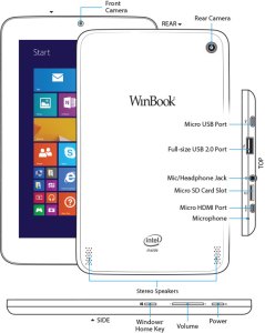
For starters, the hardware is pretty solid. The device is sturdy, the various ports are not loose, like you sometimes find with other cheap tablets. This is good because the device offers a vast array of plug in options (most of which are “micro”). It charges via a standard microUSB. It has expandable memory via microSD card. It has a micro HDMI for video output to HD televisions. And it has a fully supported USB 2.0 port. This last one is the real kicker for a 7inch tablet. With this single port, you can attach a USB hub, and virtually replace your old desktop. The tablet becomes the “tower” and you attach a monitor, keyboard, and mouse, and you’re good to go! That’s a pretty cool thing, and it’s something the iPad can’t do!
Beyond the ability to add peripheral devices, the WinBook tablet is a great form factor. It feels fine in one hand if you’re reading a book (via the Kindle app, perhaps). Unlike many higher end tablets, the bezel (edges around the screen) is thick enough to allow easy handling without accidentally tapping the screen.
The “tiles” interface of Windows 8.1 is pretty slick, once you get it set up. You can use the default “active tiles” to have updates show up on the tile itself, though this will impact the battery life. I choose to turn off most of those features, though I kept the active tile on for email and twitter. Adding apps is easy, and the app store comes on the default screens. But once you go past the build quality and number of plugins, many issues begin to arise.
The Cup Half Empty
While the build of the device is great, the screen is the weak point. It is obviously cheaper glass than what you will find on high-end devices like iPad or Galaxy Tab (let alone high end smartphones)! That means one thing….fingerprints!! I’ve done side by side testing with the WinBook and an iPad Mini, and where the iPad barely registers a spot on the screen, the WinBook is covered. That shouldn’t be a deal breaker for anyone, but I’m picky about the look of my screen. And I’m pretty sure I’m not alone.
The next issue I hit was during the set up. I had to head to google several times to figure out how to do  things like uninstall apps, stop apps running in the background (and killing my battery), and making various adjustments to settings. I was very disappointed when this happened because I hoped this would be a simple device that anyone could use right out of the box. For many, that will certainly be the case, but if you aren’t tech savvy, you might need help getting this thing up and running, and I wish that wasn’t the case.
Battery life on this tablet is pretty bad. If you work hard at application management (closing apps you aren’t using) you might get 4-5 hours out of it. The standard expectation these days is between 8-10 hours, so that’s pretty bad.
The last point I want to make about the WinBook is as much a comment on all Windows based tablets, as it is on this one device in particular.
The Problem with Windows – Tablet versus PC
 My 7 inch tablet looks a lot like a Kindle Fire, or a Samsung Galaxy Tab, but it doesn’t act like one. It acts like a PC. By that I mean, it acts like the desktop computer that Microsoft used to dominate the marketplace with for decades (and continues to dominate in the corporate space). Since my purchase I have received the dreaded “Windows Updates” quite regularly. And not only are these updates annoying, but they are draining on battery and memory.
Like all PCs that run Windows, there is a section of the hard drive dedicated for “recovery”. It’s intended to provide a backup if your device crashes. Such a file seems terribly redundant in a world of cloud computing, and also the recovery file takes up nearly 6 of the 16GB of memory that the tablet comes with! This is ridiculous!
One of my major beefs with Android phones is their tendency to have “bloat-ware” installed. You know the apps that you can’t get rid of and take up space. Samsung is one of the worst for this. But compared to the WinBook, Samsung looks like a lightweight. The WinBook came with so much pre-installed stuff that only 5GB of the 16GB of memory remained for me to use. After 6-7 apps were installed, I was officially “out of space”, and needed to buy a microSD card to add memory so I could install more apps/media on the device. And here’s the kicker, the space required for “system files” will continue to get bigger as time goes by, because Windows will keep pushing updates, while not removing any of  the older files (which can’t be removed manually). So if you added nothing to the device you would continue to lose memory space. This is absolutely unacceptable for a low memory tablet. I could see this being okay on a device with lots of memory, even on a Surface Pro 3, but for a low-end 16GB tablet, such software is simply a waste of space.
Microsoft needs to learn to differentiate between their tablets and their laptops/PCs, most importantly in regards to memory consumption. Apple retains a clear distinction (though that could change with a 12 inch iPad this coming Winter). The biggest issue is when a small tablet tries to impersonate a high-powered PC it will certainly fail somewhere, and I’ve had a negative user experience because of it. An experience I think most would also have if they had this device.
The Whole Cup Summed Up
 The WinBook has tons of potential. It’s a solid little tablet computer. The ability to plug-in peripheral devices (even external hard drives) is a great feature, and something all tablets should start being able to do. The interface of Windows 8.1 is not as bad as I expected, and after some painful setup I’ve been cruising along.
But the cheap screen, bad battery, and memory-sucking Windows environment make this a challenging choice for the casual tech user. As Microsoft continues to struggle with how to identify their devices (as tablets or PCs) the other major players have slick user experiences. Android and Apple might be in a battle for market share, but they are not at odds in regards with how to build a strong user base. Their apps stores are cleaner, their developers are more enthusiastic (meaning more apps and a better user experience), and their tablets are just that, tablets. With good battery life, and decent memory .
.
So if you are a die-hard Windows person, I’d recommend checking out the Surface Pro 3, though get ready for sticker shock with its $900 price tag (and that without the extra $130 for the keyboard cover!). The Surface is a PC masquerading as a tablet, and the marketing makes it clear that is what is intended. But if Windows isn’t important, or you’re only interested in a low price tablet, I suggest sticking with the devices of Android (i.e Nexus 7) or Amazon Kindle (i.e. Kindle 6) for the time being, while Microsoft gets it act together.

Review – Beats “Studio” Headphones

The mere mention of the words “Beats Headphones” is likely to cause an emotional response, from those who spend any amount of time committed to listening to music. Usually two camps will form. Those who think Beats are awesome, and those who think Beats are overpriced junk. While both camps have good points to make, the insistence of adhering completely to one opinion over the other only causes further confusion about what exactly these headphones are, and whether or not they are really worth the pile of cash it takes to procure them. I’ve had a pair of Beats Studio headphones for a couple of months, and I’d like to share my opinion about these polarizing headphones. Please bear in mind that I am a music head not an audiophile. It’s important to understand the difference, to know where I’m coming from as I review these “cans” (it’s easier to type “cans” than “headphones”).
Musichead: “Someone who is an avid music listener. They listen to music ALL the time, and usually are the type of people who know about the latest music, and they are always trying to put you on to a new artist.: (urban dictionary)
Audiophile: “A person enthusiastic about high-fidelity sound reproduction. Audiophile values may be applied to all stages of music reproduction: initial audio recording, production process, and the playback.” (wikipedia)
So the audiophile cares much more about the quality of recording, whereas the musichead’s focus is on the music itself (based on lyrics, vocal quality, etc). Beats offers several models of headphones, at varying prices, from the “urbeats” earbuds for $90 to the “Beats Pro”, which go for $360. My model is the Beats Studio (wired), which will run you $299.
The Cup Half Full
The Beats Studio headphones offer great sound. I say that as a musichead, and also as a guy who spent the past five years with either Apple earbuds or $15 Sony cans. Those options gave me good sound. They weren’t junk. The Sony’s were actually surprisingly good, but over time they have started falling apart, which isn’t surprising considering how cheap they were. If you want great sound, without the perfection an audiophile looks for, you will be pleased with the Beats Studio headphones. These cans are “over-the-ear headphones”, meaning your ears will be nestled down inside the soft “leather” of the earpads. I tried the “Sol Republic” headphones, which uses an “on-ear” design, but I found that they were pinching my head to the point that after 30 minutes or so I had a headache. Moving to the Studio design, I’ve found that I can wear these headphones for six straight hours without any discomfort, and that is a huge selling point for this design of headphones. The Sol Republic’s offer great sound (on par with Beats) but that on-ear design wasn’t working for me.
The Beats Studio’s offer noise-cancelling, which is internally powered. I’d never used this type of headphone before, and I really like the functionality. While not entirely noise-cancelling, the headphone completely cancel out all “white noise/ambient sound” and muffle everything else. I work in an office complex, and I finally feel like I’m not surrounded by a bunch of people. The noise-cancelling function is powered via micro-USB, providing up to 20 hours of listening between charges. This is both a good and bad thing. The older models required batteries, which would have to be changed frequently. But the charging design means that when you’re battery is drained, not only will the noise-cancelling not work, but the cans will not work entirely. So now you have another device to manage in regards to battery life and charging schedules. You can also use the headphones as glorified earmuffs, as they have a physical power button on one ear, allowing you to engage the noise-cancelling piece without actually playing music. I use that feature more often than I thought I would. 
A couple of notes about the case, and design for travel. The headphones collapse to make them easier to carry around. That said, they are still pretty big headphones, so even in their collapsed state, they will take up a good chunk of your bag or purse. Beats includes a carrying case. It looks like a big egg and it’s intention is obviously to protect the headphones, not make them any easier to pack in said bags. The case is just large enough to house the collapsed cans, the headphone cable, and the charging cable/wall charger).
Finally, a great feature of these headphones is the detaching cable. By not hard wiring the cable into the headphones themselves you will have a much easier time replacing the cable part should they become damaged (it happens!). Also the cable functions as the “power button” for battery element of the cans. When you put the plug-in place the battery starts, as does the noise-cancelling. Pull the plug, and you’ve effectively, turned them off.
The Cup Half Empty
First off these headphones are certainly a premium product. You are paying for the name brand and the “cool factor” that is associated with the Beats line. I was actually avoiding these headphones strictly because I didn’t want to give into the hype. I have audiophile friends, who insisted that there are cheaper cans with better sound. I just needed to do some homework. But I didn’t want to do some homework! I’m a musichead. I just wanted to listen to the music, and have the sound be “great but not perfect”. I tried many pairs on before settling on the hyped up/admittedly over-priced Beats headphones. And I have no regrets. The need to manage charging, as mentioned, can be a bit of a pain. And the case is large, meaning it’s always in my computer bag. If you want a small set of headphones, these are not the one’s for you.
Finally a note about Apple’s purchase of Beats. The headphones come with both a standard audio cable, and an enhanced cable with phone buttons and volume. That enhanced cable will only work with iPhone/iPad devices. If you are on Android, or using any other type of music device (any Walkman listeners out there?), you might as well chuck that extra cable out, because the standard cable is the only one that will work for you. This will only become more the case, as Apple integrates the Beats line into their portfolio of products.
The Whole Cup Summed Up 
The Beats Studio headphones offer a great music listening experience (assuming you aren’t too picky about perfection). Noise-cancelling, both while listening to music and even when unplugged is awesome. Finally, the design works very well for long listening sessions, which for me was the most important factor. Are Beats headphones overpriced? Of course they are; all name brand products are. You can certainly get a Hawaiian Shirt for less than the $120 they charge at Tommy Bahama, but people often buy for brand. Beats are no different. So if you are a musichead looking for a great listening experience, and you’ve got the extra cash or Christmas money, consider these as a decent option. I’ve definitely found them to be superior to anything I used previously, and I am enjoying my music every day. And there are other advantages to them as well…

Note: If you are looking for a cheaper options, here are a few good sets, that won’t even set you back $100, let alone $300.
First Impressions – Kindle Voyage vs Kindle Paperwhite

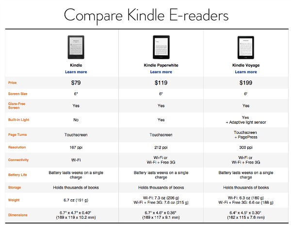
The Kindle is far and away my favorite piece of tech. I’m an avid reader and every time I sit down with my Kindle Pa perwhite the act of reading remains the same, but the experience of reading has been revolutionized. The improvements Amazon has continued adding to the Kindle line just keep making it better and better. Gone are the days of a physical keyboard (and resulting larger body or form factor). Gone are the days of seeking good lighting, as most models have a screen that lights up. And, most importantly, gone is the high price tag of the original models. While my first Kindle cost $300, the current low end, un-unlit model will run you $79, and that’s with a touch screen (my first kindle was all about the buttons). My current model, the Kindle Paperwhite, with a lit screen is $119. A great deal. While Amazon has consistently added features and reduced price over the years, their newest offering adds the features, but goes the other way with the price. It’s called the Kindle Voyage. So let’s see if all the additions make the higher price tag ($199) worth it.
It’s Easier To Hold
 First off the form factor has been changed for the Kindle Voyage. The previous two models had almost identical shapes. They had matte finish backs (and associated fingerprint issues) and rounded edges. The Kindle Voyage has the same matte finish, but it also has more angles, which makes holding the device a little easier. The new Kindle is also slightly smaller in width, height, and weight than the previous model. These improvements make it easier to use with one hand, and have longer reading sessions, without resorting to resting it on your lap, or table.
The other major change in the form of the Kindle is related to the raised edges on the old model. The old Kindle has a drop of a few millimeters from the plastic edge to the screen. The new Kindle is completely flush. I like this change a lot. It has a much better look (though that’s not a great reason to spend extra money), but the main reason I like the flat screen approach has to do with how it impacts the reading experience.
It’s Easier to Read 
The first way that the new Kindle improved the reading experience is the flat screen in relationship to new buttons on each side. The buttons are called “PagePress” in the marketing, and they bring back something from the older Kindles that people had complained about losing: the physical page turn buttons. Unlike the old models though, the PagePress buttons aren’t designed to “click” when pressed, like a standard button. Instead they are pressure buttons. So you can rest your thumb on the button and the page will not turn until you apply pressure. On my Kindle Paperwhite, when I want to turn a page, I lift my finger from the edge of the device and tap the right side of the screen (or use my other hand entirely). While that might seem minor, the action of moving to tap often causes my grip to change, and I end up resetting my hold on the device every page turn. With the new model, you don’t have to move your finger. I know, talk about a first world problem right!?!? But there you have it, no more finger exercises in page turning.
Beyond the new buttons, the Kindle has a another improvement that makes a better argument for upgrading than the page turning function, and that is “adaptive light”.
 The Kindle Voyage now has an “auto-brightness” feature that you’ll find on almost all smartphones. So the backlight in the device will adjust based on the lighting around you. If you enter a dark room the screen will brighten to the optimal brightness for reading (which isn’t the brightest setting, which would be too bright!). If you are outdoors and the sun is shining, again the screen will adjust, by actually going to full brightness to compensate for sun glare. This is a cool feature. While I have brightness control on my Kindle Paperwhite, I find I do adjust brightness a lot, and to have the device do that work for me would be a very nice feature.
The Whole Cup Summed Up
The Kindle Voyage is a big step up for the Kindle line of  eReaders. Unlike previous years, this model doesn’t just improve pixel density to make the screen appear more like real paper (though it does that too, by doubling the pixels on the screen over the previous model). The Kindle Voyage improves the form factor for easy one hand reading, and page turning. And it improves the reading experience via Auto Brightness.
The question that must be asked is whether those changes are worth $80, which is the price difference between the Voyage and the current Kindle Paperwhite. For me, while I like the changes that price difference seems to be a little too much. I can move my finger to turn pages, and I can adjust my own brightness. Others might find more value in those features though, and if so, the Kindle Voyage offers a great reading experience.
A Holiday Note: The basic Kindle is currently on sale for $59 and the Kindle Paperwhite is $99. No holiday deals on the Kindle Voyage, but the other Kindles are available for shipping prior to Christmas, so if you’re ready to get into the eReader game, now is the time. Happy eReading!!
For further review of the new Kindle Voyage, check out these links:
First Impressions – Echo Smart Speaker (from Amazon)
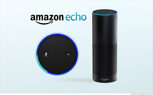
Amazon is usually not shy about releasing new products. Just opening up the home page of amazon.com will usually point you right at whatever new thing the company is pushing to the market. It’s the holiday season so the Kindle Fire tablets are front and center, which is not a surprise. But there’s a new device that Amazon is releasing very quietly. It’s a Bluetooth speaker called the Echo, and it’s like nothing you’ve seen before.
Thanks to a generous co-worker I am getting to test out this new device over the holiday season. Currently the speaker is only available via invitation (which you can request here). And it’s only for Amazon Prime members at the moment too, at the cost of $100 (it will be $200 when it releases to the general public). Based on my first couple of weeks with the Echo, I’ve already got my invitation request in! So what is the Echo exactly?
It’s a Bluetooth Speaker
There are tons of Bl uetooth speakers on the market; everything from the cheap things you can get at Wal-Mart or Target, to the higher end (while still consumer focused) devices like the Jambox from Jawbone. You can always drop a ton of coin on the offerings from Bose, but that’s not what the majority of casual music listeners are looking for in a Bluetooth speaker. The Bluetooth speaker I’ve had for a while is the Jam Wireless Speaker (which you can pick up for $30). It’s a decent speaker but it has to be charged, and has limited bluetooth range. So I’ve been pretty sour on Bluetooth speakers in general. But the Echo is a powered speaker (meaning it’s plugged into the wall all the time). So no issues with power drain. So far the Bluetooth range to my phone has been good too. No dropped connections at this point. But Echo is so much more than just a Bluetooth speaker.
It’s a Digital Assistant
Think Siri. Think Google Now. If you’re a Windows user, think Cortana. These are all digital assistants. They come in all high-end smartphones, standard these days, and in plenty of tablet computers as well. They are tools that connect you to the Internet, for news updates, weather reports, calendar appointments, Wikipedia searches, that sort of thing. I have an iPhone and rarely use Siri, but I do use Google Now quite a bit. Especially for those “what sushi bars are nearby” kind of questions. The Echo speaker has a digital assistant built into it, and her name is “Alexa”.
All you have to do is say the name “Alexa” and the speaker comes to life (via a spinning blue circle on the top) and begins listening for your questions. Simple things like “what time is it” and “ will it rain tomorrow” are child’s play for her. Using the WIFI element built into the speaker, Alexa can search Wikipedia with the best of them. Answering the question tech companies seems to always think we care the most about, you know it, “how tall is Mount Everest?” It’s really important that we all know this. And Alexa will make sure we stay informed. On that topic, you can ask “Alexa, give me my news update” and she will connect to either NPR or BBC radio to provide a quick news briefing just for you. There are some tailoring aspects that I haven’t had time to explore, but I’m excited to learn more!
With the Echo companion app installed on your smartphone or tablet, you can have Alexa save things to a “to do” list or a “shopping list”, just by saying “Alexa add milk to my shopping list”. That’s pretty handy. Now you don’t need to pick up a phone or tablet to have a digital assistant ready to take care of you. Alexa is still a bit of a beta device though, so she can’t answer everything, so be warned. “Alexa what movies are playing near me?” She hasn’t got a clue. But will gladly search BING for you.
One last note about music listening with the Echo. Prime members have access to “Prime Music” and that is the main resource Alexa uses when you ask for a genre or artist. Don’t be surprised that the selection is limited. Alexa can also search for any music you’ve purchased on amazon.com. The other two music resources, as of now, are “I Heart Radio” and “TuneIn Radio“. Both give you plenty of options for whatever genre of tunes you’re in the mood for.
It’s Always Listening
Here’s the coolest thing about the Echo speaker. There are microphones lining the top circle of the  device (where the pretty blue light shows up when active). And they are long-range mics, so even if you are across the room, the speaker can hear you and respond. “Alexa, play some Christmas music” and before you know it, chestnuts are roasting by that open fire! Do you want more volume, just say “Alexa volume up” or “Alexa volume 5”. Beware of going over Volume 7 though. I made the mistake of saying volume 10 to her (the highest setting) and the music was so loud the mics couldn’t hear me. Pretty funny scene though as I shouted for Alexa to turn the music down. Volume can be controlled via an included remote control too, but you won’t want to use it.
The Whole Cup Summed Up
 The Echo Smart speaker has a ton of potential. Tech writers are already speculating about what this new technology could mean for the future of home tech. Imagine coming home and saying “Alexa lights on and play some 80s hair bands” and it’s done (though darker lights might be a better choice if you’re planning to jam to Motley Crue). The possibilities go beyond lighting and sweet tunes though. Digital Assistants could control your thermostat (like the Nest does now), unlock your doors, open your garage, start your oven, or brew your morning coffee. We are only limited by our imagination! And Echo, along with Alexa is the first step into a pretty cool world.
To get an idea of what this device can do, check out Amazon’s official commercial here.
And for a slightly more “colorful” commercial, check out this parody.
First Impressions: iPhone 6 – It’s Pretty Awesome!

I’ll admit it right out of the gate, I love this phone. It’s simply awesome. And now I sound like the typical Apple fanboy who can see the iPhone do no wrong. But that’s not the case. I love (and hate) Apple and Android both equally. I’ve had both devices over the years. I just switched to the iPhone 6 from the HTC One (M8) which was an excellent Android smartphone. In my opinion, the iPhone 6 is simply better; and this is especially true for the casual user. And that’s who I’m most interested in.
Disclaimer: Many of the items I will discuss here are also available on the iPhone 6 Plus, which I’ve reviewed previously. I intentionally focused on what makes the “plus” different from the iPhone 6, as not to be too repetitive. So if you like what you see here, but would like the larger 5.5 inch screen, the iPhone 6 Plus might be a better choice. But read my review before dropping the coin!
iPhone 6 
It seems like Apple has always been mired in one debate: is the company revolutionary or evolutionary? Apple fans believe that their beloved company is truly revolutionary, creating new markets for products out of thin air (iPhone, iPad, iTunes). Others, mostly Android fans, would argue that Apple doesn’t “innovate” but is rather copying already existing technology while, arguably, evolving the devices along the way (iPhone, iPad, iTunes – see what I did there?). As a true tech junkie, I don’t have a horse in that race. Apple is both in my mind. And the rest is just marketing (which no one disputes they do better than anyone else). For the sake of this review, I will side with evolution, because that’s really what the iPhone 6 is all about.
The Cup Half Full
I’ve mentioned the amazing design in previous posts, but it can’t be overstated. The difference between the iPhone 5/5S and the iPhone 6 is stunning. And the most stunning is that it isn’t as revolutionary as it could have been. All sorts of “mock-ups” flooded the internet leading up to the announcement of the iPhone 6. Many showed a major departure from the previous model; truly revolutionary design. Apple didn’t go that way. And for a company dominating the US Market with millions of consumers using their devices, major shifts are usually not advisable. The iPhone 6 is bigger but skinnier. It has the same alumimum/glass construction, but the glass is rounded on the corner, giving the face of the phone an entirely different look and feel. So first and foremost the iPhone 6 is a brilliant evolution of the design of the iPhone. It fits perfectly in the hand. I have bigger hands, and always felt the iPhone 5/5S was actually a little too small for me. I think there’s a reason Ap ple went with 4.7 inches for the screen versus 5.0, and it’s all about how that device sits in your hand for one-hand use.
In addition to the form factor, the iPhone 6 has many new features coming with iOS 8. The inclusion of Near Field Communication (NFC) partnered with Apple Pay will only prove useful if retailers adopt the program. I, for one, like the idea of using my phone to make purchases. And if you are concerned about security, I suggest checking out this link to see how Apple Pay works, because if anything this system would be more secure than our traditional swiping credit cards (assuming it works).

iOS 8 also allows you to respond to text messages and emails directly from the notification as they come in (I just did this while writing this review). It’s all about fast interactions with your phone. The iMessage app has also been updated to allow for voice messaging with a single button push, and instant pictures and videos sent over iMessage. I’m in favor of anything that makes my tech interactions faster. While I love interacting with technology, I prefer to use time efficiently, and clicking through six screen when it could be one tap is a great evolution in speedy tech. Third party keyboards are now also available (via the App Store). If you’ve longed for the ability to swipe your words versus tap them, now you’ve got options. Swiftkey and Swype are two good places to start for keyboards.
The Cup Half Empty
Apple is a closed system, famously so. Coming from Android this time around there are things I can no longer do that I liked doing on my HTC phone. I’ve sung the praises of “launchers” that replace the Operating System with different hybrids. Nothing of the sort will be found in the App Store, no matter how deep you dig. You get the grid. Apple did allow for widgets in the Notification Screen, but widgets are easily the most confusing piece of the Android system, and so Apple has hidden them away to keep distractions from their clean ecosystems to a minimum.
HealthKit was supposed to revolutionize how we see mobile health, and it failed on the first day. Apple is quickly putting out new updates to iOS 8 to rectify this problem, but it’s still a problem. So if you planned to have the iPhone 6 be your one stop shop for fitness and health tracking, you’re gonna have to wait a bit longer. Though the pedometer element is currently working (my phone is tracking my steps just like my old FitBit Flex).
The Whole Cup Summed Up
I’m sure as my eyes come back into focus in the coming weeks after being star-struck by the iPhone 6, I will find more things to add to my “half empty” part of the cup. But at the moment there’s not a lot I can say that’s negative about this phone. It’s better than all of the current flagship Android devices. Granted, it’s only in that spot because they took many features straight from the Android ecosystem and added them as “innovations” to the iPhone (What’s App has had all of the functions of the new iMessage for some time now).
If you’re debating between the iPhone 6 and the iPhone 6 Plus, head to your nearest retailer (Target, Best Buy, Walmart, Cellular Carriers) and get both devices in your hand. I’m on the side that says the iPhone 6 Plus is simply too big for the casual tech consumer. But you’ll have to be the judge for yourself.
First Impressions: iPhone 6 Plus

The newest iPhone is out and people are clamoring to get their hands on it. The fact that Apple sold over 10 million units in the first weekend seems to indicate at least some level of consumer interest. If you google iPhone 6 you will find no shortage of reviews about Apple’s newest phone offering. You’ll see things about design and durability. But, like many tech sites, many of these reviews can become quite technical. What you’ll find here are my first impressions of the iPhone 6 Plus, and how I think it can make life easier, or harder, as the case may be.
iPhone 6 Plus – Disclaimer
The iPhone 6 Plus is BIG. I’m saying that from the perspective of a guy who used a 5 inch HTC One (M8) for a period of time, and thought that was big. If you are at all leery about having a huge phone, read no further, the iPhone 6 (with it’s 4.7 inch screen) is your best choice. But if you are okay with a phone that won’t fit in your pocket (unless you bend it!) and a phone that will constantly require a second hand to use it efficiently, read on.
The Cup Half Full
So how does the iPhone 6 Plus make the phone experience better? First off is the design. Compared to the Note4 or LG G3 (two competing phablets), the iPhone 6 Plus is a beauty. It’s super thin. It’s smooth aluminum back and rounded corners are an absolute delight to look at and it feels great in the hand (though I recommend a case to avoid it slipping out of your hand, here’s mine). The long held design of the screen (with an app bar at the bottom, and stat information at the top) make much better use of the space compared to rivals, which only makes the screen seem larger and more useful.
The phone has a larger battery, which should allow for much longer periods between charges. Only time will tell though. The device also has an improved camera with image stabilization. This could be a big deal. In simplest terms, the camera in the iPhone 6 Plus is designed to help those of us with shaky hands. Not a feature to underestimate. Finally, the iPhone 6 Plus has some innovations in the way the screen works, taking full advantage of the larger screen. This means that some apps (like email and messages) will actually look different than the apps on the smaller iPhone 6. Also when the phone is in landscape mode, the “app drawer” will move from the bottom to the side. Seems funny to me that the iPad Mini doesn’t even do that. So there are no shortage of good things going on with the iPhone 6 Plus, but the pendulum still swings both ways, and this is where the device starts to worry me.
The Cup Half Empty
While beautiful in design, the iPhone 6 Plus has one “big” problem. This device is huge. But here’s the trick; it’s supposed to be. It’s a phablet, which is the horrid word somebody came up with to describe a device that is part Phone and part Tablet. When the phablet device came into it’s own with the Samsung Galaxy Note, the device had a very specific purpose. It was a device competing more with the 7 inch tablets than against 5 inch phones. It was and is a device for “power users”. You know the corporate types that used to live in their blackberry screens. The phablet is trying to be more than a phone. In terms of regular consumers, the phablet is a good choice if you don’t already own a tablet device (iPad, Nexus 7, etc.) If you don’t want two devices, the phablet bridges the gap (which is even more relevant when cost is factored in). And that’s what the iPhone 6 Plus is. It’s a phablet. But I worry that through a combination of factors, both on the part of Apple and consumers, people don’t realize this. And that could be a problem down the road. I’ll explain.
By  launching both iPhones together, Apple made it look like they were selling two sizes of the same device. When in fact they are selling the next iPhone (iPhone 6) and their first phablet (iPhone 6 Plus). People jumping from the 3.5 inch screen of the iPhone 4/4S or the 4 inch screen of the iPhone 5/5S are in for serious culture shock when they try to wrap their hands around the case holding the massive 5.5 inch screen of the iPhone 6 Plus. I believe that Apple set the precedent a year ago when they released the iPhone 5S and iPhone 5C at the same time. The iPhone 5C was clearly the silver medal to the gold of the iPhone 5S. So most people think the same is the case with the current generation of the iPhones. That reasoning would lead people to conclude the iPhone 6 Plus is the one to get if you want the “best” one. And that’s why the backorders for the larger device stand at 3-4 weeks, where you can get your hands on the iPhone 6 in 7-10 days. And after waiting all those agonizing weeks, these new iPhone 6 Plus users are going to realize that their new phone requires two hands for most of the things it can do. And while we might think that’s a small thing, that’s probably because we’ve grown so accustomed to single handed cell phones we take that convenience for granted.
 Both iPhone 6 models have a new feature to help address the increased screen size, and it’s called Reachability. Basically you double TAP (not click) the home button and the screen lowers itself about 1.5 inches, bringing the top of the screen closer to your waiting thumb. On the iPhone 6 this functionality works very well. But based on my hands-on experiences with the iPhone 6 Plus, based on where we generally place our hand when holding the phone, the size makes it virtually impossible to reach either the home button (for the tapping) or the top of the screen (to pull down notifications). You must either move your hand down or up, or use your other hand to tap the home button. And that is a problem that “reachability” on the iPhone 6 Plus didn’t fix.
The Whole Cup Summed Up
So think carefully as you consider the iPhone 6 Plus, over the iPhone 6. While you get increased batter life, a better camera, and a larger screen, you also must contend with a massive phone in your pockets and in your hands. That’s my biggest beef with the iPhone 6 Plus. It’s so much like the iPhone 6, just much much bigger.
Apple has designed a beautiful phone, no doubt, but I believe the 4.7 inch design of the iPhone 6 is the current sweet spot as far as comfort and usability. But if you want the larger screen, the iPhone 6 Plus certainly has enough to offer to make it worth it. Though one of these thumb extenders might come in handy…

First Impressions – Amazon Fire TV
After much debate I finally gave in a week ago and got a Fire TV from Amazon. This is the first media streamer offered by the company. Being that I have used almost every media streamer on the market, I was highly skeptical of Amazon’s entry into an already packed field. A few unique features had piqued my interest, but it was still a $100 streamer, and that’s not a price point that I personally consider an impulse buy. It was the gaming feature that I was most interested in, and when I read on the tech blogs that you could use a USB Xbox 360 controller (which I happen to have) instead of buying the $40 amazon controller, I took the plunge.

The Cup Half Full
Like all things Amazon, the setup is a breeze. Frankly, I’d be surprise if someone could mess up the process. You just plug in the HDMI to your TV, and then turn on the power. I quickly discovered that you are immediately greeted by a non-optional tutorial video. After that you are up and running.
If you own a Kindle Fire tablet, all of your apps that are compatible with Fire TV will be there. And adding new ones is super easy. There are plenty of free channels, including several free games to let you test out the device.
Almost all of the major content providers are represented: Netflix and Hulu chief among them. Of course Amazon has their videos (both Prime and Purchase) front and center. The remote has a well publicized “voice search” option, which works well, but only with Amazon content. Interestingly, I did a voice search for a game I knew was in the store (because it was well reviewed on a website) and the search couldn’t find it. So there’s that.
Finally, the gaming experience has exceeded my expectations. Bear in mind I am not a hard core gamer by any stretch. I prefer Mario over Halo. I liked a few of the games I was playing, “Dream Flight” being the one I spent the most time playing (and it cost me a whole dollar!). Then I plugged in my USB controller and loaded up “Asphalt 8”, which is a car racing game. And I was blown away. The graphics are on par with the original Xbox, and the game play is easy. And the game is a blast. And it’s free! You get to play a few courses before you start needing to either win races to get money or pull out your credit card. I can see myself really getting into this game. And for this reason alone, I’m happy I made this purchase. But I’m not happy with everything.

The Cup Half Empty
Netflix is a rental company, they always have been. Their goal is to get your monthly dues and then that’s it. No strings. Amazon is an entirely different beast, and it’s nowhere more evident than on the screens of the Fire TV. Amazon wants you to buy things. On the Fire TV they are mainly peddling movies and TV shows. I would imagine that as their Prime Music service is developed, that service will follow a similar path. And that is my first beef with the Fire TV. When you use the very cool voice search option, you will get content but you won’t know off the bat if content is Prime (meaning free with membership) or if you’re going to need to drop some coin to get to watch it. That really frustrates me. I rent my fair share of movies on Amazon. I’m not opposed to that aspect of the company being the replacement for Blockbuster Video. But when I want to browse the “free” stuff, they are not making it as easy as it should be. And certainly not making it as easy as Netflix and Hulu make it. But Amazon is a content seller, not a rental service provider. That’s why Prime Videos and Prime Music still feel like a perk to the service versus a fully fleshed out service standing on it’s own against it’s competitors.
My other issue with the Fire TV is the User Interface (UI). Basically, that’s the screens that you browse through. The structure of the screens is not as smooth as the UI on Roku or Apple TV. And, again, they are constantly steering you towards Purchase/Rental Content, which just makes it feel like you have a salesperson in your living room trying to constantly make you buy things. They don’t need to push so hard, in my mind.
The Whole Cup Summed Up
The Fire TV is most definitely a first generation device. Since I’m usually an early adopter for tech toys, I was prepared for that going in. The first Fire tablet was replaced by the infinitely improved Fire HD and HDX tablet lines, and I’m certain that is what will happen with the Fire TV (assuming they are selling enough units to keep the line going). The next generation will have an improved UI. I’m not sure if they will ever make the Prime stuff separate from the rest, but there are still plenty of things they can do to make browsing content a better experience.
The strongest thing the Fire TV has going for it, which also seems to be the thing they are pushing the least, are the games. At $99 it is easily the cheapest gaming system you can play on your TV with a traditional controller (except for a couple Kickstarter systems perhaps). The support for USB controllers is nice, and 3rd party companies will certainly make Bluetooth controllers below the $40 price point for Amazon’s branded device. And that is something that Roku has only tried casually, and Apple TV hasn’t tried at all. But we will probably have to wait for the Fire TV 2 to see the improvements that will make this device a must own for the casual gaming, and casual media watching crowd.

This post will be updated when I have used the device long enough to give a more detailed review.
