Blog Archives
Charitech – One Today (App of Note)

I love technology and I strive to be charitable, as much as I am able. As a tech geek I use technology to make philanthropy easier. These are my tips and tricks. I call it Charitech.

Last Summer, when I started focusing a lot of energy on philanthropy, I was quickly overwhelmed by the daunting task of charity. It’s so easy to see the great needs and want to run in the opposite direction. Sadly, that seems like a natural reaction. So my first goal was finding ways to make charity more accessible and less scary. One of the first apps I found is called “One Today“.
 “One Today” is a Google product. For some that’s a great thing, for others that might be a reason to run for the hills! But I would recommend checking it out, regardless of your attitude towards the great search engine giant. “One Today” is a great way to do charity in small ways. And it’s as simple as the touch of a button.
When you first download the app, you are asked to select areas of interest that you would like to contribute funds towards. I chose: Food, Health, Housing, Civil Rights & Liberties, and Poverty. From there the application provides a variety of charities to choose from for donations. And all you’re being asked to contribute is one dollar. Yep, just a buck. That is something I could manage.
The very first charity I gave to really opened my eyes to poverty. The  charity is called “Rescuing Leftover Cuisine“. This charity “brings excess food from restaurants, catering companies, and institutions to local agencies, such as homeless shelters”, in 12 different cities in the United States. The app provides additional information about the charity and the need. For this charity they point out that while “40 % of food produced is wasted, while 1 in 7 Americans face food insecurity”. I was shocked that such a charity was needed in the United States. In a nation of such great wealth, I couldn’t believe it. But those are the numbers, and it makes sense, when you think on it a bit.
So what does your ONE DOLLAR get? Again, according to the app, $1 means 42 meals for the hungry. 42 MEALS!!! That was another shocker, and it was a simple choice to push the blue button in the lower right corner and contribute one dollar. Maybe I even dug deep and gave $2 that time and BOOM!! 84 meals for the hungry. It’s so small, and so big at the same time.
 I love how this app makes small acts of charity accessible. My daughter and I created an idea back in the Autumn of 2015. It’s called “Penny for the fountain, Dollar for the Poor“. Whenever she comes upon a fountain that she wants to toss a penny into, we open “One Today” and find a charity to give one dollar to. We talk about the charity options, and press that magic button. Then she tosses her coin in the fountain. That’s everything I hoped to accomplish with my other blog “Developing Charity” in a nutshell. Adding a little charity to an action that was going to happen anyway. My daughter is a big believer in the power of wishing wells! 🙂
So consider downloading this app, and giving it a go. It won’t take much time, it won’t take much money, but a little can add up to a lot.
Download the app here: iOS and Android
And check out more information on charities at www.developingcharity.net
#practicecharity
Charitech – Where Charity Meets Technology

Last August I had a moment. One of those moments that forever changes your trajectory. That moment came from my experience with a story about a displaced Palestinian man, who fled Syria to Lebenon with his two kids. He made a living selling pens on the street. The amazing element is that a picture of the man spawned a kickstarter style campaign, raising over $250K for him and his family! The story of such giving floored me. And looking at myself in the mirror, I knew I that I wasn’t doing enough. Why? Because I wasn’t DOING ANYTHING! I talk a good talk, but that was it. So at that moment I decided to change. I launched a new blog (www.developingcharity.net). And I started an effort I called “Project 520” where I would donate $10 to a different charity every week of the next year ($10 X 52 weeks = $520). And I’m just wrapping up my 10th week. And it’s been great so far. But I wanted to find a way to connect my love of technology with my newfound charitable efforts. And that’s what “Charitech” is all about.
Charitech – How technology tools can enhance the process of personal philanthropy (in big and little ways)
I’ve long held that technology needs to enhance our lives. That’s the essential element. I have found tech tools that enhance my experiences with charity, and I plan to highlight a couple of them in “Apps of Note” in the coming weeks and months. But let me introduce you to one tool that is well worth your time. It is called “Charity Navigator” and it is availalbe as an app (iOS and Android) and a website. If you are a skeptic when it comes to charities. If you wonder, “where does my donation actually go?” or “how much of my donation goes to administration and fundraising?” This app will help you. This app can give you a wealth of information in an easy to digest package. So let’s break it down with a simple “App of Note” review.
Charity Navigator

In the simplest terms, Charity Navigator is a repository of sorts, gathering up data on a vast array of charities from around the country and around the globe. With a simple “search” function, you can lock in on a specific charity and look at the basic metrics of their philanthropic efforts. A quick search for one of my favorite charities, “water.org”, shows a 4 star rating, and a score of 95.38 out of 100. These numbers are arrived at through an analysis of both the financial responsiblity of the charity, as well as accountability and transparency. The main page of the search shows the address and phone number of the charity, and lists the board leadership, CEO, and mission statement. All important information to have public, ensuring that your chosen charity is on the up and up.
A slide to the right reveals the next feature of the app, “metrics”. Two pie charts are shown, the first a breakdown of where contributions come from (contributions, gifts, grants = good), and the second charts shows how the expenses break down (the larger percentage going to “program” the better). For my chosen charity, 99.2% of their funds come from “contributions, gifts, and grants” and 73.4% of their expenses go to program. That’s not too shabby. Though I have seen charities with over 90% going to program. It’s just important to remember that the
larger the charity is, the more money is probably being donated, and there will be corresponding overhead, in terms of the people needed to manage those funds efficiently. Which is what leads to the final section.
![IMG_0548[3]](https://twolumpsoftech.com/wp-content/uploads/2015/11/img_05483.png)
![IMG_0549[1]](https://twolumpsoftech.com/wp-content/uploads/2015/11/img_05491.png)
 Sliding the screen down from the two pie charts you are greeted with a vast array of data. Revenue vs Expenses in bar chart. Full breakdown of expenses. A checklist of accountability and transparency including things like “audited by independant accountant”, “independant voting board members”, and “CEO listed with salary”. The more check marks, the stronger the charity. Finally you’ll come to the money. Actual totals of revenue and expenses. Here’s where you find out if a large adminstration cost is justified. Water.org has annual contributions of over 15 million dollars. So I can understand why they would need people to manage those funds, and ensure proper distribution to the people who need the services the charity provides (in this case, clean water to third world countries mostly).
The Whole Cup Summed Up
Charity Navigator is a tool in the arsenal of anyone interested in becoming engaged in philanthropy. I agree when the skeptics say you need to know where your money is actually going. Where I break with the skeptics is the next step. Many people use the bad charities as an excuse to do nothing. If there are charities mis-using donations then all charities are bad. I guess that’s the logic. But with tools like Charity Navigator, we don’t have that excuse. This tool helps anyone become educated in intelligent giving. You can know with a reasonable amount of certainty that you are indeed giving to a good cause by using these tools. And I highly recommend checking the app out.
Charitech – Where Charity meets Technology
 This is just the first tool I’m sharing on Two Lumps of Tech. I have others. I have a whole folder on my iPad and iPhone filled with such tools. Giving isn’t hard, once you do it. It’s that first step. That first buck or $10 in my case. And once you have your tools straight, once you have your plan of attack, then it’s easy. And it feels good to do it. Because now your technology is not only helping you, it is helping others. And that brings our gadgets to a whole new level.
Remember – Something is Better than Nothing.
#practicecharity
Upgrade Time!! Two Lumps of Smartphone Advice

We are officially in upgrade season! I am well aware of the daunting task of sorting through all of the different options for smartphones. There are just so many players in the game it can get overwhelming quickly.
What follows is a simple breakdown of my TOP FIVE favorites phones. I’m including a few links to other reviews for each phone, to give you a well-rounded opinion of each device. To keep things simple here, I’m focusing on a few key features of each phone, which I’ve found to be important to the majority of consumers, from the tech-savvy to the casual user. So here we go!
Disclaimer #1: This list is not in order of preference. I’m not awarding medals here, just giving a shorter list than you’ll find with the carriers.
Disclaimer #2: I’m sticking strictly with the high-end smartphones. If you are upgrading, you can usually get a good deal regarding up-front cost, and the monthly cost will be consistent to what you’re used to. As a general rule, upgrading at least every two years is the best way to make sure you have a smooth experience with your phone. Things just change too quickly! If you want to stick with a Mid-Tier phone, definitely try to get your hands on the MOTO G, which is an amazing phone for $180!
On with the list:
Moto X (2nd or 3rd generation)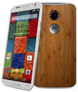
Motorola has been making great phones for the past three years, with the “Moto X” line. These phones are defined by high
quality build, simple operating system, and small physical size (when compared to the actual screen size). The 3rd Gen Moto X was just announced in August. This phone is HUGE. 5.7 inches makes it a “phablet” and those who want the smaller handset should steer clear. The 2nd generation is still a very good phone, and smaller, so you’ve got options. The 3rd Gen Moto X did vastly improve the camera though, so if that’s important, bear it in mind (though it still is not as good as Samsung and iPhone).
Moto X (3rd Gen) Review – Mobile Tech
Moto X (2nd Gen) Review – Engadget
iPhone 6S/iPhone 6S Plus
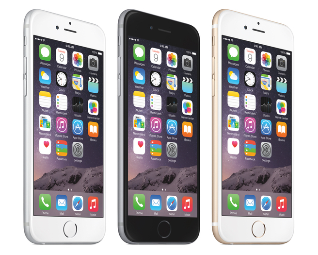 I had the iPhone 6 for a while, and I thought it was a perfect phone. Great size (4.7 inch screen). Great camera. Decent battery life. If you like Apple, the iPhone 6 is a great choice. I am currently using an iPhone 6 Plus, but that 5.5 inch screen is just too big for me! Apple announced their new iPhones on September 9th. As with all “S” models, the form factor has not changed. This phone looks the same as the previous models. They have vastly improved the camera with 12MP, and optical image stabilization (helps shaky hands take clear pics). They’ve added a 5MP front camera, and are using the screen itself to make a “flash” for selfies. the screen itself has been improved with the use of “3D Touch” which makes it so you can do different things when you press the screen versus just tap the screen (this tech is based on the Apple Watch screen). Overall it’s a good “off-year” for the iPhone, but if you want major changes, wait another year for iPhone 7.
iPhone 6S Plus Review – Tech Radar
Samsung Galaxy S6/Galaxy S6 Edge/Galaxy S6 Edge Plus
This has been my primary phone for the past six months. Samsung made a beautiful phone with the Galaxy S6. Metal and glass construction, it feels incredibly similar to the iPhone (almost too similar). With a 5.1 screen, it’s big but not too big. The operating system is intuitive, and camera is great. I particularly like the “wide-screen selfie” feature and that you can snap a photo by tapping the flash on the back of the phone (less cumbersome than finding the button on the screen. The Samsung Galaxy S6 also offers turbo charge (15min gets you 40% battery) and wireless charging, which is pretty cool. If you aren’t into Apple, the Galaxy S6 is definitely the way to go at the moment.
If you want something different, Samsung is also offering the Galaxy S6 Edge, which has curved edges. My experience with that device proved to me that the edges look cool but offer little in enhancement, and only make it harder to hold. If you want something really big, the Samsung Galaxy S6 Edge PLUS just release, with a 5.5 screen size. Again it looks really cool, but for me is a pain to use, especially with the huge size.
Samsung Galaxy S6 Review – CNET
Samsung Galaxy S6 Edge Review – Digital Trends
Samsung Galaxy S6 Edge + Review – Phandroid
LG G4
 I hated the LG G3, so I wasn’t even going to include it, but a buddy let me play around with the G4 the other week, and my opinion suddenly changed. The LG G4 is a very different type of phone. It features a 5.5 inch screen, but the phone size is pretty small, all things considered. LG definitely took a card out of Motorola’s deck, in terms of making sure big screens doesn’t mean gigantic phones. The LG G4 features a leather back, in varying textures and colors. It feels great! The other odd thing about LG is that they moved the power and volume buttons to the back of the phone. It seems like an odd choice, but I am starting to see the logic of it, and it makes those edges super thin. All they need is a fingerprint scanner on the back, but that’s not here yet (maybe G5 next year!)
HTC One (M9) and (M8)
Finally we come to HTC. I used the HTC One (M8) for six months last year (that’s pretty much the longest I use a device). I loved the feel of the phone (all metal). The screen was brilliantly bright, and the device was lightning fast. But my big beef was related to the extra space used for the company logo on the front (my opinions can be seen here). You’d think they’d finally fix that with the M9, but that was not the case.
The HTC One (M9) is a minor improvement over the previous model. The camera was switched from 4 ultra pixels (which no one ever understood, including me), to 16 mega pixels. But lots of pixels doesn’t mean a better camera, and HTC has lost it’s way a bit here. Still, when compared to ANY mid-tier smartphone the HTC One (M9) and (M8) are heads are shoulders above in terms of picture quality. So as I knock on the camera, it still has a place among these top-tier phones. The HTC One (M9) also updated their operating system to adapt based on your current location. This functionality can be achieved through “launcher applications” like “Everything Me“, but HTC has it built it, which is actually a pretty cool thing. I imagine other smartphone makers will be looking at options like this in future models.
HTC One (M8) Review – Engadget
 A Note on Phablets
Oh those giant smartphones!! The line between phone and phablet is roughly 5.5 inches. You have a few options. We’ve already talked about the iPhone 6S Plus, Galaxy S6 Edge Plus, and LG G4. Another popular phablet worth considering, if you’re in the market for a big phone is the recently release Galaxy Note 5. They took the materials that built the Galaxy S6 line of phones (metal and glass) and blasted it to 5.7 inches. As always with the Note line, there is a stylus. This time around they have focused as much on the stylus as the phone, and my experience with it was great. In my opinion, any phone over 5.5 inches should have a stylus, so Samsung is leading the pack there.
Samsung Galaxy Note 5 Review – The Verge
The Whole Cup Summed Up
If you’re in the market for a new smartphone, you’ve got tons of options. Hopefully this list is helpful in sorting through what makes these high-tier models different from each other. In the end, there’s no right answer for everyone. Some live and die for iPhone; while others believe Android is the only way to go. Some say 5.5 inch Phablets are ridiculously large, but at the same time, I know many people who wouldn’t want any other size. So head to your nearest carrier and get these phones in your hands before you drop the coin, and I’m sure you’ll find something that works great for you!
Happy Smartphone Shopping!

First Impressions – Samsung Galaxy S6 and Galaxy Edge
 If you aren’t a tech geek like me you probably had no idea that an annual conference is held ever year in Barcelona, Spain. And at this conference many tech companies roll out their new gadgets. Well that event is called the Mobile World Congress (MWC), and it started March 1st. Two major smartphone companies announced devices on the first day: Sasmung and HTC. Today we’ll look at the new Samsung phones, the Galaxy S6 and Galaxy Edge. We’ll focus on the S6 model, as the Edge is pretty much the same phone with the addition of having a screen that wraps around, you guessed it, the edge!
The Design
 Samsung has long been known for putting out high-end phones in cheap looking cases. The tendancy to focus on plastic has been the chief argument by their competitors that they are not good phones. The Galaxy S5 last year found itself in those cross-hairs like never before because while the software was pumped up with new features (fingerprint ID, heart rate monitor, improved camera), the hardware itself still felt cheap; pic below – S6 (left) S5 (right). The tech industry knew that Samsung had to change that approach with the Galaxy S6 and they did exactly that.
 One review I read called the S6 the “love child of the iPhone 4 and the iPhone 6” and that’s pretty accurate. The phone is now entirely metal and glass. The metal edges look almost identical to the iPhone 6, and the glass back harkens back to the iPhone 4 and 4S. Though Samsung is using much stronger glass, so the scratching issues that plagued those iPhones should be avoided. This phone looks great! It looks like the high-end phone that this line has always been. Does it s
 till look a lot like the previous models? Yep. The dimensions are even the same as the S5. The camera is the same (with improved optics). The three buttons at the bottom (including those two that disappear when not in use) are still there. But it’s an improvement, no doubt. It’s evolutionary, not revolutionary, but after 4 models that looked virtually the same (little bigger each time), I think evolutionary is good enough for this year. Let’s briefly breakdown what the new features are and what features are gone for good.
What’s New
 Fingerprint Access
Last year to use this feature you had to swipe your finger/thumb across the home button (making it useless, based on my experience with it). Now it works just like the iPhone button. Rest your finger on the button and you are unlocked. The fingerprint will also pair for payments using Samsung Pay.
Improved Screen and Speaker
The screen is brighter and the speaker is louder. Since the phone size didn’t change, those updates should be pretty noticable.
I mproved Cameras
While the 16MP back camera is the same, they’ve added “optical image stabilization” which means your pics will look better, as it helps handle shaky shots (the iPhone 6 Plus uses this tech as well). The forward facing camera is now 5MP, which means those selfies will be crystal clear! You also can access the camera much quicker, with a double tap of the home button (they say less than a second).

Battery Charging – This one is a mixed bag for hardcore Samsung users. The battery is no longer replaceable (like most high-end phones these days), but they’ve added tech to the device that makes charging lightening fast (10 minutes of charge gets you 4 hours of battery!). They’ve also made it possible for wireless charging with any of the many charging mats on the market.
What’s Gone
Replaceable Battery
While this means extra batteries are a thing of the past, you do get a slimmer phone in the process. And rapid charge is a huge move forward, making all those extra batteries rather redundant.
 SD Card Slot
No more expandable memory for the Galaxy S Line. Samsung has adjusted the memory tiers from 16/32/64 to 32/64/128 (those would be Gigabytes). Most people would have to try and use 32 GB unless they are loading lots of videos or never cleaning out their camera roll. This is just another example of the movement towards cloud storage.
Waterproofing
The S5 was one of the  few high-end smartphones that was waterproof (meaning you could drop it in the toilet). That no longer is the case. So either get a LifeProof case for the phone, or be more careful when you’re at the beach this summer (not to mention those pesky toilets!)
The Edge – it’s trying really hard to be super cool
T he other phone Samsung introduced this week is the Galaxy Edge. Last year the Note Edge was released, which featured a third screen along the edge of the right side of the phablet. Now the edge is on both sides, but it doesn’t act like a third screen. It just stretches the screen over the side. There is still a “clock mode” so you can see the time on the phone’s edge when it’s laid flat. The Edge definitely looks cool. Its guts are no different from the Galaxy S6 though, so we’ll have to see how pricing works out, and if the “cool factor” is worth the cost.
The Whole Cup Summed Up 
I like the Samsung Galaxy S6 and Galaxy Edge. Samsung has always made decent phones that came in cheap packages. It’s great that the argument about the hardware can be put to rest (of course the lawsuits from Apple might start a whole new argument). Now you have some clear choices regarding SOFTWARE. Do you like Android or Apple? Do you like the interface that Samsung puts on top of the Android system (it’s called TouchWiz)? Do you like the grid design of Apple’s iOS 8? It’s really all about preference. All of these phones are premium hardware. Metal and Glass. They have similar cameras (though Apple remains the king for the moment at least there). They do the same things. They play the same games. Support the same apps. So head to the store when these phones come out and get them in your hands, and see what you think. I tend to jump between Apple and Android every six months (thank you T-Mobile Jump program). I love the iPhone 6. I think it’s the perfect phone, in terms of size, and functionality. But the S6 has me tempted. If it’s not too expensive the Galaxy Edge has me tempted too. But I have till May to sort it out. If you want either Samsung smartphone, your first chance will be April 10th.
Who knew that Samsung and Apple were cousins all along!?!
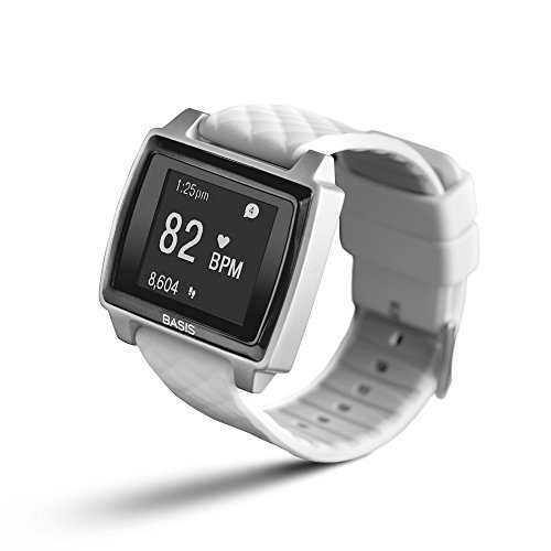
Review – Basis Peak Fitness Watch

I have reached the end of my two week testing of the Basis Peak Fitness Watch. If you haven’t caught up with my “first impressions” review, click here first for a breakdown of the features of this device.
The Basis Peak has definitely lived up to its category as a fitness watch. It’s much more than a typical fitness band, which generally counts your steps, calories, and maybe flights of stairs. A few fitness bands are starting to show actual clocks and collect or display heart rate data. I fall in the camp that says for a fitness band to be considered a watch it needs to look like a watch. Maybe I’m old-school. But I’ve asked around and that seems to be the general consensus. If it looks like a watch, it’s a watch. And the Basis Peak certainly looks like a watch. But it’s not a smartwatch, not by a long shot.
It is the current expectation in the tech industry that even the most basic smartwatch must do several things, and do them consistently well.
- Show incoming calls and allow answer or decline from the watch (then you grab your phone to actually start talking if you selected “answer”)
- Show incoming emails and texts from multiple text/IM services
- Show Calendar appointments with alerts sent to the wrist
That’s it. Those three things are not optional any longer. The smartwatch that I usually wear is the original Pebble, and it is arguably one of the most basic smartwatches, but it does those three things consistently. It also has apps for timers, weather, Evernote, and games. You can even track your Domino’s pizza order with it! Being that the Basis Peak costs TWICE AS MUCH you would expect that it would have similar “smartwatch” features. And while the device makes an attempt, it simply isn’t there yet. I found the watch could consistently receive incoming calls and texts, but nothing else. And this was only when paired to an iPhone. It was all but impossible to pair the watch with an Android phone during my tests. I made it work eventually, but for casual users, who want a “pair and go” approach for their device, this is not an ideal choice.
So if the Peak is not a Smartwatch, you might be wondering what it does to justify its $200 price tag? Simply put, it tracks your health metrics, and a lot of them. Steps are caught like any pedometer (no mileage calculated though). The device has an excellent heart rate monitor, which I found very useful. It also has sensor to detect perspiration and skin temperature. I guess I could see some value in the sweat sensor, but I live in Minnesota, and my skin temps are going to swing wildly just by moving between buildings and vehicles, so I’m not sure why I should care about that. Data is only good if you can do something with it. And that brings me to the last feature of the Peak Fitness watch that I found useful.
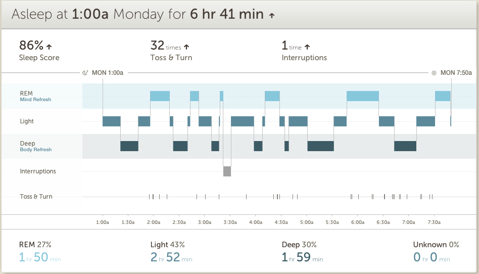 Most fitnessbands/smartwatches make some attempt to track sleep, but the Peak does this better than any other device I’ve used. Being able to look at my sleep metrics, which were broken down between Light, Deep, and REM sleep was helpful not only in determining if I was getting enough sleep, but whether I was getting the right amount of each type of sleep. I found myself trying to get to bed earlier to get more quality in my sleep, and that turns a gimmick into a tool.
 Aside from the features on the watch itself, Basis offers a website and smartphone app. I found the website more useful than the app in general, having more real estate to show the data over time in effective ways. The company offers various “goals” to shoot for, but since there is little interaction with the watch itself, other than telling you when you’ve “met your goal”, I found that more gimmicky than useful. In the end I found tracking over time less important than tracking right in the moment. I walked a few flights of stairs, entirely winded, and I could actually check my heart rate, in real-time, and that’s pretty useful, if you’re trying to improve your health through exercise.
The Cup Half Full
 The Peak went to market as a Fitness Watch. Its main feature was the Heart Rate Monitor, and that is the thing it does best. I tested the monitor against a doctor validated monitor and found it to be very accurate. Not exactly the same, but close enough to use it as a guide. I have used the heart rate monitor more than anything else with the Peak, and I know I will miss having that feature when I return to the Pebble this week.
The rest of the Fitness Watch metrics are nothing to get excited about, but they work. It tracks steps pretty accurately, if you’re one to shoot for those 10,000 daily steps. The fact that it is waterproof is a huge plus, and should really be a standard feature for this type of device. The battery life came through at roughly 4-5 days between charges, which is great. It also has a nice  charger, using a magnet connection for easy charging, without any case to remove or small connection devices to lose.
The watch itself is very comfortable. The silicone wristband can pinch a little when you strap it on, but once in place I barely know it’s there. It needs to fit snugly to ensure accuracy with the HR Monitor, so comfort is very important. It’s not a stunning watch by any stretch, but it’s also not an eyesore. It works as a watch and as a Fitness Tracker.
The Cup Half Empty
As stated, it isn’t a Smartwatch. I found all of the functionality that was added to the device via a software update in early February to be inconsistent at best and at times virtually impossible. The watch connects to the smartphone via Bluetooth and after some initial problems with my iPhone 6 I got that syncing very smoothly. But only voice and text information came to the watch, despite ensuring the settings were turned on to have emails and calendar updates come too. My attempts to sync with an Android device (HTC One M8) were incredibly frustrating. Even after a software update came during my trial claiming to “resolve Bluetooth sync issues” I still could not get the device to pair. I’m in the business of finding devices that are so easy just about anyone can use them. The Basis Peak failed that test on all levels in terms of its “smartwatch features”.

In addition to those issues, the only other problem I have with the Peak is related to its price. For $200 it should be able to do more than it does. Things like showing the current temperature would be a start. You get the date when you tap the screen, but that’s it. There are no buttons on the device, which is actually kind of nice, but it took me a google search to figure out that you had to slide up and down along the right edge of the watch to turn on the backlight. The device is marketed as being “automated” and thus the premium price model, but it is simply too far behind with some basic features to justify the cost. I could deal with $149, but $200 is too much.
The Whole Cup Summed Up
 I sort of love and hate the Basis Peak Fitness Watch. Over the course of my two weeks of testing I found the device very useful at times, and very frustrating at others. The 24/7 Heart Rate monitoring and Sleep Tracker actually drove me to change some of my habits, including giving up caffeine, and working harder to be more active. I can’t over-stress how important that piece of the puzzle is when looking at fitness watches or fitness bands. They MUST drive change in your habits, or they are really just an over-price clock. And in that regard the Basis Peak was a great success. A greater success than 2 years of wearing a Fitbit Flex and Pebble smartwatch ever were. Is it worth $200 for those features? That’s really up to each consumer. But if you are in the market for a fitness watch that will help drive behavior, the Peak is actually a decent contender.
But if you are in the market for a smartwatch that also has a fitness element, this is not your watch. Not at all. Certainly Basis will get their act together at some point and software updates will improve the notifications element of the Peak (after all, these features have only been live for three weeks as of 2/17). So only early adopters who can put up with the frustrations of inconsistency need apply. I’m one of those people, and even I was pushed to the breaking point when trying to sync to Android.
The Basis Peak is a great Fitness Tracker and has a place among the current crop of devices trying to give us all health data on the go, to keep us better informed about how our choices impact our health. Yet these devices are only as good as the value you place in them though, so bear that in mind as you ponder your choices. The Basis Peak is not a great Smartwatch, so steer clear until they fix those features.
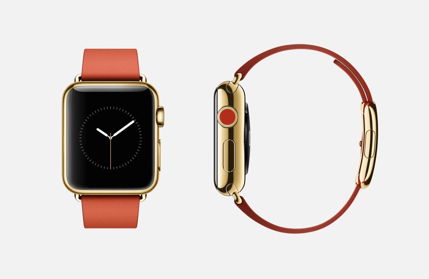
For me this one is still over-priced for what you get. And if I really want to go that route, I’ll just wait for the Apple Watch in April.
Tech of Disney – Two Awesome Apps!!

Our Walt Disney World vacation was a success and everyone involved agreed that technology played a central role. We’ve already talked about how MagicBands made negotiating the parks, resorts, and souvenir shops easier. Today we’ll look at the applications we used during (and prior) to the trip to make sense of the madness and make sure everyone had a great time.
Disclaimer: Our vacation was in January, which is a slow month. So bear that in mind when making your plans. Even with these great apps, heading to WDW in July will always be pretty busy, but I’m sure these apps will help.
I was the “tech guy” for our trip and I employed several apps to keep everything sorted out. I used Google Maps to negotiate the way from Orlando to Clearwater, Florida and back (we spent a day at the Clearwater Marine Aquarium). I used Yahoo Weather to keep an eye on the sky and help everyone know whether to wear a jacket or shorts, depending on the day. I used the stock “Notes” app on my iPhone to keep tabs on souvenir money, and the breakdown of our meal plans (which we accessed with those sweet MagicBands). But there were two primary apps that I used to make this vacation successful, and I’m very excited to tell you about them. So here we go:
My Disney Experience App

This app is the “official app” from Disney for your vacation. The app provides a ton of tools to use in the parks including Ride Information, Character Meet-Up locations, Dining Options, Guest Services, and even Shopping.
The My Disney Experience App is something you definitely need while you’re in the park, or even before you’re in the park for planning purposes. Let me share how I used the app for our trip.
Using the App in the Parks
 I used the My Disney Experience App for two major things while in the park. First, the app allows you to modify your Fast Pass options directly on the device. We had an early Fast Pass for the Rock Coaster in Hollywood Studios. The bus took a long time showing up (one of the few times that happened to us), and the drive to the park was taking longer than I expected it to. Bottom line, we were going to miss our Fast Pass for the ride, and I knew, from reviewing the app, that we had a 45 minute wait if we had to go through the
 “stand by” line. So I pulled up the Fast Pass options on the My Disney Experience App, located another Fast Pass window, and switched everyone in our group to that window instead. We did indeed arrive at Hollywood Studios after our first Fast Pass had expired, but because of the functionality of the My Disney Experience app, we were able to saunter our way to the ride (taking a family pic in front of the Tower of Terror along the way) and take advantage of our revised Fast Pass window. This is just on example of the many times I adjusted our Fast Pass times with this app. We actually switched which park we were going to one of the days, and I was able to completely reassign our Fast Passes to the other park, all from within the app on my iPhone.

 The second way I used this app in the parks was for Dining. We were doing Quick Service Meals during most of our trip, which is the Disney equivalent of Fast Food. The app shows all of the Quick Service restaurants in the parks with menus provided. On our day in the Magic Kingdom we needed to find a location for dinner. While others in our group rode Dumbo the Flying Elephant, I pulled up the Dining options and took stock of what restaurants were around us (some restaurants have limited hours, and the app indicates that). By the time everyone was done flying I had narrowed it down to two places. With the whole group gathered around, I told them what foods each place offered, and the general consensus was to skip to gourmet mac and cheese of the Friar’s Nook (my choice), and head over for burgers and chicken in Tomorrowland at “Cosmic Rays Starlight Cafe”. You can’t win them all. Having all of the menus at your fingertips is a great feature, and something unique to the My Disney Experience app. If you are doing Table Service Dining, you can even make your reservations right from the app. But make sure you do that way ahead of time, because those slots fill up fast, and you’ll have few, if any, options if you do it the day of your visit.
While My Disney Experience provided some great options, including visual maps to guide our way through the parks, another app was my primary tool to make sure we spent more time on rides, and less time in lines. It’s an app called “Touring Plans”.
Touring Plans App

I’m not sure how I stumbled upon the website for “touring plans“. It was probably during my google searches for “planning a trip to Disney”. However it was that I found it, I can say without hesitation that this app was the jewel that made our vacation a smooth ride from start to finish. Unlike the “My Disney Experience” app, this one has a cost related to it, but I assure you that the price of $12.95 for an annual membership is well worth it. Your $13 gets you access to the Touring Plans website, offering tons of tools, including pre-designed schedules, from which the site got their name. You also can full access to the mobile application (available on iOS and Android). The mobile app is available for free, but you can’t access many of the features without a membership.
The “Touring Plans” app offers all sorts of information about the parks. Park hours (including the “extra magic hours” for resort guests), Crowd Calendar, Wait Times, Fast Pass Availability, and Ride information (height, intensity, description, and ratings). Bottom line, the only things missing from this app are dining information, and the ability to change Fast Passes on the go (but you have My Disney Experience for those anyway). While those features might sound similar to the “My Disney Experience” app, I found that Touring Plans was easier to use, and had more reliable wait times for rides especially.
As I looked over the app, I had a feeling of nostalgia that is usually associated with viewing photos from a trip. But that makes sense, since I spent most of my time there staring at these screens. But I wouldn’t have it any other way. Let me share how I used this app prior to our visit and during our time in the parks.
Using the App to Plan the Trip
Two months before our trip the family gathered to do some trip planning. Using the “touring plans” application I accessed the “Crowd Calendar” which does its best to predict the tourist traffic each day. We could see the days we would be there, with estimated crowd level. We used that information, along with the days that each park had “extra magic hours” (resort guests get early entrance or staying after the park close to the public) to determine which park we would visit each day. Our planning proved overwhelmingly successful. We had minimal lines, and tons of space as we made our way around the parks. Touring Plans Crowd Calendar proved accurate for us!
 The second thing we had to determine was which rides everyone wanted to go on. Bear in mind we had ages ranging from an 8-year-old up to the Grandparents, so everyone wasn’t always going to agree. I used a spreadsheet to create what I called “The Super Awesome Ride Selection Machine”, and filled it with data gathered from the ride descriptions in the “Touring Plans” app. Then I sat with everyone and had them rate their interest in every single ride (0 – not interested to 5 – we MUST go on that!!!!). In the end I had a good idea about which rides everyone wanted to go on, and when we’d need to split up. I used that information in real-time once we hit the park. We managed to get to roughly 90% of the rides we wanted to get to, and that is thanks to the wait time calculator. But I’m getting ahead of myself.
Using the App in the Parks
The “touring plans” app provides estimated wait times for all of  the rides and shows in all of the parks. When you pull up the ride list, you see the Disney posted time (reflected on the My Disney Experience App) and the “expected time” as calculated by Touring Plans. These numbers are derived from historical data and users entering their wait times while they are in line (which is added to the algorithms driving the historical data). I used the app, to time several of the lines we stood in. I verified just about every line’s wait time against the apps expected time and found the app was accurate almost all of the time. If anything, it sometimes stated a longer time than we experienced; it never went the other way! In addition to providing expected wait times, each ride indicates when there is a Fast Pass available, and when the line is expected to get shorter. We planned to ride Big Thunder Mountain again on the day we were in Magic Kingdom. I saw that there was a 40 minute wait as the expected time in Touring Plans. But the app told me that if we waited another hour the line would drop to 10 minutes. We waited (hit another ride in the meantime), and then we rode the ride an hour later with that 10 minute wait! Spectacular.
Anyone planning a trip to Walt Disney World (or Universal Studios – they have this service too), should get Touring Plans. It’s the easiest $13 you’ll spend, and it will definitely make your trip more enjoyable. If you don’t have a tech geek like me in our group, the site offers designed “touring plans” that will literally guide you through the park, hitting all the rides you want to go to at the optimal time. We didn’t use that service, but I can definitely see how it could benefit a group that doesn’t have a person who is fine staring at their smartphone the entire trip.
The Whole Cup Summed Up
As technology increases its presence in our lives, it is becoming more important to be comfortable with the tools. This is certainly the case for a vacation to Walt Disney World. The use of two relatively simple apps will have great benefits for your trip. You will stand in shorter lines, you will use your Fast Passes effectively (we changed some when we realized we had Passes for a ride with a 5 minute wait!), and you will feel more in control of your experience. Need to find a place to eat dinner? The My Disney Experience app has everything you need to know from menus, to prices, to exact locations in the parks. Need to know if it’s worth walking all the way across the park to hit Space Mountain one more time? Touring Plans can tell you how long you will wait before you take one step towards Tomorrowland. These are great tools. They are easy to use. And the first one is free and the second one is a bargain. So make sure to grab these apps before you head to Florida and I’m sure you will have an amazing time!
And when you want to know where to find her, you won’t need a Fairy Godmother…

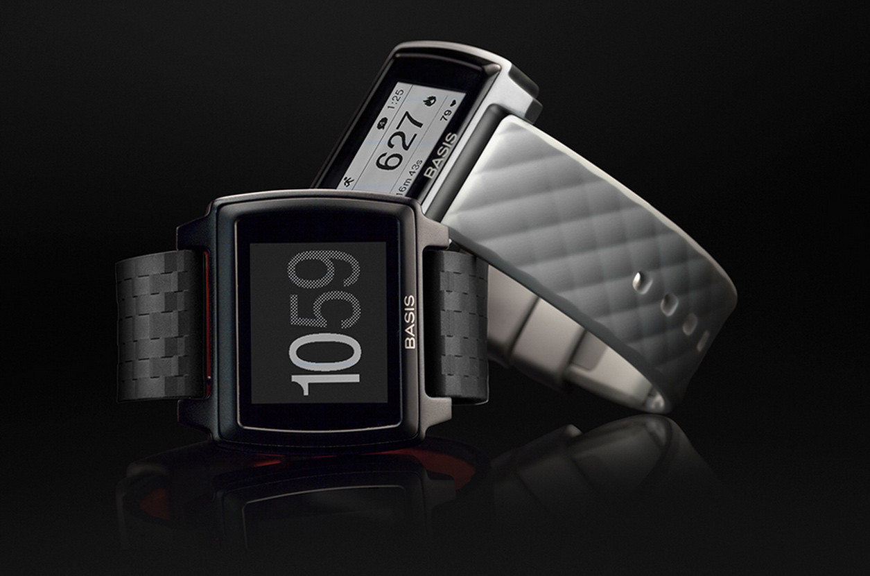
First Impressions – Basis Peak Fitness and Sleep Tracker
Just when it seemed that the smartphone had eliminated the need for the old wristwatch, along comes the tech industry to reinvent an age old tool. Smartwatches once again dominated the Consumer Electronics Show (CES) in 2015, showing that wrist-based tech is certainly on the rise! From the simple fitness bands like the Fitbit Flex and Misfit Flash, to the souped-up smartwatches like Moto 360, Samsung Gear S, and the forthcoming Apple Watch, the tech industry is very interested in slapping something on your wrist.
But how do you know what is best for you? ![]() Do you even need one? Well, all of that depends on what you value. Do you want fitness metrics like steps, miles, elevation, heart-rate, and calories burned? Do you want a wristband that interacts with your phone to show calls, texts, emails, and calendar notices? The Wrist Tech industry is very diverse, and actually pretty overwhelming when you really start to see how many options are out there. I recently got my hands on one of the lesser known devices. Based on my initial experience, I’d categorize it as a “fitness watch”. It’s called the Basis Peak, and these are my first impressions.
Do you even need one? Well, all of that depends on what you value. Do you want fitness metrics like steps, miles, elevation, heart-rate, and calories burned? Do you want a wristband that interacts with your phone to show calls, texts, emails, and calendar notices? The Wrist Tech industry is very diverse, and actually pretty overwhelming when you really start to see how many options are out there. I recently got my hands on one of the lesser known devices. Based on my initial experience, I’d categorize it as a “fitness watch”. It’s called the Basis Peak, and these are my first impressions.
BASIS PEAK – Hardware
 First off, the form factor. The Peak is not too big, and not too small. Weight is also minimal. It has a two tone LCD touchscreen which works very well. It comes with a rubber wristband that I find comfortable. This is important because to get accuracy from the heart-rate monitor it’s essential that the watch be strapped tightly to your wrist.
Battery life has been very good. I’m getting about 3 days of life (from the promised 5 days), but I have been using it a lot. Remember that the high end of battery life is usually found through minimal use. But 3 days isn’t bad, especially for a device that does 24/7 tracking.
The Peak is waterproof. So you can shower and swim with it on and there are no worries. Finally, the device will work with both Android and Apple phones, which makes it a rare breed indeed.
Overall I like the look and feel of the Basis Peak. So let’s talk about what this Fitness Watch does.
It’s a Fitness Tracker
First and foremost, this device is for fitness. It is not trying to compete with the Smartwatch category, at least not directly. The Basis Peak offers a few fitness metrics: steps, calories burned, and heart-rate (we’ll get to that last one in a minute). Noticeably missing from the device are the ability to track mileage (a significant omission), and elevation (which would require an altimeter to work). Many other fitness trackers offer both of those features, and for a premium cost device (the Peak will set you back $200) they really should be included.
Though the metrics are limited, it’s what the Peak does with the data that is pretty cool. The device sells itself as fully automated. You don’t have to tell the device when you go for a walk, take a run, or head off on a bike ride. The device can tell what you are doing, and the device responds with an icon for the activity, and begins tracking the activity as a “work out ” session of sorts. This is a great feature for people who like to track their metrics during exercise, especially those serious runners and bikers. And the key to solid metrics is the heart-rate monitor.
T his is my first experience with a fitness band offering constant tracking of an actual health element. It’s one thing to see if you can get those 10,000 steps in every day and the resulting feeling of accomplishment. It’s quite another when your fitness watch can give you insight into your actual health in real time. I’m quickly discovering that I am pretty out of shape. I know that by watching my heart rate skyrocket, even during a long, slow walk. I am excited by the idea of mobile technology like a fitness watch helping people make better health choices in the moment. The Peak is already doing that for me, after just a few days.
It’s a Sleep Tracker
You didn’t know how important it was to track your sleep patterns, did you!? According to the fitness band/watch industry it’s very important because the feature is pretty much standard on anything strapped to your wrist. I’ve used the FitBit Flex sleep tracker for a while and I didn’t find it terribly useful. That particular tracker only tracked sleep and awake, using “micro-movements”. So it showed me when I moved around in my sleep, but the data didn’t get any more specific.
![]() The Basis Peak is different, and it’s all because of the heart rate monitor, and something the company calls Body IQ. The device offers several metrics for sleep tracking including: Light Sleep, Deep Sleep, REM Sleep, Toss/Turn, and Interruptions. The phone based app also gives information to help you understand how much of each type of sleep is typical, so you have an idea if you are getting enough of what you need. This is the first fitness watch that I’ve used where the sleep monitor actually tells me something useful and something I can take action on.
The Basis Peak is different, and it’s all because of the heart rate monitor, and something the company calls Body IQ. The device offers several metrics for sleep tracking including: Light Sleep, Deep Sleep, REM Sleep, Toss/Turn, and Interruptions. The phone based app also gives information to help you understand how much of each type of sleep is typical, so you have an idea if you are getting enough of what you need. This is the first fitness watch that I’ve used where the sleep monitor actually tells me something useful and something I can take action on.
It’s a Smartwatch (sorta)
 When the Basis Peak first shipped it was strictly a Fitness Watch. It could do everything I’ve already described and nothing else. Then came the “smartwatch update“. This update was promised to early adopters and the company delivered recently with an update that allows Smartphones to communicate with the Peak, showing incoming calls, emails, texts, and calendar appointments on your wrist. The features are still pretty glitchy, which isn’t surprising because it’s so new. I tested both an Android phone and an iPhone and both were inconsistent with delivery of calls, texts, emails, and calendar appointments. Also the “manual sync” button in the phone app of both devices often resulted in an error saying “sync failed”. These issues definitely make the “smartwatch” element of the Peak less reliable.
Bottom line, if you want a full smartwatch experience, the Peak is not the device for you. At least not until they’ve worked through many of the bugs that are currently plaguing it.
The Whole Cup Summed Up
The Basis Peak is a Fitness Watch. That’s the most important thing to remember. It’s trying to take on some of the other Smartwatches out there, but it’s just not there yet. The fitness metrics offered by the Peak are pretty standard, and nothing to get too excited about. What I am finding most useful is the Heart Rate Monitor and enhanced Sleep Tracking. In the end, the purpose for wearing a fitness watch or fitness band is to help you make better choices about your health, and the heart rate monitor is proving an excellent tool for me in that regard.
The Basis Peak will certainly get better in time. The company promised a software update and they delivered. This is no small feat, especially for a smaller company. This builds customer trust and that is essential for the fledgling industry of Wrist Tech.
The device currently cost $199 and comes in a couple colors.  You can swap out your wristband to jazz it up too. My opinion, based my first impressions of the Peak, is that it is overpriced for the features it offers. A $200 fitness watch should at least offer mileage tracking. It also wouldn’t hurt to put in that altimeter so users could track elevation (I used to challenge myself to take the stairs!). At a premium price, it should offer every feature possible. The only justification for the high cost would be the inclusion of “smartwatch” features, which the company is starting to offer. But the phone connectivity is still unreliable, and so be prepared for some frustration if you plan to use those features.
Mobile Health is taking off, and fitness bands and watches are leading the charge, providing valuable health data on your wrist (and your phone). This is technology that truly has the potential to change lives. Unlike the majority of tech updates (tablets, phones, and gaming consoles), wrist tech is often focused on health. At the same time these devices can keep you connected to the things that you value, in a way that involves minimal interruptions from technology.
These two elements in partnership on a small device like a wristband will revolutionize how we communicate with our friends and family, and with our doctors too! Great tech should be easy and life enhancing, and that’s the direction we are heading!
Review – Beats “Studio” Headphones

The mere mention of the words “Beats Headphones” is likely to cause an emotional response, from those who spend any amount of time committed to listening to music. Usually two camps will form. Those who think Beats are awesome, and those who think Beats are overpriced junk. While both camps have good points to make, the insistence of adhering completely to one opinion over the other only causes further confusion about what exactly these headphones are, and whether or not they are really worth the pile of cash it takes to procure them. I’ve had a pair of Beats Studio headphones for a couple of months, and I’d like to share my opinion about these polarizing headphones. Please bear in mind that I am a music head not an audiophile. It’s important to understand the difference, to know where I’m coming from as I review these “cans” (it’s easier to type “cans” than “headphones”).
Musichead: “Someone who is an avid music listener. They listen to music ALL the time, and usually are the type of people who know about the latest music, and they are always trying to put you on to a new artist.: (urban dictionary)
Audiophile: “A person enthusiastic about high-fidelity sound reproduction. Audiophile values may be applied to all stages of music reproduction: initial audio recording, production process, and the playback.” (wikipedia)
So the audiophile cares much more about the quality of recording, whereas the musichead’s focus is on the music itself (based on lyrics, vocal quality, etc). Beats offers several models of headphones, at varying prices, from the “urbeats” earbuds for $90 to the “Beats Pro”, which go for $360. My model is the Beats Studio (wired), which will run you $299.
The Cup Half Full
The Beats Studio headphones offer great sound. I say that as a musichead, and also as a guy who spent the past five years with either Apple earbuds or $15 Sony cans. Those options gave me good sound. They weren’t junk. The Sony’s were actually surprisingly good, but over time they have started falling apart, which isn’t surprising considering how cheap they were. If you want great sound, without the perfection an audiophile looks for, you will be pleased with the Beats Studio headphones. These cans are “over-the-ear headphones”, meaning your ears will be nestled down inside the soft “leather” of the earpads. I tried the “Sol Republic” headphones, which uses an “on-ear” design, but I found that they were pinching my head to the point that after 30 minutes or so I had a headache. Moving to the Studio design, I’ve found that I can wear these headphones for six straight hours without any discomfort, and that is a huge selling point for this design of headphones. The Sol Republic’s offer great sound (on par with Beats) but that on-ear design wasn’t working for me.
The Beats Studio’s offer noise-cancelling, which is internally powered. I’d never used this type of headphone before, and I really like the functionality. While not entirely noise-cancelling, the headphone completely cancel out all “white noise/ambient sound” and muffle everything else. I work in an office complex, and I finally feel like I’m not surrounded by a bunch of people. The noise-cancelling function is powered via micro-USB, providing up to 20 hours of listening between charges. This is both a good and bad thing. The older models required batteries, which would have to be changed frequently. But the charging design means that when you’re battery is drained, not only will the noise-cancelling not work, but the cans will not work entirely. So now you have another device to manage in regards to battery life and charging schedules. You can also use the headphones as glorified earmuffs, as they have a physical power button on one ear, allowing you to engage the noise-cancelling piece without actually playing music. I use that feature more often than I thought I would. 
A couple of notes about the case, and design for travel. The headphones collapse to make them easier to carry around. That said, they are still pretty big headphones, so even in their collapsed state, they will take up a good chunk of your bag or purse. Beats includes a carrying case. It looks like a big egg and it’s intention is obviously to protect the headphones, not make them any easier to pack in said bags. The case is just large enough to house the collapsed cans, the headphone cable, and the charging cable/wall charger).
Finally, a great feature of these headphones is the detaching cable. By not hard wiring the cable into the headphones themselves you will have a much easier time replacing the cable part should they become damaged (it happens!). Also the cable functions as the “power button” for battery element of the cans. When you put the plug-in place the battery starts, as does the noise-cancelling. Pull the plug, and you’ve effectively, turned them off.
The Cup Half Empty
First off these headphones are certainly a premium product. You are paying for the name brand and the “cool factor” that is associated with the Beats line. I was actually avoiding these headphones strictly because I didn’t want to give into the hype. I have audiophile friends, who insisted that there are cheaper cans with better sound. I just needed to do some homework. But I didn’t want to do some homework! I’m a musichead. I just wanted to listen to the music, and have the sound be “great but not perfect”. I tried many pairs on before settling on the hyped up/admittedly over-priced Beats headphones. And I have no regrets. The need to manage charging, as mentioned, can be a bit of a pain. And the case is large, meaning it’s always in my computer bag. If you want a small set of headphones, these are not the one’s for you.
Finally a note about Apple’s purchase of Beats. The headphones come with both a standard audio cable, and an enhanced cable with phone buttons and volume. That enhanced cable will only work with iPhone/iPad devices. If you are on Android, or using any other type of music device (any Walkman listeners out there?), you might as well chuck that extra cable out, because the standard cable is the only one that will work for you. This will only become more the case, as Apple integrates the Beats line into their portfolio of products.
The Whole Cup Summed Up 
The Beats Studio headphones offer a great music listening experience (assuming you aren’t too picky about perfection). Noise-cancelling, both while listening to music and even when unplugged is awesome. Finally, the design works very well for long listening sessions, which for me was the most important factor. Are Beats headphones overpriced? Of course they are; all name brand products are. You can certainly get a Hawaiian Shirt for less than the $120 they charge at Tommy Bahama, but people often buy for brand. Beats are no different. So if you are a musichead looking for a great listening experience, and you’ve got the extra cash or Christmas money, consider these as a decent option. I’ve definitely found them to be superior to anything I used previously, and I am enjoying my music every day. And there are other advantages to them as well…

Note: If you are looking for a cheaper options, here are a few good sets, that won’t even set you back $100, let alone $300.
First Impressions: iPhone 6 Plus

The newest iPhone is out and people are clamoring to get their hands on it. The fact that Apple sold over 10 million units in the first weekend seems to indicate at least some level of consumer interest. If you google iPhone 6 you will find no shortage of reviews about Apple’s newest phone offering. You’ll see things about design and durability. But, like many tech sites, many of these reviews can become quite technical. What you’ll find here are my first impressions of the iPhone 6 Plus, and how I think it can make life easier, or harder, as the case may be.
iPhone 6 Plus – Disclaimer
The iPhone 6 Plus is BIG. I’m saying that from the perspective of a guy who used a 5 inch HTC One (M8) for a period of time, and thought that was big. If you are at all leery about having a huge phone, read no further, the iPhone 6 (with it’s 4.7 inch screen) is your best choice. But if you are okay with a phone that won’t fit in your pocket (unless you bend it!) and a phone that will constantly require a second hand to use it efficiently, read on.
The Cup Half Full
So how does the iPhone 6 Plus make the phone experience better? First off is the design. Compared to the Note4 or LG G3 (two competing phablets), the iPhone 6 Plus is a beauty. It’s super thin. It’s smooth aluminum back and rounded corners are an absolute delight to look at and it feels great in the hand (though I recommend a case to avoid it slipping out of your hand, here’s mine). The long held design of the screen (with an app bar at the bottom, and stat information at the top) make much better use of the space compared to rivals, which only makes the screen seem larger and more useful.
The phone has a larger battery, which should allow for much longer periods between charges. Only time will tell though. The device also has an improved camera with image stabilization. This could be a big deal. In simplest terms, the camera in the iPhone 6 Plus is designed to help those of us with shaky hands. Not a feature to underestimate. Finally, the iPhone 6 Plus has some innovations in the way the screen works, taking full advantage of the larger screen. This means that some apps (like email and messages) will actually look different than the apps on the smaller iPhone 6. Also when the phone is in landscape mode, the “app drawer” will move from the bottom to the side. Seems funny to me that the iPad Mini doesn’t even do that. So there are no shortage of good things going on with the iPhone 6 Plus, but the pendulum still swings both ways, and this is where the device starts to worry me.
The Cup Half Empty
While beautiful in design, the iPhone 6 Plus has one “big” problem. This device is huge. But here’s the trick; it’s supposed to be. It’s a phablet, which is the horrid word somebody came up with to describe a device that is part Phone and part Tablet. When the phablet device came into it’s own with the Samsung Galaxy Note, the device had a very specific purpose. It was a device competing more with the 7 inch tablets than against 5 inch phones. It was and is a device for “power users”. You know the corporate types that used to live in their blackberry screens. The phablet is trying to be more than a phone. In terms of regular consumers, the phablet is a good choice if you don’t already own a tablet device (iPad, Nexus 7, etc.) If you don’t want two devices, the phablet bridges the gap (which is even more relevant when cost is factored in). And that’s what the iPhone 6 Plus is. It’s a phablet. But I worry that through a combination of factors, both on the part of Apple and consumers, people don’t realize this. And that could be a problem down the road. I’ll explain.
By  launching both iPhones together, Apple made it look like they were selling two sizes of the same device. When in fact they are selling the next iPhone (iPhone 6) and their first phablet (iPhone 6 Plus). People jumping from the 3.5 inch screen of the iPhone 4/4S or the 4 inch screen of the iPhone 5/5S are in for serious culture shock when they try to wrap their hands around the case holding the massive 5.5 inch screen of the iPhone 6 Plus. I believe that Apple set the precedent a year ago when they released the iPhone 5S and iPhone 5C at the same time. The iPhone 5C was clearly the silver medal to the gold of the iPhone 5S. So most people think the same is the case with the current generation of the iPhones. That reasoning would lead people to conclude the iPhone 6 Plus is the one to get if you want the “best” one. And that’s why the backorders for the larger device stand at 3-4 weeks, where you can get your hands on the iPhone 6 in 7-10 days. And after waiting all those agonizing weeks, these new iPhone 6 Plus users are going to realize that their new phone requires two hands for most of the things it can do. And while we might think that’s a small thing, that’s probably because we’ve grown so accustomed to single handed cell phones we take that convenience for granted.
 Both iPhone 6 models have a new feature to help address the increased screen size, and it’s called Reachability. Basically you double TAP (not click) the home button and the screen lowers itself about 1.5 inches, bringing the top of the screen closer to your waiting thumb. On the iPhone 6 this functionality works very well. But based on my hands-on experiences with the iPhone 6 Plus, based on where we generally place our hand when holding the phone, the size makes it virtually impossible to reach either the home button (for the tapping) or the top of the screen (to pull down notifications). You must either move your hand down or up, or use your other hand to tap the home button. And that is a problem that “reachability” on the iPhone 6 Plus didn’t fix.
The Whole Cup Summed Up
So think carefully as you consider the iPhone 6 Plus, over the iPhone 6. While you get increased batter life, a better camera, and a larger screen, you also must contend with a massive phone in your pockets and in your hands. That’s my biggest beef with the iPhone 6 Plus. It’s so much like the iPhone 6, just much much bigger.
Apple has designed a beautiful phone, no doubt, but I believe the 4.7 inch design of the iPhone 6 is the current sweet spot as far as comfort and usability. But if you want the larger screen, the iPhone 6 Plus certainly has enough to offer to make it worth it. Though one of these thumb extenders might come in handy…

Coming Soon: iPhone 6 and 6 Plus – First Impressions

If you are an iPhone user, there are some new posts coming in the next week that you might want to take a look at. I will be doing a “first impressions” review of both the iPhone 6 (my new phone), and the iPhone 6 Plus. My reviews are always written with the casual user in mind, so if you aren’t a tech geek like me, but are debating about Apple’s new offering, hopefully I can help you out a bit.
