Category Archives: Reviews
ElevatoR(eview): JBL Charge 3 Speaker

Tech reviews for the average consumer in under two minutes!
The JBL Charge 3 falls into the category of mid-tier consumer Bluetooth speakers. There are cheaper options for certain (JBL Clip 2 comes to mind) and there are much more expensive options (I’m looking at you Sonos and the upcoming Apple HomePOD). JBL makes quality speakers that focus on solid all-around sound without killing your pocketbook. This speaker is about 8 inches in height, and has great sound even at high  volumes. I chose this speaker because it is wide range Bluetooth (100 feet without walls), waterproof (you can dunk this sucker), and it works with the Amazon Echo series of speakers (I pair this one with a Echo DOT). The sounds quality between this speaker and it’s younger brother the JBL Flip 4 was basically the same, at least to my ear (I’m no audiophile though). I chose the Charge 3 mainly because of it’s larger battery (20 hours) and it’s ability to charge devices on the go (it has a built in USB to charge your phone/tablet).
The only downside I’ve found with this speaker is pairing. I was able to pair 2 different phones (as advertised), but not consistently. Perhaps it was a fluke, but something to consider. Also pairing to my Amazon Echo DOT has been challenging, as it keeps losing the connection. As a bluetooth speaker, this thing rules. As a “smartspeaker” jerry-rigged with a DOT, there’s work to be done to make that experience smooth.
ElevatoR(eview) Verdict:
Design: Cup Half Full
Ease of Use (Bluetooth Speaker): Cup Half Full
Ease of Use (with Echo DOT): Cup Half Empty
Sound Quality: Cup Half Full
Cost: Cup Half Full
Overall: Cup Half Full
Long-form reviews to consider, when you have more time:
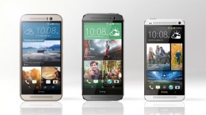
HaikuReview – HTC One M9
Metal-wrapped body
Same as the one from last year,
But still beautiful.
Stainless steel is slick,
Probably ought to buy a case
Or get insurance.

Last year’s five-inch screen
Same look, same feel, same smartphone?
Almost, but not quite.
With last year’s model
Ultra-Pixel camera
Was not a big hit.
So now it is gone.
Now twenty MegaPixel,
For amazing shots.
Camera on front
Uses those Ultra-Pixels
For those selfies (sigh).

User interface
Is much more intuitive,
Using location.
When you are at work
The phone will respond to it.
Stop Candy Crush Now!
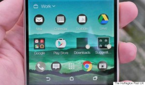
When you are at home
Everything auto-updates.
Candy Crush away!
Phone is still too big.
Wasted space due to logo
Makes one-hand use tough.
![]()
A decent upgrade,
Although Samsung got more press
It’s worth Checking Out.

Review – Nexus 9 Tablet

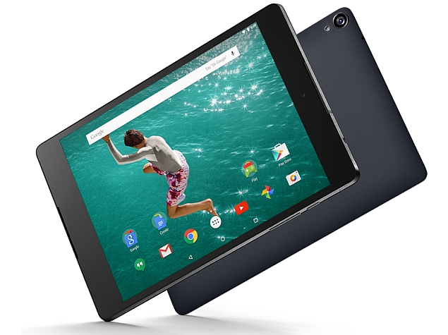
When I took the Nexus 9 out of the box, the first thing that struck me was the unique size. I’ve had several 7 inch tablets, and also a 10 inch iPad for many years, so when I first took this 9 inch device into my hands I was a little perplexed over the reason for such a size. It’s basically a small iPad or a large iPad Mini (to put it into the Apple terms that most would be able to relate to). The device most similar to the Nexus 9 on the market right now is the Kindle HDX 8.9 from Amazon. That particular tablet can go toe-to-toe with Nexus 9 in terms of specs, but comes in $20 cheaper. Of course, the Nexus 9 gives you a clean Android operating system, versus the highly customized Kindle software. So maybe the $20 saved isn’t worth it, if you want more than Amazon’s somewhat limited app selection.
The battle over tablets has reached a fever pitch in the past couple of years. Some signs even indicate that the devices have peaked, as sales are starting to flatten out, or even drop in some cases, in terms of year-over-year growth. Even the all-powerful iPad is not immune to this. Simply put, people who wanted tablets bought them, and now they don’t need another for at least two years, and in many cases the time is much longer. So the tech companies are now heading back to the drawing board of sorts, trying to come up with the next evolution of tablets that will bring consumers back to the table. It’s my opinion that the Nexus 9 is the first effort from Google to do just that. They haven’t done anything huge yet, but by placing the size smack-dab between the small and large tablets, they are in effect offering a middle of the road option for consumers uncertain about what tablet they might prefer. The battle for tablet consumers is only made more intense by the increasing size of smartphones. Where “phablet” was once seen as more of a joke than an actual phone people would want, now the market for the 5 inch screen on smartphones is the strongest of the lot. So as the 7 inch tablet starts being challenged by the smartphone market, and the 10 inch tablets are often seen as too high priced for many consumers, tech companies are looking for ways to offer a better tablet at a competitive price. And that brings us to the Nexus 9.
The Cup Half Full
I did not initially like the Nexus 9. I used it casually over the course of the week, and found myself longing to return to my standard iPad Mini. But then I sat down with the device for a few hours and really dug into it. I got to know the new operating system, Lollipop, and then my attitude started to change.
Lollipop does something that comes as a shock to tech followers , it finds Android copying Apple! It’s been the other way around with Apple ripping off Android for so long, it’s kind of refreshing to see the flat simplistic approach Apple employed with iOS 7 (and now iOS 8) brought into Android’s Lollipop. It’s a welcome change. The previous operating systems, Jelly Bean and Kit Kat, were often way too dark, and the buttons didn’t always make the most sense. That all changed with Lollipop.
I like many of the features, but I will focus on two of them here. First is Multi-User Access. I had the original Nexus 7, and one feature I liked about that device was the ability to set up a “guest account” so others could use my device without messing up my stuff. Lollipop is making multi-user accounts even easier. You can swipe between Google accounts easily, if you’re like me and have multiple email addresses for various reasons. But you can also create additional profiles that can have total access to your google apps, have limited access based on your settings, or have unique profiles built from the guests own google apps using their login information. It’s easy to switch between accounts, right from the notification screen, and the setup was a breeze. This is a feature missing from iPads, and it is a key advantage Android has over Apple currently.
 The other setting option I like is all about the battery. Sure all mobile devices have battery settings. This is where you can see your percentage and turn on your “energy saver” (which the Nexus 9 also has). But the difference with this device is that it will calculate the estimated battery life and graph it for you, so you have a good idea how long you’ve got before you need a charge. I tested out this feature with the screen at full brightness and then at minimal brightness and I saw a four hour time difference in battery life! That’s very useful and very telling about what exactly is sucking the life out of your battery. And it isn’t your addiction to Candy Crush (probably…)
Finally, I absolutely love the speakers built into the front of the device. This is HTC hard at work moving those speakers from the bottom of tablets to the spot where they belong. The Nexus 9 cranks out the sound. It’s not quite as good as the speakers you’ll find on the Kindle Fire line, but it’s better than anything Apple is doing these days.
The Cup Half Empty
Google tries to sell the Nexus 9 as a “one-hand tablet” but I didn’t find that to be the case for me. It’s simply too wide. It suffers from the same issue as the iPad Mini. You can’t one-hand the device. To be fair, the rubber back of the Nexus makes one-hand holding a little easier than the metal-backed iPad Mini, but it’s still awkward and risky, unless you’ve secured it in a solid case. Beyond the size of the case, the build quality of the Nexus 9 just doesn’t seem on par with other $400-$500 tablets. It feels more like a $200-$300 tablet. By feel, I am referring to the cheap rubber back, and the cheap glass. You’ll find the oils in your fingers will smudge both sides of the tablet very quickly. I did side-by-side testing with an iPad to see how quickly fingerprints appeared, and the Nexus was immediately evident with a couple taps on the screen. The iPad put up a better fight, and that is because of the quality of the glass, and the way the glass screen is attached to the device (iPad glass is glued to the surface of the screen versus laying on the screen like the Nexus 9). In addition the volume and power buttons are loose and, again, feel cheap. Google contracted HTC to build the Nexus 9 and the only evidence of that are the metal edges, which show just a shadow of the beautiful HTC One smartphone line. I wonder what the Nexus 9 would have looked like if Google had allowed HTC to bring that design to the larger form.
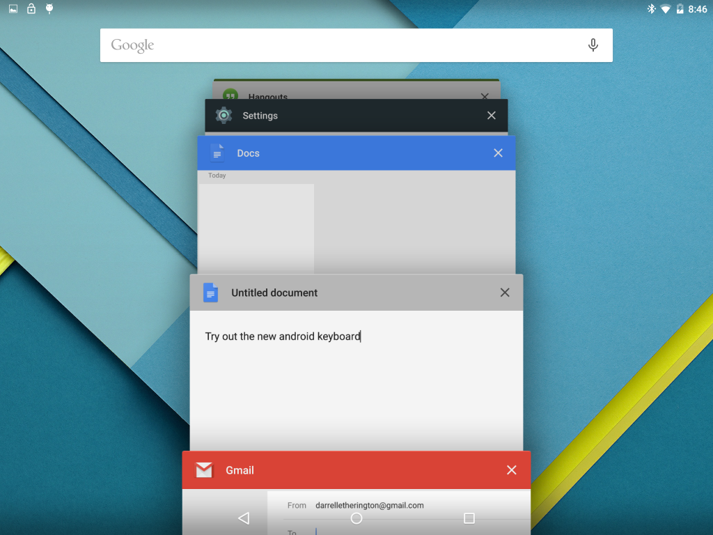 While I really like Lollipop, there is one element that frustrated me, and that is the multitasking pane. When you click the multitask button (right hand button), you get a tiled view of all your open applications. It’s similar to Safari’s Multi-Web page view, for those familiar with the design. You can scroll through your various apps and move between them easily, but when you swipe them away you must do this smoothly or the app will bounce to the side and stay in place. I found that the multi-task pane filled up with lots of apps quickly, and it was a chore to clean up those apps running in the background (which is definitely a good habit to save on battery life).
The last issue I have with the Nexus 9 is the price. The 16GB model starts at $399 and that is simply too much for this device. Since the device doesn’t offer expandable memory, you’re probably best served with the 32GB for $479, which is the largest you can get (no 64GB at this time, unlike many other high-end tablets). The general consensus among reviewers is that the Nexus 9 is a great $299 tablet, and I would agree with that conclusion. With a better build, the device’s software certainly justifies the cost, but the Nexus 9 isn’t there. Remember that Lollipop is very new, so while it is currently only available on a few select devices, given a little more time you will be able to experience this operating system on many other smartphones and tablets.
The Whole Cup Summed Up
 The Nexus 9 ended up being a much better device than I thought it was going to be. While the device looks and feels very mid-level for a tablet, what is under the hood is actually very impressive. Lollipop is a huge step forward for Android; It is an operating system that feels much more consumer focused than previous versions. I am certain that consumers who are less comfortable with this type of technology will feel fine on the Nexus 9. But should they get it? Is it worth the $400 price tag when you can get an iPad Mini with similar specs for $100 less. Or an iPad Air with superior specs for $100 more? I would say to steer clear of the Nexus 9 at this point, unless you really enjoy the Android operating system. There are certainly plenty of people out there who love Android the way others love Apple. And for them the Nexus 9 is a good choice. It’s the best tablet yet of the Nexus Line. It offers amazing speakers and a size that makes it more useful than the typical 7 inch tablet.
The Nexus 9 is the first entry in what I think is the next evolution of tablets. People are used to their 7 inch tablets and 10 inch tablets, and they don’t need new ones. Well, the tech industry won’t stand for that! They need to get everyone excited again! The Nexus is a new size (well Kindle did do it first, I guess) and it indicates a trend to the tablet line that is looking for a way to differentiate themselves from the giant smartphones (iPhone 6 Plus, Samsung Note 4). I’m excited to see what is coming in the next year. New tablets and smartphones will continue to change the landscape and hopefully the casual consumers who bought iPads by the truck load will reap the benefits.

Review – Basis Peak Fitness Watch

I have reached the end of my two week testing of the Basis Peak Fitness Watch. If you haven’t caught up with my “first impressions” review, click here first for a breakdown of the features of this device.
The Basis Peak has definitely lived up to its category as a fitness watch. It’s much more than a typical fitness band, which generally counts your steps, calories, and maybe flights of stairs. A few fitness bands are starting to show actual clocks and collect or display heart rate data. I fall in the camp that says for a fitness band to be considered a watch it needs to look like a watch. Maybe I’m old-school. But I’ve asked around and that seems to be the general consensus. If it looks like a watch, it’s a watch. And the Basis Peak certainly looks like a watch. But it’s not a smartwatch, not by a long shot.
It is the current expectation in the tech industry that even the most basic smartwatch must do several things, and do them consistently well.
- Show incoming calls and allow answer or decline from the watch (then you grab your phone to actually start talking if you selected “answer”)
- Show incoming emails and texts from multiple text/IM services
- Show Calendar appointments with alerts sent to the wrist
That’s it. Those three things are not optional any longer. The smartwatch that I usually wear is the original Pebble, and it is arguably one of the most basic smartwatches, but it does those three things consistently. It also has apps for timers, weather, Evernote, and games. You can even track your Domino’s pizza order with it! Being that the Basis Peak costs TWICE AS MUCH you would expect that it would have similar “smartwatch” features. And while the device makes an attempt, it simply isn’t there yet. I found the watch could consistently receive incoming calls and texts, but nothing else. And this was only when paired to an iPhone. It was all but impossible to pair the watch with an Android phone during my tests. I made it work eventually, but for casual users, who want a “pair and go” approach for their device, this is not an ideal choice.
So if the Peak is not a Smartwatch, you might be wondering what it does to justify its $200 price tag? Simply put, it tracks your health metrics, and a lot of them. Steps are caught like any pedometer (no mileage calculated though). The device has an excellent heart rate monitor, which I found very useful. It also has sensor to detect perspiration and skin temperature. I guess I could see some value in the sweat sensor, but I live in Minnesota, and my skin temps are going to swing wildly just by moving between buildings and vehicles, so I’m not sure why I should care about that. Data is only good if you can do something with it. And that brings me to the last feature of the Peak Fitness watch that I found useful.
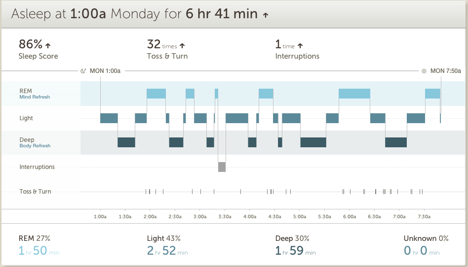 Most fitnessbands/smartwatches make some attempt to track sleep, but the Peak does this better than any other device I’ve used. Being able to look at my sleep metrics, which were broken down between Light, Deep, and REM sleep was helpful not only in determining if I was getting enough sleep, but whether I was getting the right amount of each type of sleep. I found myself trying to get to bed earlier to get more quality in my sleep, and that turns a gimmick into a tool.
 Aside from the features on the watch itself, Basis offers a website and smartphone app. I found the website more useful than the app in general, having more real estate to show the data over time in effective ways. The company offers various “goals” to shoot for, but since there is little interaction with the watch itself, other than telling you when you’ve “met your goal”, I found that more gimmicky than useful. In the end I found tracking over time less important than tracking right in the moment. I walked a few flights of stairs, entirely winded, and I could actually check my heart rate, in real-time, and that’s pretty useful, if you’re trying to improve your health through exercise.
The Cup Half Full
 The Peak went to market as a Fitness Watch. Its main feature was the Heart Rate Monitor, and that is the thing it does best. I tested the monitor against a doctor validated monitor and found it to be very accurate. Not exactly the same, but close enough to use it as a guide. I have used the heart rate monitor more than anything else with the Peak, and I know I will miss having that feature when I return to the Pebble this week.
The rest of the Fitness Watch metrics are nothing to get excited about, but they work. It tracks steps pretty accurately, if you’re one to shoot for those 10,000 daily steps. The fact that it is waterproof is a huge plus, and should really be a standard feature for this type of device. The battery life came through at roughly 4-5 days between charges, which is great. It also has a nice  charger, using a magnet connection for easy charging, without any case to remove or small connection devices to lose.
The watch itself is very comfortable. The silicone wristband can pinch a little when you strap it on, but once in place I barely know it’s there. It needs to fit snugly to ensure accuracy with the HR Monitor, so comfort is very important. It’s not a stunning watch by any stretch, but it’s also not an eyesore. It works as a watch and as a Fitness Tracker.
The Cup Half Empty
As stated, it isn’t a Smartwatch. I found all of the functionality that was added to the device via a software update in early February to be inconsistent at best and at times virtually impossible. The watch connects to the smartphone via Bluetooth and after some initial problems with my iPhone 6 I got that syncing very smoothly. But only voice and text information came to the watch, despite ensuring the settings were turned on to have emails and calendar updates come too. My attempts to sync with an Android device (HTC One M8) were incredibly frustrating. Even after a software update came during my trial claiming to “resolve Bluetooth sync issues” I still could not get the device to pair. I’m in the business of finding devices that are so easy just about anyone can use them. The Basis Peak failed that test on all levels in terms of its “smartwatch features”.

In addition to those issues, the only other problem I have with the Peak is related to its price. For $200 it should be able to do more than it does. Things like showing the current temperature would be a start. You get the date when you tap the screen, but that’s it. There are no buttons on the device, which is actually kind of nice, but it took me a google search to figure out that you had to slide up and down along the right edge of the watch to turn on the backlight. The device is marketed as being “automated” and thus the premium price model, but it is simply too far behind with some basic features to justify the cost. I could deal with $149, but $200 is too much.
The Whole Cup Summed Up
 I sort of love and hate the Basis Peak Fitness Watch. Over the course of my two weeks of testing I found the device very useful at times, and very frustrating at others. The 24/7 Heart Rate monitoring and Sleep Tracker actually drove me to change some of my habits, including giving up caffeine, and working harder to be more active. I can’t over-stress how important that piece of the puzzle is when looking at fitness watches or fitness bands. They MUST drive change in your habits, or they are really just an over-price clock. And in that regard the Basis Peak was a great success. A greater success than 2 years of wearing a Fitbit Flex and Pebble smartwatch ever were. Is it worth $200 for those features? That’s really up to each consumer. But if you are in the market for a fitness watch that will help drive behavior, the Peak is actually a decent contender.
But if you are in the market for a smartwatch that also has a fitness element, this is not your watch. Not at all. Certainly Basis will get their act together at some point and software updates will improve the notifications element of the Peak (after all, these features have only been live for three weeks as of 2/17). So only early adopters who can put up with the frustrations of inconsistency need apply. I’m one of those people, and even I was pushed to the breaking point when trying to sync to Android.
The Basis Peak is a great Fitness Tracker and has a place among the current crop of devices trying to give us all health data on the go, to keep us better informed about how our choices impact our health. Yet these devices are only as good as the value you place in them though, so bear that in mind as you ponder your choices. The Basis Peak is not a great Smartwatch, so steer clear until they fix those features.
For me this one is still over-priced for what you get. And if I really want to go that route, I’ll just wait for the Apple Watch in April.
Tech of Disney – Two Awesome Apps!!

Our Walt Disney World vacation was a success and everyone involved agreed that technology played a central role. We’ve already talked about how MagicBands made negotiating the parks, resorts, and souvenir shops easier. Today we’ll look at the applications we used during (and prior) to the trip to make sense of the madness and make sure everyone had a great time.
Disclaimer: Our vacation was in January, which is a slow month. So bear that in mind when making your plans. Even with these great apps, heading to WDW in July will always be pretty busy, but I’m sure these apps will help.
I was the “tech guy” for our trip and I employed several apps to keep everything sorted out. I used Google Maps to negotiate the way from Orlando to Clearwater, Florida and back (we spent a day at the Clearwater Marine Aquarium). I used Yahoo Weather to keep an eye on the sky and help everyone know whether to wear a jacket or shorts, depending on the day. I used the stock “Notes” app on my iPhone to keep tabs on souvenir money, and the breakdown of our meal plans (which we accessed with those sweet MagicBands). But there were two primary apps that I used to make this vacation successful, and I’m very excited to tell you about them. So here we go:
My Disney Experience App

This app is the “official app” from Disney for your vacation. The app provides a ton of tools to use in the parks including Ride Information, Character Meet-Up locations, Dining Options, Guest Services, and even Shopping.
The My Disney Experience App is something you definitely need while you’re in the park, or even before you’re in the park for planning purposes. Let me share how I used the app for our trip.
Using the App in the Parks
 I used the My Disney Experience App for two major things while in the park. First, the app allows you to modify your Fast Pass options directly on the device. We had an early Fast Pass for the Rock Coaster in Hollywood Studios. The bus took a long time showing up (one of the few times that happened to us), and the drive to the park was taking longer than I expected it to. Bottom line, we were going to miss our Fast Pass for the ride, and I knew, from reviewing the app, that we had a 45 minute wait if we had to go through the
 “stand by” line. So I pulled up the Fast Pass options on the My Disney Experience App, located another Fast Pass window, and switched everyone in our group to that window instead. We did indeed arrive at Hollywood Studios after our first Fast Pass had expired, but because of the functionality of the My Disney Experience app, we were able to saunter our way to the ride (taking a family pic in front of the Tower of Terror along the way) and take advantage of our revised Fast Pass window. This is just on example of the many times I adjusted our Fast Pass times with this app. We actually switched which park we were going to one of the days, and I was able to completely reassign our Fast Passes to the other park, all from within the app on my iPhone.

 The second way I used this app in the parks was for Dining. We were doing Quick Service Meals during most of our trip, which is the Disney equivalent of Fast Food. The app shows all of the Quick Service restaurants in the parks with menus provided. On our day in the Magic Kingdom we needed to find a location for dinner. While others in our group rode Dumbo the Flying Elephant, I pulled up the Dining options and took stock of what restaurants were around us (some restaurants have limited hours, and the app indicates that). By the time everyone was done flying I had narrowed it down to two places. With the whole group gathered around, I told them what foods each place offered, and the general consensus was to skip to gourmet mac and cheese of the Friar’s Nook (my choice), and head over for burgers and chicken in Tomorrowland at “Cosmic Rays Starlight Cafe”. You can’t win them all. Having all of the menus at your fingertips is a great feature, and something unique to the My Disney Experience app. If you are doing Table Service Dining, you can even make your reservations right from the app. But make sure you do that way ahead of time, because those slots fill up fast, and you’ll have few, if any, options if you do it the day of your visit.
While My Disney Experience provided some great options, including visual maps to guide our way through the parks, another app was my primary tool to make sure we spent more time on rides, and less time in lines. It’s an app called “Touring Plans”.
Touring Plans App

I’m not sure how I stumbled upon the website for “touring plans“. It was probably during my google searches for “planning a trip to Disney”. However it was that I found it, I can say without hesitation that this app was the jewel that made our vacation a smooth ride from start to finish. Unlike the “My Disney Experience” app, this one has a cost related to it, but I assure you that the price of $12.95 for an annual membership is well worth it. Your $13 gets you access to the Touring Plans website, offering tons of tools, including pre-designed schedules, from which the site got their name. You also can full access to the mobile application (available on iOS and Android). The mobile app is available for free, but you can’t access many of the features without a membership.
The “Touring Plans” app offers all sorts of information about the parks. Park hours (including the “extra magic hours” for resort guests), Crowd Calendar, Wait Times, Fast Pass Availability, and Ride information (height, intensity, description, and ratings). Bottom line, the only things missing from this app are dining information, and the ability to change Fast Passes on the go (but you have My Disney Experience for those anyway). While those features might sound similar to the “My Disney Experience” app, I found that Touring Plans was easier to use, and had more reliable wait times for rides especially.
As I looked over the app, I had a feeling of nostalgia that is usually associated with viewing photos from a trip. But that makes sense, since I spent most of my time there staring at these screens. But I wouldn’t have it any other way. Let me share how I used this app prior to our visit and during our time in the parks.
Using the App to Plan the Trip
Two months before our trip the family gathered to do some trip planning. Using the “touring plans” application I accessed the “Crowd Calendar” which does its best to predict the tourist traffic each day. We could see the days we would be there, with estimated crowd level. We used that information, along with the days that each park had “extra magic hours” (resort guests get early entrance or staying after the park close to the public) to determine which park we would visit each day. Our planning proved overwhelmingly successful. We had minimal lines, and tons of space as we made our way around the parks. Touring Plans Crowd Calendar proved accurate for us!
 The second thing we had to determine was which rides everyone wanted to go on. Bear in mind we had ages ranging from an 8-year-old up to the Grandparents, so everyone wasn’t always going to agree. I used a spreadsheet to create what I called “The Super Awesome Ride Selection Machine”, and filled it with data gathered from the ride descriptions in the “Touring Plans” app. Then I sat with everyone and had them rate their interest in every single ride (0 – not interested to 5 – we MUST go on that!!!!). In the end I had a good idea about which rides everyone wanted to go on, and when we’d need to split up. I used that information in real-time once we hit the park. We managed to get to roughly 90% of the rides we wanted to get to, and that is thanks to the wait time calculator. But I’m getting ahead of myself.
Using the App in the Parks
The “touring plans” app provides estimated wait times for all of  the rides and shows in all of the parks. When you pull up the ride list, you see the Disney posted time (reflected on the My Disney Experience App) and the “expected time” as calculated by Touring Plans. These numbers are derived from historical data and users entering their wait times while they are in line (which is added to the algorithms driving the historical data). I used the app, to time several of the lines we stood in. I verified just about every line’s wait time against the apps expected time and found the app was accurate almost all of the time. If anything, it sometimes stated a longer time than we experienced; it never went the other way! In addition to providing expected wait times, each ride indicates when there is a Fast Pass available, and when the line is expected to get shorter. We planned to ride Big Thunder Mountain again on the day we were in Magic Kingdom. I saw that there was a 40 minute wait as the expected time in Touring Plans. But the app told me that if we waited another hour the line would drop to 10 minutes. We waited (hit another ride in the meantime), and then we rode the ride an hour later with that 10 minute wait! Spectacular.
Anyone planning a trip to Walt Disney World (or Universal Studios – they have this service too), should get Touring Plans. It’s the easiest $13 you’ll spend, and it will definitely make your trip more enjoyable. If you don’t have a tech geek like me in our group, the site offers designed “touring plans” that will literally guide you through the park, hitting all the rides you want to go to at the optimal time. We didn’t use that service, but I can definitely see how it could benefit a group that doesn’t have a person who is fine staring at their smartphone the entire trip.
The Whole Cup Summed Up
As technology increases its presence in our lives, it is becoming more important to be comfortable with the tools. This is certainly the case for a vacation to Walt Disney World. The use of two relatively simple apps will have great benefits for your trip. You will stand in shorter lines, you will use your Fast Passes effectively (we changed some when we realized we had Passes for a ride with a 5 minute wait!), and you will feel more in control of your experience. Need to find a place to eat dinner? The My Disney Experience app has everything you need to know from menus, to prices, to exact locations in the parks. Need to know if it’s worth walking all the way across the park to hit Space Mountain one more time? Touring Plans can tell you how long you will wait before you take one step towards Tomorrowland. These are great tools. They are easy to use. And the first one is free and the second one is a bargain. So make sure to grab these apps before you head to Florida and I’m sure you will have an amazing time!
And when you want to know where to find her, you won’t need a Fairy Godmother…

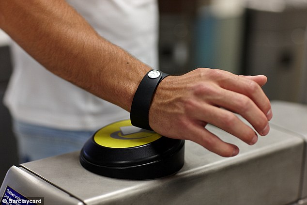
The Tech of Disney – MagicBands

I first heard about the Disney MagicBands from the CIO of Medtronic, who praised the technology in a town hall meeting, after a recent trip to Walt Disney World. He was drawn to the concept of a single device that could provide a variety of services in a portable form. I was excited to get my hands (or wrist rather) on my MagicBand for our Disney trip. Would it live up to the hype, or would this fledgling technology prove unequal to the task? I’m happy to say that the bands worked like a charm for several specific tasks. Here they are:
Magicband as a Room Key and Park Ticket
First off, the MagicBand replaces the room key for those staying at a Disney Resort, as we did. This isn’t a huge advancement in tech, as all it really does is take the chip found normally in the key card of a traditional hotel and places it in the band. Still it’s great to have one less thing to lose, because unlike a room key in your pocket/wallet/purse, it’s a lot harder to lose something strapped to your wrist (though I imagine some could still manage it!)

While the room key aspect of the MagicBand isn’t that revolutionary, the employment of the Band as a Park ticket is where things start to get interesting. Now Disney doesn’t care if you pass your band around your group when accessing your hotel rooms. Those rooms aren’t tied to daily admission. Park Tickets are costly, and everyone needs their own, so they added a second level of security at the gates to the parks themselves to ensure there isn’t any Band sharing. When you first scan your MagicBand at the gate, you are asked to place your index finger on a scanner. This effectively ties your MagicBand to your fingerprint, meaning no one else can enter a park with your MagicBand except you. That’s a great piece of security that isn’t that invasive to the entrance process. I had to redo my fingerprint at our second park, but I suspect that happened because I used a finger with a scar that gave the scanner some issues. Even with the second scan, it was not a time-consuming process.
If you are using a Park Hopper, which allows you to visit multiple parks in a single day, the MagicBand will work for all parks. You’ll have to scan that finger each time, but it’s usually a one-and-done kind of experience. We actually hit three parks in one day at one point, and the single park ticket on the wrist made the process very smooth. By the end of the week, entrance was a science. Smack your wrist to the Mickey till it turned green, then place finger on scanner until the bar went all blue, and you are on your way!
Magicband as a FastPass/PhotoPass
 Disney has been using the FastPass option for a while now. Essentially, a FastPass allows you to jump to the front (or near the front) of the line for the rides. Every ticket gets you three FastPasses for the day you are in the park. This isn’t a perk for people staying at Resorts, but having a MagicBand makes using them more convenient. Without a MagicBand, you are issued a paper ticket for the ride and time for each of your FastPasses. This means you’ve got three “tickets” to keep track of throughout the day! The SmartBand keeps your FastPasses for you, and you can double (and triple) check the times via the “My Disney Experience” app on your phone. A scan of the wrist at the FastPass entrance shows your name on a screen and you are on your way to the front. Insiders Tip: They do not check your fingerprint for the FastPass line, so you have the ability to swap bands. My daughter wasn’t interested in many of the roller coasters that we got fast passes for, so she often gave her band to a more adventurous cousin for a second spin.
 PhotoPass is another convenient service provided by Disney. The parks are filled with employed photographers, all set to take your family photos in front of iconic location like Cinderella’s Castle and the big golf ball at EPCOT Center. Again, the MagicBand can be used to quickly scan after the picture is taken, and the photo is uploaded automatically to your PhotoPass account. Another bonus is photo stations located after many of the rides (especially the coasters) where you can view your “during ride” pictures. You know the ones, with the scream faces! These stations have a place to scan your MagicBand as well, so those photos are instantly added too.
MagicBand as a Payment Source
The final aspect of the Disney MagicBand is the most complicated. Basically, the band can replace your credit card, so in theory you can leave your wallet behind (assuming you aren’t buying any adult beverages). Like the secondary security at the gates with fingerprint identification, whenever you use the card for purchase you are required to enter a four digit PIN number. This is not only a convenient feature, but a required one if you are traveling with children, and you don’t want them buying a bunch of stuff at the gift stores without your knowledge. Without the PIN, the payment source aspect of the MagicBand is worthless.
If you are staying at a Resort and have a Dining Plan, you can use your MagicBand for that as well. It requires the PIN number, so keep that handy.
The Whole Cup Summed Up
The Disney MagicBand is a truly revolutionary tool within the Parks and Resorts. Without the band each person would be walking around with a park ticket, three fast pass slips, a hotel room key, a photopass card, and credit card/cash in the wallet. With this simple accessory all of those items are combined into one thing. Of course I still got locked out of our hotel room one day when I went next door to talk schedules and forgot to put my Band on. Thankfully someone was there to let me in.
 But here’s what I’m most excited about after using the Disney MagicBand for a week, and that’s the potential wider expansion. We are already seeing the possibilities with the wave of Smartwatches that are sweeping through the tech festivals this year. Apple is set to launch their first smartwatch in the coming months. Android Wear is being adopted by more and more companies. People often ask me why we need another device strapped to our wrist? Won’t that just be another distraction? I agree with that possible outcome if the devices on our wrists are too interactive. If smartwatches are just another screen to stare at, that is a problem. Imagine how many people are going to walk into walls as a result! But if the bands on our wrist can be closer to the MagicBand than the Apple Watch, I think there is great potential for widespread adoption. With Apple Pay, more attention is being given to the industry of mobile payments. Google Wallet has been around for a long time, but few use it. I see a future where your wallet truly is right on your wrist. And this new technology will be even more secure than our antiquated bar scanner cards, using things like Apple’s fingerprint verification. The possibilities are limited only by our imaginations!
So if you are off to Disney and staying at a Resort, get ready for the Disney MagicBand, because you will get one. You can even jazz them up with stick on covers and accessories! Not staying at Resort, but still want in on the fun? You can purchase a band for $12.95 and activate all of the goodies already mentioned!
So strap that band on your wrist and wonder at the ease of use, the diversity of options, and the possibilities for such technology beyond the lands of Mickey Mouse, where the rest of the world is just waiting to join in.

The Tech of Disney** – Here Come the Reviews!
 We have just completed 8 days at Walt Disney World in Florida. We went with a specific plan, and months of preparation. But you know what they say about “best laid plans”. Managing 10 people (from an 8-year-old to the Grandparents), over the course of 8 days, where each day averaged 12 hours of actual Disney Park time was going to be a challenge. Kids had competing priorities, timing was a best guess much of the time. And so we had to make many adjustments to our daily schedules on the fly. And technology played a huge role in making those changes positive.
Over the next week of so, I will be posting a series of blogs about “The Tech of Disney”. Each post will focus on a different aspect of how technology enhanced our vacation (and the few times when technology failed us,  which was bound to happen at some point along the way). Disney has figured out many ways to make the vacation on their resorts a smooth process, but still we were newbies, figuring things out as we went along. I’m certain that our next visit to WDW will be even better because of the lessons we’ve learned throughout this week. And I know I will be looking for great apps again to make sure I am in control of my experience. Because while “going with flow” might sound good, planning and control are the best ways to make sure you get to everything you want to get to, and you don’t spend all our time in lines or on buses.
So check out the coming blogs if you have Disney in your future vacation plans, and hopefully I can help you out. Or if you’re a tech geek like me, make sure to read the blogs to hear a firsthand experience with the Tech of Disney!
**We also visited the Clearwater Marine Aquarium and Universal Studios/Islands of Adventure, so the posts will address the tech of those locations as well. Call it a bonus.


The Tech of Disney – Considering Airport Tech
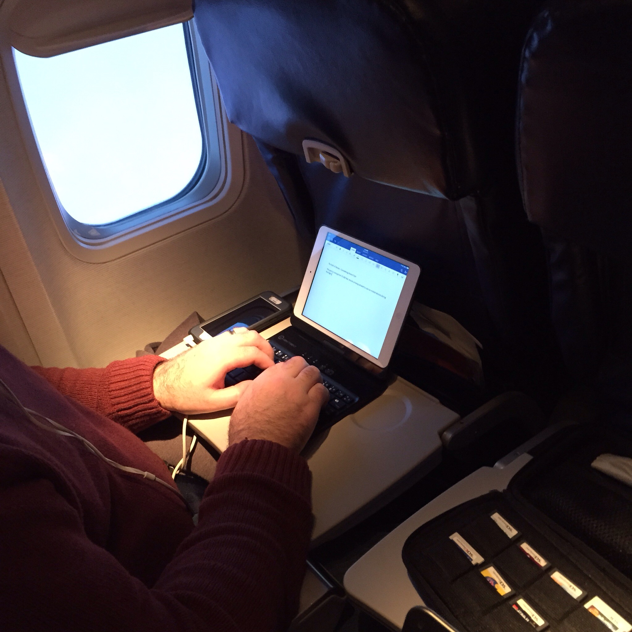
This post is coming from 35,000 feet, thanks to being allowed to use our mobile devices during the flight. I’m not the biggest fan of flying, but sitting here with my iPad, iPhone, and Kindle I definitely have my security blanket! I’d like to take a moment with this first post to talk briefly about the airport experience, considering how tech impacts the process.
Thanks to our group rate, we were able to bypass the long check-in line, and head to the group check-in kiosk. That didn’t stop the check-in person from being impatient and little snippy! I thought that was just something that happened on sit-com television. Ah, when art reflects life. We came into the airport with absolutely nothing that proved we had a reason to be there. Our tickets were purchased months previously. So it was just a matter of all the adults handing over the licenses to get the boarding passes distributed. I was surprised that we had to then haul our bags to the bag dropoff location. The last time I flew the conveyor belt was just behind the check in attendant (the ending of Toy Story 2 wouldn’t have been nearly as dramatic with the current setup).
Fo r some reason we got “pre-check status” for security and after a quick swabbing of my hands (checking for explosive residue!), and a journey through the metal detector, we were through security. I took note of the large cylindrical portal where less fortunate fliers were being subjected to the full body scan. We still have to fly home, so I might still have a chance to experience that first hand!
 Once to our gate, I looked around to see what the airport provided in terms of connectivity. I was happy to see lots of options, in terms of charging stations. They had the bar stool pillar, which was being actively avoided by everyone, due to it’s closeness. It was great to see other options though, including little metal booths with a bench and table, and a long bar, offering both USB connections, and regular A/C power outlets.
If you didn’t do your due diligence in charging before hand, you can definitely be charged up beforehand with all these options!
 Being from North Dakota, my in-laws were very interested in the NDSU Championship game. And I am both proud and embarrassed to say that technology allowed for a rather exhuberant outburst from my mother-in-law when NDSU proved victorious! Being that the airport offered rather spotty WIFI, my father-in-law managed to get the game up and running on his Surface Pro 3 by using his Moto X as a hotspot. Two thumbs up from Two Cups of Tech for that one!!
So we continue on our way to Orlando. Where we will disembark with our Disney Magic Bands in place, and the real fun begins.
You all look really tiny from way up here!

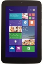
Review – WinBook 7″ Tablet Computer

I have never been impressed with what Microsoft has done with tablets. Their first attempt to battle the dominate iPad was the Surface, and it was not successful. While tech bloggers offered decent praise for the hardware at least, the tablet was not well received by the masses. Since those days Microsoft has changed their tactics in regards to their premium line, and the Surface Pro 3, clearly is up against the MacBook Air. Now it’s laptop versus laptop, and the battle is truly on it’s way to being balanced. My few interactions with the Surface Pro 3 have caused me to question my long-held stance that Windows 8 is awful. So when MicroCenter sent me an invite to pick up a 7 inch Windows 8 tablet for only $50, I jumped at the chance to take a look first-hand. I’ve been using the WinBook for a couple of weeks now, and these are my first impressions.
The Cup Half Full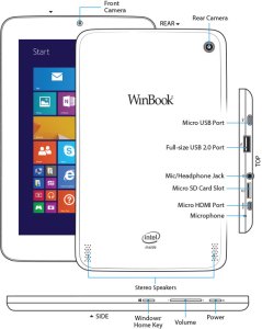
For starters, the hardware is pretty solid. The device is sturdy, the various ports are not loose, like you sometimes find with other cheap tablets. This is good because the device offers a vast array of plug in options (most of which are “micro”). It charges via a standard microUSB. It has expandable memory via microSD card. It has a micro HDMI for video output to HD televisions. And it has a fully supported USB 2.0 port. This last one is the real kicker for a 7inch tablet. With this single port, you can attach a USB hub, and virtually replace your old desktop. The tablet becomes the “tower” and you attach a monitor, keyboard, and mouse, and you’re good to go! That’s a pretty cool thing, and it’s something the iPad can’t do!
Beyond the ability to add peripheral devices, the WinBook tablet is a great form factor. It feels fine in one hand if you’re reading a book (via the Kindle app, perhaps). Unlike many higher end tablets, the bezel (edges around the screen) is thick enough to allow easy handling without accidentally tapping the screen.
The “tiles” interface of Windows 8.1 is pretty slick, once you get it set up. You can use the default “active tiles” to have updates show up on the tile itself, though this will impact the battery life. I choose to turn off most of those features, though I kept the active tile on for email and twitter. Adding apps is easy, and the app store comes on the default screens. But once you go past the build quality and number of plugins, many issues begin to arise.
The Cup Half Empty
While the build of the device is great, the screen is the weak point. It is obviously cheaper glass than what you will find on high-end devices like iPad or Galaxy Tab (let alone high end smartphones)! That means one thing….fingerprints!! I’ve done side by side testing with the WinBook and an iPad Mini, and where the iPad barely registers a spot on the screen, the WinBook is covered. That shouldn’t be a deal breaker for anyone, but I’m picky about the look of my screen. And I’m pretty sure I’m not alone.
The next issue I hit was during the set up. I had to head to google several times to figure out how to do  things like uninstall apps, stop apps running in the background (and killing my battery), and making various adjustments to settings. I was very disappointed when this happened because I hoped this would be a simple device that anyone could use right out of the box. For many, that will certainly be the case, but if you aren’t tech savvy, you might need help getting this thing up and running, and I wish that wasn’t the case.
Battery life on this tablet is pretty bad. If you work hard at application management (closing apps you aren’t using) you might get 4-5 hours out of it. The standard expectation these days is between 8-10 hours, so that’s pretty bad.
The last point I want to make about the WinBook is as much a comment on all Windows based tablets, as it is on this one device in particular.
The Problem with Windows – Tablet versus PC
 My 7 inch tablet looks a lot like a Kindle Fire, or a Samsung Galaxy Tab, but it doesn’t act like one. It acts like a PC. By that I mean, it acts like the desktop computer that Microsoft used to dominate the marketplace with for decades (and continues to dominate in the corporate space). Since my purchase I have received the dreaded “Windows Updates” quite regularly. And not only are these updates annoying, but they are draining on battery and memory.
Like all PCs that run Windows, there is a section of the hard drive dedicated for “recovery”. It’s intended to provide a backup if your device crashes. Such a file seems terribly redundant in a world of cloud computing, and also the recovery file takes up nearly 6 of the 16GB of memory that the tablet comes with! This is ridiculous!
One of my major beefs with Android phones is their tendency to have “bloat-ware” installed. You know the apps that you can’t get rid of and take up space. Samsung is one of the worst for this. But compared to the WinBook, Samsung looks like a lightweight. The WinBook came with so much pre-installed stuff that only 5GB of the 16GB of memory remained for me to use. After 6-7 apps were installed, I was officially “out of space”, and needed to buy a microSD card to add memory so I could install more apps/media on the device. And here’s the kicker, the space required for “system files” will continue to get bigger as time goes by, because Windows will keep pushing updates, while not removing any of  the older files (which can’t be removed manually). So if you added nothing to the device you would continue to lose memory space. This is absolutely unacceptable for a low memory tablet. I could see this being okay on a device with lots of memory, even on a Surface Pro 3, but for a low-end 16GB tablet, such software is simply a waste of space.
Microsoft needs to learn to differentiate between their tablets and their laptops/PCs, most importantly in regards to memory consumption. Apple retains a clear distinction (though that could change with a 12 inch iPad this coming Winter). The biggest issue is when a small tablet tries to impersonate a high-powered PC it will certainly fail somewhere, and I’ve had a negative user experience because of it. An experience I think most would also have if they had this device.
The Whole Cup Summed Up
 The WinBook has tons of potential. It’s a solid little tablet computer. The ability to plug-in peripheral devices (even external hard drives) is a great feature, and something all tablets should start being able to do. The interface of Windows 8.1 is not as bad as I expected, and after some painful setup I’ve been cruising along.
But the cheap screen, bad battery, and memory-sucking Windows environment make this a challenging choice for the casual tech user. As Microsoft continues to struggle with how to identify their devices (as tablets or PCs) the other major players have slick user experiences. Android and Apple might be in a battle for market share, but they are not at odds in regards with how to build a strong user base. Their apps stores are cleaner, their developers are more enthusiastic (meaning more apps and a better user experience), and their tablets are just that, tablets. With good battery life, and decent memory .
.
So if you are a die-hard Windows person, I’d recommend checking out the Surface Pro 3, though get ready for sticker shock with its $900 price tag (and that without the extra $130 for the keyboard cover!). The Surface is a PC masquerading as a tablet, and the marketing makes it clear that is what is intended. But if Windows isn’t important, or you’re only interested in a low price tablet, I suggest sticking with the devices of Android (i.e Nexus 7) or Amazon Kindle (i.e. Kindle 6) for the time being, while Microsoft gets it act together.

First Impressions – Kindle Voyage vs Kindle Paperwhite

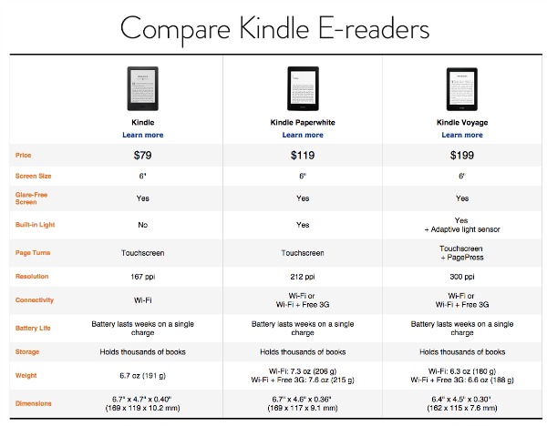
The Kindle is far and away my favorite piece of tech. I’m an avid reader and every time I sit down with my Kindle Pa perwhite the act of reading remains the same, but the experience of reading has been revolutionized. The improvements Amazon has continued adding to the Kindle line just keep making it better and better. Gone are the days of a physical keyboard (and resulting larger body or form factor). Gone are the days of seeking good lighting, as most models have a screen that lights up. And, most importantly, gone is the high price tag of the original models. While my first Kindle cost $300, the current low end, un-unlit model will run you $79, and that’s with a touch screen (my first kindle was all about the buttons). My current model, the Kindle Paperwhite, with a lit screen is $119. A great deal. While Amazon has consistently added features and reduced price over the years, their newest offering adds the features, but goes the other way with the price. It’s called the Kindle Voyage. So let’s see if all the additions make the higher price tag ($199) worth it.
It’s Easier To Hold
 First off the form factor has been changed for the Kindle Voyage. The previous two models had almost identical shapes. They had matte finish backs (and associated fingerprint issues) and rounded edges. The Kindle Voyage has the same matte finish, but it also has more angles, which makes holding the device a little easier. The new Kindle is also slightly smaller in width, height, and weight than the previous model. These improvements make it easier to use with one hand, and have longer reading sessions, without resorting to resting it on your lap, or table.
The other major change in the form of the Kindle is related to the raised edges on the old model. The old Kindle has a drop of a few millimeters from the plastic edge to the screen. The new Kindle is completely flush. I like this change a lot. It has a much better look (though that’s not a great reason to spend extra money), but the main reason I like the flat screen approach has to do with how it impacts the reading experience.
It’s Easier to Read 
The first way that the new Kindle improved the reading experience is the flat screen in relationship to new buttons on each side. The buttons are called “PagePress” in the marketing, and they bring back something from the older Kindles that people had complained about losing: the physical page turn buttons. Unlike the old models though, the PagePress buttons aren’t designed to “click” when pressed, like a standard button. Instead they are pressure buttons. So you can rest your thumb on the button and the page will not turn until you apply pressure. On my Kindle Paperwhite, when I want to turn a page, I lift my finger from the edge of the device and tap the right side of the screen (or use my other hand entirely). While that might seem minor, the action of moving to tap often causes my grip to change, and I end up resetting my hold on the device every page turn. With the new model, you don’t have to move your finger. I know, talk about a first world problem right!?!? But there you have it, no more finger exercises in page turning.
Beyond the new buttons, the Kindle has a another improvement that makes a better argument for upgrading than the page turning function, and that is “adaptive light”.
 The Kindle Voyage now has an “auto-brightness” feature that you’ll find on almost all smartphones. So the backlight in the device will adjust based on the lighting around you. If you enter a dark room the screen will brighten to the optimal brightness for reading (which isn’t the brightest setting, which would be too bright!). If you are outdoors and the sun is shining, again the screen will adjust, by actually going to full brightness to compensate for sun glare. This is a cool feature. While I have brightness control on my Kindle Paperwhite, I find I do adjust brightness a lot, and to have the device do that work for me would be a very nice feature.
The Whole Cup Summed Up
The Kindle Voyage is a big step up for the Kindle line of  eReaders. Unlike previous years, this model doesn’t just improve pixel density to make the screen appear more like real paper (though it does that too, by doubling the pixels on the screen over the previous model). The Kindle Voyage improves the form factor for easy one hand reading, and page turning. And it improves the reading experience via Auto Brightness.
The question that must be asked is whether those changes are worth $80, which is the price difference between the Voyage and the current Kindle Paperwhite. For me, while I like the changes that price difference seems to be a little too much. I can move my finger to turn pages, and I can adjust my own brightness. Others might find more value in those features though, and if so, the Kindle Voyage offers a great reading experience.
A Holiday Note: The basic Kindle is currently on sale for $59 and the Kindle Paperwhite is $99. No holiday deals on the Kindle Voyage, but the other Kindles are available for shipping prior to Christmas, so if you’re ready to get into the eReader game, now is the time. Happy eReading!!
For further review of the new Kindle Voyage, check out these links:
