Blog Archives
FiTech – Using technology for wellness

 It might be a little late for New Year’s Resolutions for 2016, but when the “get fit” bug hits you, it’s best to just seize the moment. I’ve had more “it’s time to get fit” moments than I care to reveal. I imagine most can relate to it. You have a bad test result at the doctor, you feel self-conscious at the beach, you just hit that wall where you want to change your health. You want to lose weight. You want to have more energy. You just want to feel better. So you sign up for a gym membership, buy a
  treadmill, and load the grocery cart with fruits and vegetables. And we all know how that ends. The membership keeps getting paid, but you haven’t gone in 6 months. The treadmill becomes a great place to hang laundry, and the fruits and vegetables go back to boxes and cans of processed “food stuff”. Hopefully with each “get fit” moment a few good habits remain after the membership is cancelled. But for me that’s the most I’ve ever been able to accomplish. I’m in another such moment, and I decided to seize this moment as a tech opportunity.
 From the beginning of “Have a Cup of T(ech)” the mantra has been that tech should enhance your life. Tech should make things easier. If it isn’t, then the tech is a fail and should be discarded. I’ve never turned my geeky eye on fitness tech, aside from my old FitBits. So I’m starting a new category on the tech blog focused entirely on fitness technology. I’m calling it “FiTech”. This category will cover reviews of devices like those popular FitBits (the Alta just released!). I will also look at fitness apps, health apps, nutrition tools. Each post will be looking for ways for technology to make getting fit easier. To make nutrition less of a chore. To make wellness more attainable.
![]() The first major initiative will begin this coming week with something I’m calling “Project 37”. This will be a weekly post on the blog, where I check in on my progress using two specific apps. One is “Three Minute Mindfulness” and the other is “Seven Minute Workouts”. I’ve picked these two after pretty extensive searching. I’ve invested $9 up front for these apps to see if they can go where no app has gone before: prolonged fitness and long-term health improvements. Perhaps you’ll join me. Look for a post later this week with all the details. And watch for more “FiTech” posts as well. I’m excited to see where this will go! The idea of technology improving our physical and mental well-being is full of potential! So let’s begin!
The first major initiative will begin this coming week with something I’m calling “Project 37”. This will be a weekly post on the blog, where I check in on my progress using two specific apps. One is “Three Minute Mindfulness” and the other is “Seven Minute Workouts”. I’ve picked these two after pretty extensive searching. I’ve invested $9 up front for these apps to see if they can go where no app has gone before: prolonged fitness and long-term health improvements. Perhaps you’ll join me. Look for a post later this week with all the details. And watch for more “FiTech” posts as well. I’m excited to see where this will go! The idea of technology improving our physical and mental well-being is full of potential! So let’s begin!
The Tech of NYC – The Apps
 The holiday season caught me up in a wave, and time went along with it. So a month after I spent a packed weekend in New York City, I am finally getting around to a quick review of the apps that I used to have a successful weekend in the Big Apple. I’ll say right away that my app plan didn’t go as expected, but everything worked out perfectly in the end. Some old apps showed new power, and some new apps proved duds. So first off here are the apps that I pre-loaded for the trip.
The Apps that I planned to use
I love app folders. I have hundreds, yes HUNDREDS, of apps on my iPhone, and folders keep me from going absolutely bonkers. Though if you find yourself searching for an app, here’s a TECH TIP. Just swipe down from the CENTER of the screen, and you’ll find a search bar at the top. Type the app name and you’re on your way! Ok, back to the apps.
 I created a “New York City” folder to hold all of the “amazing” apps I planned to use. Here’s the breakdown.
Top of the Rock
Rockefeller Center
New York eTips
NYC Tourist
NYC Essential Guide
NYC Subway
Central Park eTips
911 Memorial
 My choices of applications were based in what I “planned” to do. I wanted to go to the top of Rockefeller Center (mainly because it was cheaper than the Empire State Building and closer to my hotel). So I got a couple Rockefeller apps. I planned to ride the subway at least a couple of stops, so there’s the NYC Subway app. Central Park was on my Agenda and “eTips” had a nice app highlighting a few bits. Finally, every tourist needs some tourism apps that are all encompassing. I grabbed 3 of them (New York eTips, NYC Tourist, and NYC Essential Guide). I ended up missing the Top of the Rock so those apps went unused. But I missed that trip because our team went down to the financial district to visit the 9/11 Memorial, and that’s where I ended up with my last app on the list, the 911 Memorial App, which proved to be one of the most interesting and powerful apps in the bundle. So how did I use these apps? Spoiler, my primary app wasn’t even on the original list.
The Apps that didn’t make the Cut
I browsed my tourism apps on the plane ride to JFK. I quickly discovered that the eTips guides for NYC and Central Park had only limited content before you had to pony up some dough. For a three day trip, I planned on spending my money on souvenirs not apps. So there went both eTips guides. NYC Tourist offers a nice map showing lots of locations, but it is incredibly busy. I did keep the app the first day, and used it a couple times (found the closed Carnegie Deli with it). But ultimately it went on the scrap pile too. That left me with just a handful of apps that really made the weekend work.
The Apps I Actually Used
My primary tourism app was “NYC Essential Guide”. This app does suffer from the “only a few things are free” issue that plagued all of my tourism apps, but one feature made this app worth it. It’s called “Top 25” which highlights 25 points of interest, including brief overviews, maps, reviews, and contact information. I can see a lot of potential in the “premium features” but I wasn’t spending nearly enough time to make that worth it. Maybe next time! The trip to the 911 Memorial was on the subway’s Red Line. I used my “NYC Subway” app to keep track of the stops and to know when to dash out the doors. TIP: if standing, lean against the train’s forward motion, or you’ll end up on your butt; it’s  fast!” The final app I ended up with (aside from my final surprise) was the 911 Memorial app. I highly recommend a visit to this memorial. And plan to take the audio tour and keep your camera in your pocket. This is a somber experience, a sobering experience, and one not to be missed. Everyone I went with got the audio tour kit (with a tape player of sorts and headphones). I opted for the earbuds only, and added the audio tour via the free 911 app. The lady at the audio tour counter didn’t even charge me the $5 for the earbuds. We went into the memorial as a group of 10, but we came out slowly one by one, as we each were immersed in the experience of the memorial. If you can, go.
The old app worth its weight in gold!
 Two words. Google Maps. We all know this app. We all have used it from time to time. If it’s to find a local restaurant, get turn-by-turn navigation, or simply check out cities around the globe down to street view; this is an app I always took for granted. But when I hit the pavement Sunday afternoon to begin my ambitious 10 mile hike around Midtown and Central Park, Google Maps was my guide. I spent some time before I left the hotel figuring out how many minutes it would take to get from location to location, to ensure I would make it back to catch my ride to the airport. I loaded my itinerary into my Evernote App, and I never touched the phone again (except to take pictures). My plan, built with Google Maps, went off without a hitch. I could totally see this being my go-to app when I’m in a new city (I get to test my theory in San Francisco in two days). An old favorite showing it still reigns as the king of maps!
The Whole Cup Summed Up
Apps are only as good as how seamless they work with your planned agenda. They are only good if they enhance your experience. If you are fighting the app, it’s not worth the time. I used some duds, and found some gems during my weekend in New York City. So the next time you head out on the road, be sure to find some apps, and build a folder to keep them straight. You’ll use some often, and quickly deleting others, and that’s okay. Just don’t forget, when in doubt, turn to Google Maps!
Happy Traveling


The Tech of NYC

Two Lumps of Tech is once again on the road (or in the air rather). Since I’m being sent to New York City to work at a conference, I figure it’s another great chance to see how tech tools can enhance travel. Hopefully enhancement is what I experience!
I have three days in NYC. Much of the time I will be providing app support for my company, but I plan to get out a bit. As my hotel is located just a block off of Times Square, and I don’t have much interest in dealing with cabs or the subway on this trip, I’ll be sticking to the “theater district” with a possible trip up 7th Avenue to see Carnegie Hall and Central Park. As this is my first trip to the Big Apple, I have absolutely no idea where anything is located, and so we have APPS!!!
 For this first post, I’ll just quickly highlight a few apps I have downloaded and ready to go for the trip. Future “Tech of NYC” posts will focus on these apps more, and determine which ones might be helpful to others should they happen to find themselves in New York City.
I always have one “must do” on my list when I travel for work. This time it’s visit the “Top of the Rock” which is the name for the observation deck of Rockefeller Center. With it only being two weeks till Christmas, as trip to NYC has to include a visit to the massive Christmas tree at the Rock. Luckily “there’s an app for that”. I quickly found an app called “Top of the Rock” which covers everything you need to know before hitting the elevators (including the hours those elevators run). There is a feature I’m excited to try that turns your phone into a viewfinder. Theoretically you point your camera at a building and the screen gives information about it. We’ll see how well that works Saturday!
 I have two other apps loaded to help navigate the city. “NYC Tourist” is a pretty generic map app, highlighting points of interest. Of course how long those city blocks will end up feeling like is still to be determined. The other app is called “NYC Essential Guide”. I’m pretty impressed with this app so far. Simple navigation shows things like attractions, transportation, restaurants, and entertainment (and sports for those who like that sort of thing). I quickly discovered the exact location of the Carnegie Deli, and discovered it is on my way to Carnegie Hall (not a surprise of course). I think this will be my go to app when I’m hoofing it around town.
I have lots of places I hope to visit during my off hours this weekend, and hopefully these apps will make things easier. Only time will tell. I hear there’s nothing like New York City during the Holidays. Stay tuned for more!
Charitech – Where Charity Meets Technology

Last August I had a moment. One of those moments that forever changes your trajectory. That moment came from my experience with a story about a displaced Palestinian man, who fled Syria to Lebenon with his two kids. He made a living selling pens on the street. The amazing element is that a picture of the man spawned a kickstarter style campaign, raising over $250K for him and his family! The story of such giving floored me. And looking at myself in the mirror, I knew I that I wasn’t doing enough. Why? Because I wasn’t DOING ANYTHING! I talk a good talk, but that was it. So at that moment I decided to change. I launched a new blog (www.developingcharity.net). And I started an effort I called “Project 520” where I would donate $10 to a different charity every week of the next year ($10 X 52 weeks = $520). And I’m just wrapping up my 10th week. And it’s been great so far. But I wanted to find a way to connect my love of technology with my newfound charitable efforts. And that’s what “Charitech” is all about.
Charitech – How technology tools can enhance the process of personal philanthropy (in big and little ways)
I’ve long held that technology needs to enhance our lives. That’s the essential element. I have found tech tools that enhance my experiences with charity, and I plan to highlight a couple of them in “Apps of Note” in the coming weeks and months. But let me introduce you to one tool that is well worth your time. It is called “Charity Navigator” and it is availalbe as an app (iOS and Android) and a website. If you are a skeptic when it comes to charities. If you wonder, “where does my donation actually go?” or “how much of my donation goes to administration and fundraising?” This app will help you. This app can give you a wealth of information in an easy to digest package. So let’s break it down with a simple “App of Note” review.
Charity Navigator

In the simplest terms, Charity Navigator is a repository of sorts, gathering up data on a vast array of charities from around the country and around the globe. With a simple “search” function, you can lock in on a specific charity and look at the basic metrics of their philanthropic efforts. A quick search for one of my favorite charities, “water.org”, shows a 4 star rating, and a score of 95.38 out of 100. These numbers are arrived at through an analysis of both the financial responsiblity of the charity, as well as accountability and transparency. The main page of the search shows the address and phone number of the charity, and lists the board leadership, CEO, and mission statement. All important information to have public, ensuring that your chosen charity is on the up and up.
A slide to the right reveals the next feature of the app, “metrics”. Two pie charts are shown, the first a breakdown of where contributions come from (contributions, gifts, grants = good), and the second charts shows how the expenses break down (the larger percentage going to “program” the better). For my chosen charity, 99.2% of their funds come from “contributions, gifts, and grants” and 73.4% of their expenses go to program. That’s not too shabby. Though I have seen charities with over 90% going to program. It’s just important to remember that the
larger the charity is, the more money is probably being donated, and there will be corresponding overhead, in terms of the people needed to manage those funds efficiently. Which is what leads to the final section.
![IMG_0548[3]](https://twolumpsoftech.com/wp-content/uploads/2015/11/img_05483.png)
![IMG_0549[1]](https://twolumpsoftech.com/wp-content/uploads/2015/11/img_05491.png)
 Sliding the screen down from the two pie charts you are greeted with a vast array of data. Revenue vs Expenses in bar chart. Full breakdown of expenses. A checklist of accountability and transparency including things like “audited by independant accountant”, “independant voting board members”, and “CEO listed with salary”. The more check marks, the stronger the charity. Finally you’ll come to the money. Actual totals of revenue and expenses. Here’s where you find out if a large adminstration cost is justified. Water.org has annual contributions of over 15 million dollars. So I can understand why they would need people to manage those funds, and ensure proper distribution to the people who need the services the charity provides (in this case, clean water to third world countries mostly).
The Whole Cup Summed Up
Charity Navigator is a tool in the arsenal of anyone interested in becoming engaged in philanthropy. I agree when the skeptics say you need to know where your money is actually going. Where I break with the skeptics is the next step. Many people use the bad charities as an excuse to do nothing. If there are charities mis-using donations then all charities are bad. I guess that’s the logic. But with tools like Charity Navigator, we don’t have that excuse. This tool helps anyone become educated in intelligent giving. You can know with a reasonable amount of certainty that you are indeed giving to a good cause by using these tools. And I highly recommend checking the app out.
Charitech – Where Charity meets Technology
 This is just the first tool I’m sharing on Two Lumps of Tech. I have others. I have a whole folder on my iPad and iPhone filled with such tools. Giving isn’t hard, once you do it. It’s that first step. That first buck or $10 in my case. And once you have your tools straight, once you have your plan of attack, then it’s easy. And it feels good to do it. Because now your technology is not only helping you, it is helping others. And that brings our gadgets to a whole new level.
Remember – Something is Better than Nothing.
#practicecharity
App of Note – Funny or Die News Flash

UPDATE: August 2016. This app is no longer being offered. But read on and remember a cool concept, and hope for something similar to return to the news landscape. We can all use a little humor in our daily news!
I’ll admit it. I’m a bit of a news junkie. I do my best to stick to tech news and the major headlines, and I try to stay away from the comment sections. I think it’s good to be informed, but in a world where endless news articles are just a click away, some balance is required to not find yourself immersed by the torrent. Enter, smart news applications.
Smart News apps are designed to give you a quick burst of news. Not too much, but not too little. I’ve already reviewed one of my favorites, Yahoo News Digest, in a previous “App of Note”. Today I want to introduce you to another. And I’ll get this out of the way first, it is currently iOS only. So if you don’t have an iPhone or iPad, you are out of luck for the moment. But do read on, for this sweet little news app will certainly come to Android in the future, and if you’ve got a good sense of humor, and a tolerance for minor vulgarity, this news app will keep you informed while it’s making you laugh, and it’s called “Funny or Die News Flash”.
What Makes a Good Smart news App?
 In my opinion, every Smartnews app should meet the following criteria:
1. Scheduled Delivery– Smartnews should come at specific times during the day, versus constantly being updated. That way you can read all the content, and you know you’re done until the next delivery. Just like the good ole newspaper!
2. Short Informative Articles – Smartnews should be a quick read. I’m talking about the walk from the car to the office, or an elevator ride. You should barely need to scroll down through the article, because your goal is to know the top stories and that’s it. There are plenty of apps offering a more lengthy take on the news of the day (see #3)
3. Links, Links, and more Links – While a smartnews app is designed to be a short read it should offer links to get to longer articles, or even related articles from within the app.
4. Social Element – Smartnews should at the very least offer buttons for Facebook, Twitter, Text, and Email. That way if you read an article you want to share with others, it’s just a click to send it on it’s way.
5. Intelligent Swiping – This one might just be me, but every smartnews app I’ve used makes use of up/down and left/right  swiping in intuitive ways. That’s the key to a quick read. Read what is on the screen, swipe left, read the next story, swipe left, and so on. You want to send to Facebook, swipe up, click the icon, and off it goes. If a smartnews app is clunky, it is no longer serving it’s purpose.
So let’s see how the “Funny or Die News Flash” application stacks up to my criteria.
It Offers a Good News Spectrum
The app takes brevity to a whole new level. Each “story” is designed with two sections. The first part is the informative news piece. The second part is the joke related to the first part. It can literally be two sentances. That certainly puts the “flash” in news flash. But while the articles are incredibly short, they are also very diverse. US, International, Business, Entertainment, Sports, Tech. They don’t all show up each day, but I’ve seen them all appear from time to time. I checked the articles showing in the app against some of my other favorite smartnews apps, and I found they all had similar stories, because they all cover the most popular things in the media at the time. So for “short informative articles” Funny or Die News Flash nails it.
It Offers Social Element and Links
 Each article includes a “share” button, which allows you to send the story to a wide variety of sources. These include Facebook, Twitter, Evernote, Flipboard, and Pocket. Along with standard email and text links. Across from the “share” button is a link to the “Full Story”, which includes the name of the source (i.e. Baltimore Sun, Telegraph). Clicking this link takes you into Safari and you are able to read the entire story, which is great. So “Funny or Die News Flash” is solid with “link, links, and more links” and the “social element”.
It Offers a Slick Interface
One reason I love the Yahoo News Digest is how the swiping works. There you just swipe left/right to go through the articles, and up/down to read the articles. The “Funny or Die News Flash” just takes out the up/down element. Each articles is a single page, and you swipe left/right through them. You might be think, “what’s so slick about that?”. Well the really cool part is the video element. This is the first app I’ve seen that basically has a GIF running for every story, relevant to the article it covers. That means you actually have a short video (muted), playing while you read the story. It looks great. It loads fast! So “intelligent swiping” is a solid yes.
Where it Hits, and Where it Misses
The other thing “Funny or Die News Flash” has that no other smartnews app I’ve seen has is the humor. I’ve found myself laughing out loud at some of the jokes they tie to current headlines. It’s like having a comedian reading the news, which is really the only way the news should be read in my opinion. I get to be informed and entertained at the same time. So that is a big HIT for this application.
The only element I find frustrating is related to “scheduled delivery”. The app seems to only refresh at certain times during the day, but there’s no control over that (like there is in other smartnews apps, like Yahoo News Digest). And I have found that they tend to add new articles to the front of the “news feed” while leaving some articles on the back end that I’ve already read. Those jokes were certainly funny the first time I read them, but they lose their kick the next go around. And I really want to swipe to the very end, because that’s when the Funny or Die News Flash delivers, what I think is it’s best joke (to the right).
The Whole Cup Summed Up
 Smartnews apps are a great way to get fast news on mobile devices. They keep you informed while not taking up too much of your time. It’s the perfect tool for someone constantly on the go. Who has time to watch CNN, MSNBC, or the rest of the 24 hour news cycle anyway? With “Funny or Die News Flash” your in, you laugh, your out, and more clued in to what is going on in the news for the day.
If you have an iPhone and a good sense of humor, pick up the Funny or Die News Flash right now! It’s free and it’s hilarious. Well worth the few minutes it takes to get through the content. And if the news stories of the day aren’t so rosey, don’t they say that laughter is the best medicine?
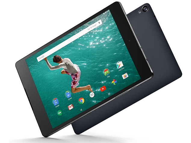
Review – Nexus 9 Tablet

When I took the Nexus 9 out of the box, the first thing that struck me was the unique size. I’ve had several 7 inch tablets, and also a 10 inch iPad for many years, so when I first took this 9 inch device into my hands I was a little perplexed over the reason for such a size. It’s basically a small iPad or a large iPad Mini (to put it into the Apple terms that most would be able to relate to). The device most similar to the Nexus 9 on the market right now is the Kindle HDX 8.9 from Amazon. That particular tablet can go toe-to-toe with Nexus 9 in terms of specs, but comes in $20 cheaper. Of course, the Nexus 9 gives you a clean Android operating system, versus the highly customized Kindle software. So maybe the $20 saved isn’t worth it, if you want more than Amazon’s somewhat limited app selection.
The battle over tablets has reached a fever pitch in the past couple of years. Some signs even indicate that the devices have peaked, as sales are starting to flatten out, or even drop in some cases, in terms of year-over-year growth. Even the all-powerful iPad is not immune to this. Simply put, people who wanted tablets bought them, and now they don’t need another for at least two years, and in many cases the time is much longer. So the tech companies are now heading back to the drawing board of sorts, trying to come up with the next evolution of tablets that will bring consumers back to the table. It’s my opinion that the Nexus 9 is the first effort from Google to do just that. They haven’t done anything huge yet, but by placing the size smack-dab between the small and large tablets, they are in effect offering a middle of the road option for consumers uncertain about what tablet they might prefer. The battle for tablet consumers is only made more intense by the increasing size of smartphones. Where “phablet” was once seen as more of a joke than an actual phone people would want, now the market for the 5 inch screen on smartphones is the strongest of the lot. So as the 7 inch tablet starts being challenged by the smartphone market, and the 10 inch tablets are often seen as too high priced for many consumers, tech companies are looking for ways to offer a better tablet at a competitive price. And that brings us to the Nexus 9.
The Cup Half Full
I did not initially like the Nexus 9. I used it casually over the course of the week, and found myself longing to return to my standard iPad Mini. But then I sat down with the device for a few hours and really dug into it. I got to know the new operating system, Lollipop, and then my attitude started to change.
Lollipop does something that comes as a shock to tech followers , it finds Android copying Apple! It’s been the other way around with Apple ripping off Android for so long, it’s kind of refreshing to see the flat simplistic approach Apple employed with iOS 7 (and now iOS 8) brought into Android’s Lollipop. It’s a welcome change. The previous operating systems, Jelly Bean and Kit Kat, were often way too dark, and the buttons didn’t always make the most sense. That all changed with Lollipop.
I like many of the features, but I will focus on two of them here. First is Multi-User Access. I had the original Nexus 7, and one feature I liked about that device was the ability to set up a “guest account” so others could use my device without messing up my stuff. Lollipop is making multi-user accounts even easier. You can swipe between Google accounts easily, if you’re like me and have multiple email addresses for various reasons. But you can also create additional profiles that can have total access to your google apps, have limited access based on your settings, or have unique profiles built from the guests own google apps using their login information. It’s easy to switch between accounts, right from the notification screen, and the setup was a breeze. This is a feature missing from iPads, and it is a key advantage Android has over Apple currently.
 The other setting option I like is all about the battery. Sure all mobile devices have battery settings. This is where you can see your percentage and turn on your “energy saver” (which the Nexus 9 also has). But the difference with this device is that it will calculate the estimated battery life and graph it for you, so you have a good idea how long you’ve got before you need a charge. I tested out this feature with the screen at full brightness and then at minimal brightness and I saw a four hour time difference in battery life! That’s very useful and very telling about what exactly is sucking the life out of your battery. And it isn’t your addiction to Candy Crush (probably…)
Finally, I absolutely love the speakers built into the front of the device. This is HTC hard at work moving those speakers from the bottom of tablets to the spot where they belong. The Nexus 9 cranks out the sound. It’s not quite as good as the speakers you’ll find on the Kindle Fire line, but it’s better than anything Apple is doing these days.
The Cup Half Empty
Google tries to sell the Nexus 9 as a “one-hand tablet” but I didn’t find that to be the case for me. It’s simply too wide. It suffers from the same issue as the iPad Mini. You can’t one-hand the device. To be fair, the rubber back of the Nexus makes one-hand holding a little easier than the metal-backed iPad Mini, but it’s still awkward and risky, unless you’ve secured it in a solid case. Beyond the size of the case, the build quality of the Nexus 9 just doesn’t seem on par with other $400-$500 tablets. It feels more like a $200-$300 tablet. By feel, I am referring to the cheap rubber back, and the cheap glass. You’ll find the oils in your fingers will smudge both sides of the tablet very quickly. I did side-by-side testing with an iPad to see how quickly fingerprints appeared, and the Nexus was immediately evident with a couple taps on the screen. The iPad put up a better fight, and that is because of the quality of the glass, and the way the glass screen is attached to the device (iPad glass is glued to the surface of the screen versus laying on the screen like the Nexus 9). In addition the volume and power buttons are loose and, again, feel cheap. Google contracted HTC to build the Nexus 9 and the only evidence of that are the metal edges, which show just a shadow of the beautiful HTC One smartphone line. I wonder what the Nexus 9 would have looked like if Google had allowed HTC to bring that design to the larger form.
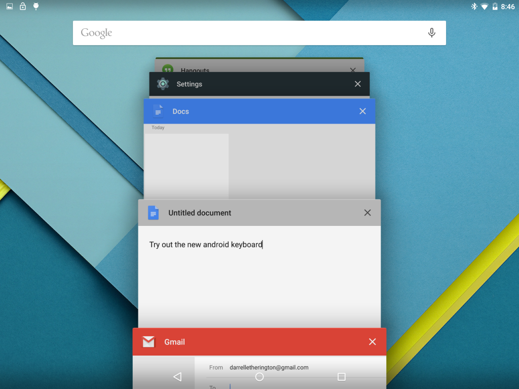 While I really like Lollipop, there is one element that frustrated me, and that is the multitasking pane. When you click the multitask button (right hand button), you get a tiled view of all your open applications. It’s similar to Safari’s Multi-Web page view, for those familiar with the design. You can scroll through your various apps and move between them easily, but when you swipe them away you must do this smoothly or the app will bounce to the side and stay in place. I found that the multi-task pane filled up with lots of apps quickly, and it was a chore to clean up those apps running in the background (which is definitely a good habit to save on battery life).
The last issue I have with the Nexus 9 is the price. The 16GB model starts at $399 and that is simply too much for this device. Since the device doesn’t offer expandable memory, you’re probably best served with the 32GB for $479, which is the largest you can get (no 64GB at this time, unlike many other high-end tablets). The general consensus among reviewers is that the Nexus 9 is a great $299 tablet, and I would agree with that conclusion. With a better build, the device’s software certainly justifies the cost, but the Nexus 9 isn’t there. Remember that Lollipop is very new, so while it is currently only available on a few select devices, given a little more time you will be able to experience this operating system on many other smartphones and tablets.
The Whole Cup Summed Up
 The Nexus 9 ended up being a much better device than I thought it was going to be. While the device looks and feels very mid-level for a tablet, what is under the hood is actually very impressive. Lollipop is a huge step forward for Android; It is an operating system that feels much more consumer focused than previous versions. I am certain that consumers who are less comfortable with this type of technology will feel fine on the Nexus 9. But should they get it? Is it worth the $400 price tag when you can get an iPad Mini with similar specs for $100 less. Or an iPad Air with superior specs for $100 more? I would say to steer clear of the Nexus 9 at this point, unless you really enjoy the Android operating system. There are certainly plenty of people out there who love Android the way others love Apple. And for them the Nexus 9 is a good choice. It’s the best tablet yet of the Nexus Line. It offers amazing speakers and a size that makes it more useful than the typical 7 inch tablet.
The Nexus 9 is the first entry in what I think is the next evolution of tablets. People are used to their 7 inch tablets and 10 inch tablets, and they don’t need new ones. Well, the tech industry won’t stand for that! They need to get everyone excited again! The Nexus is a new size (well Kindle did do it first, I guess) and it indicates a trend to the tablet line that is looking for a way to differentiate themselves from the giant smartphones (iPhone 6 Plus, Samsung Note 4). I’m excited to see what is coming in the next year. New tablets and smartphones will continue to change the landscape and hopefully the casual consumers who bought iPads by the truck load will reap the benefits.

Tech of Disney – Two Awesome Apps!!

Our Walt Disney World vacation was a success and everyone involved agreed that technology played a central role. We’ve already talked about how MagicBands made negotiating the parks, resorts, and souvenir shops easier. Today we’ll look at the applications we used during (and prior) to the trip to make sense of the madness and make sure everyone had a great time.
Disclaimer: Our vacation was in January, which is a slow month. So bear that in mind when making your plans. Even with these great apps, heading to WDW in July will always be pretty busy, but I’m sure these apps will help.
I was the “tech guy” for our trip and I employed several apps to keep everything sorted out. I used Google Maps to negotiate the way from Orlando to Clearwater, Florida and back (we spent a day at the Clearwater Marine Aquarium). I used Yahoo Weather to keep an eye on the sky and help everyone know whether to wear a jacket or shorts, depending on the day. I used the stock “Notes” app on my iPhone to keep tabs on souvenir money, and the breakdown of our meal plans (which we accessed with those sweet MagicBands). But there were two primary apps that I used to make this vacation successful, and I’m very excited to tell you about them. So here we go:
My Disney Experience App

This app is the “official app” from Disney for your vacation. The app provides a ton of tools to use in the parks including Ride Information, Character Meet-Up locations, Dining Options, Guest Services, and even Shopping.
The My Disney Experience App is something you definitely need while you’re in the park, or even before you’re in the park for planning purposes. Let me share how I used the app for our trip.
Using the App in the Parks
 I used the My Disney Experience App for two major things while in the park. First, the app allows you to modify your Fast Pass options directly on the device. We had an early Fast Pass for the Rock Coaster in Hollywood Studios. The bus took a long time showing up (one of the few times that happened to us), and the drive to the park was taking longer than I expected it to. Bottom line, we were going to miss our Fast Pass for the ride, and I knew, from reviewing the app, that we had a 45 minute wait if we had to go through the
 “stand by” line. So I pulled up the Fast Pass options on the My Disney Experience App, located another Fast Pass window, and switched everyone in our group to that window instead. We did indeed arrive at Hollywood Studios after our first Fast Pass had expired, but because of the functionality of the My Disney Experience app, we were able to saunter our way to the ride (taking a family pic in front of the Tower of Terror along the way) and take advantage of our revised Fast Pass window. This is just on example of the many times I adjusted our Fast Pass times with this app. We actually switched which park we were going to one of the days, and I was able to completely reassign our Fast Passes to the other park, all from within the app on my iPhone.

 The second way I used this app in the parks was for Dining. We were doing Quick Service Meals during most of our trip, which is the Disney equivalent of Fast Food. The app shows all of the Quick Service restaurants in the parks with menus provided. On our day in the Magic Kingdom we needed to find a location for dinner. While others in our group rode Dumbo the Flying Elephant, I pulled up the Dining options and took stock of what restaurants were around us (some restaurants have limited hours, and the app indicates that). By the time everyone was done flying I had narrowed it down to two places. With the whole group gathered around, I told them what foods each place offered, and the general consensus was to skip to gourmet mac and cheese of the Friar’s Nook (my choice), and head over for burgers and chicken in Tomorrowland at “Cosmic Rays Starlight Cafe”. You can’t win them all. Having all of the menus at your fingertips is a great feature, and something unique to the My Disney Experience app. If you are doing Table Service Dining, you can even make your reservations right from the app. But make sure you do that way ahead of time, because those slots fill up fast, and you’ll have few, if any, options if you do it the day of your visit.
While My Disney Experience provided some great options, including visual maps to guide our way through the parks, another app was my primary tool to make sure we spent more time on rides, and less time in lines. It’s an app called “Touring Plans”.
Touring Plans App

I’m not sure how I stumbled upon the website for “touring plans“. It was probably during my google searches for “planning a trip to Disney”. However it was that I found it, I can say without hesitation that this app was the jewel that made our vacation a smooth ride from start to finish. Unlike the “My Disney Experience” app, this one has a cost related to it, but I assure you that the price of $12.95 for an annual membership is well worth it. Your $13 gets you access to the Touring Plans website, offering tons of tools, including pre-designed schedules, from which the site got their name. You also can full access to the mobile application (available on iOS and Android). The mobile app is available for free, but you can’t access many of the features without a membership.
The “Touring Plans” app offers all sorts of information about the parks. Park hours (including the “extra magic hours” for resort guests), Crowd Calendar, Wait Times, Fast Pass Availability, and Ride information (height, intensity, description, and ratings). Bottom line, the only things missing from this app are dining information, and the ability to change Fast Passes on the go (but you have My Disney Experience for those anyway). While those features might sound similar to the “My Disney Experience” app, I found that Touring Plans was easier to use, and had more reliable wait times for rides especially.
As I looked over the app, I had a feeling of nostalgia that is usually associated with viewing photos from a trip. But that makes sense, since I spent most of my time there staring at these screens. But I wouldn’t have it any other way. Let me share how I used this app prior to our visit and during our time in the parks.
Using the App to Plan the Trip
Two months before our trip the family gathered to do some trip planning. Using the “touring plans” application I accessed the “Crowd Calendar” which does its best to predict the tourist traffic each day. We could see the days we would be there, with estimated crowd level. We used that information, along with the days that each park had “extra magic hours” (resort guests get early entrance or staying after the park close to the public) to determine which park we would visit each day. Our planning proved overwhelmingly successful. We had minimal lines, and tons of space as we made our way around the parks. Touring Plans Crowd Calendar proved accurate for us!
 The second thing we had to determine was which rides everyone wanted to go on. Bear in mind we had ages ranging from an 8-year-old up to the Grandparents, so everyone wasn’t always going to agree. I used a spreadsheet to create what I called “The Super Awesome Ride Selection Machine”, and filled it with data gathered from the ride descriptions in the “Touring Plans” app. Then I sat with everyone and had them rate their interest in every single ride (0 – not interested to 5 – we MUST go on that!!!!). In the end I had a good idea about which rides everyone wanted to go on, and when we’d need to split up. I used that information in real-time once we hit the park. We managed to get to roughly 90% of the rides we wanted to get to, and that is thanks to the wait time calculator. But I’m getting ahead of myself.
Using the App in the Parks
The “touring plans” app provides estimated wait times for all of  the rides and shows in all of the parks. When you pull up the ride list, you see the Disney posted time (reflected on the My Disney Experience App) and the “expected time” as calculated by Touring Plans. These numbers are derived from historical data and users entering their wait times while they are in line (which is added to the algorithms driving the historical data). I used the app, to time several of the lines we stood in. I verified just about every line’s wait time against the apps expected time and found the app was accurate almost all of the time. If anything, it sometimes stated a longer time than we experienced; it never went the other way! In addition to providing expected wait times, each ride indicates when there is a Fast Pass available, and when the line is expected to get shorter. We planned to ride Big Thunder Mountain again on the day we were in Magic Kingdom. I saw that there was a 40 minute wait as the expected time in Touring Plans. But the app told me that if we waited another hour the line would drop to 10 minutes. We waited (hit another ride in the meantime), and then we rode the ride an hour later with that 10 minute wait! Spectacular.
Anyone planning a trip to Walt Disney World (or Universal Studios – they have this service too), should get Touring Plans. It’s the easiest $13 you’ll spend, and it will definitely make your trip more enjoyable. If you don’t have a tech geek like me in our group, the site offers designed “touring plans” that will literally guide you through the park, hitting all the rides you want to go to at the optimal time. We didn’t use that service, but I can definitely see how it could benefit a group that doesn’t have a person who is fine staring at their smartphone the entire trip.
The Whole Cup Summed Up
As technology increases its presence in our lives, it is becoming more important to be comfortable with the tools. This is certainly the case for a vacation to Walt Disney World. The use of two relatively simple apps will have great benefits for your trip. You will stand in shorter lines, you will use your Fast Passes effectively (we changed some when we realized we had Passes for a ride with a 5 minute wait!), and you will feel more in control of your experience. Need to find a place to eat dinner? The My Disney Experience app has everything you need to know from menus, to prices, to exact locations in the parks. Need to know if it’s worth walking all the way across the park to hit Space Mountain one more time? Touring Plans can tell you how long you will wait before you take one step towards Tomorrowland. These are great tools. They are easy to use. And the first one is free and the second one is a bargain. So make sure to grab these apps before you head to Florida and I’m sure you will have an amazing time!
And when you want to know where to find her, you won’t need a Fairy Godmother…

Apps of Note – Yahoo News Digest
![]()
In recent years Yahoo has been in the midst of a brand shift. They changed everything from their leadership to their logo. The company that was the “Google” of its day, has been looking for a way to get our attention, especially on our smartphones and tablets. They released a Weather App, which I also highly recommend. That app took advantage of the finger swiping we’ve all grown accustomed to on our hand-held devices. I’ve been using Yahoo weather since the day it was released. When I heard that Yahoo was releasing a News App, I was pretty excited to see if they could give me a similar experience, but this time instead of the 10 day forecast or storm warnings, they would give me a dose of the daily news. In my opinion, they certainly delivered.
Do you like to be informed on the daily news without feeling the need to become a news-junkie? Do you prefer your news to come in a package that you can knock out in five minutes flat? Then I’ve got the app for you. It’s called the “Yahoo News Digest”.
The Cup Half Full
The real genius of the Yahoo News Digest is you get the amount of news you want, which can be a quick glance, or an in-depth read. It’s up to you how far you want to dig. When you open the app, you get a list of 7-12 news stories stacked for a quick scroll through vertically. Each story is categorized (World, US News, Politics, Arts, Science, Entertainment, etc.). If you just want to see the high level news, one swipe and you’re done. Just the headlines and sentence or two. To go another level in, just tap which ever story you want to read and a short news article appears. Swipe up and down and you can read the article. Swipe left and right and you’ll be jumping through each of
the articles you had in the main screen. It’s fast!
Each article includes links to larger news stories, or relevant articles to consider for further reading. Once you’ve read all the articles available, you get a “Did you Know” fact that is related to the day or one of the articles you’ve just finished. It doesn’t take long to quickly scan through all the content, which is saying something in the world of the never-ending news cycle.
The Digest is delivered twice a day, and you set the time you want to receive it. My morning digest comes at 7am, and my evening one at 6pm. Finally the app has all the standard social networking links, so if you want to tweet about an article, post it to your Facebook wall, or email it to a friend, the buttons are right there for your clicking pleasure.
The Cup Half Empty
 The Yahoo News Digest is intended to be a “twice a day news” resource. If you want up-to-the-minute breaking news stuff, the Digest will not suit your needs. I put that as a “half empty” element, though for me, I like that it doesn’t constantly update with new information. Once I’ve read my 10 articles, I’m done till the next Digest is delivered.
You also have basically no control over what news you receive. Most news apps have a lot of customization built into them. Not interested in Kim Kardashian and the Hollywood crowd? Just turn of the “entertainment news” and you’re good to go. That’s not an option with the Yahoo News Digest. Though I’ve never seen a Kardashian article yet, so that’s good. Everyone gets the same “paper” for every daily edition, and for many that could be seen as a bad thing, in an age where we like everything customized for us.
The Whole Cup Summed Up
 The Yahoo News Digest is trying to do something very specific. Provide two daily doses of relevant news for the masses. The interface is clean and easy to use. The tap and swipe approach makes this app great for people just getting into smart phone and tablets. The ability to read stories quickly, but also dig deeper into the “in-depth” elements is great for a news-junkie like me.
But at the same time, Yahoo’s “one size fits all” approach to the app will certainly frustrate some users who want to only see news about things they are interested in. If that’s you, I recommend checking out “SmartNews”, which take news customization to a crazy place, and is also one of my go-to news apps that I use every single day.
I really like the Yahoo News Digest and think that it truly is news for masses. It’s the daily and evening paper of yester-year in a cool new package. So stay informed without the distraction of news apps that consume time and attention. Because it’s much better to experience the world than read about it.
Available on Apple and Android Smartphones and Tablets for FREE!

Apps of Note – Hanx Writer (iPad app)

Sitting atop the free apps in the App Store is an odd choice. It’s a typewriter app. It’s actually the typewriter app that I am using to write this short review.
So, I guess Tom Hanks (yeah the ‘life is like a box of chocolates’ Tom Hanks) is really into typewriters. Seems to border on an obsession, but then again, I can think of worse things for a movie star to spend all his piles of money on. Mr. Hanks has decided to try and infect the rest of us with his typewriter hysteria, by way of the “Hanx Writer“.
The Cup Half Full

The app comes with one free typewriter interface, and it’s a decent design. You get an onscreen keyboard with buttons that actually move down as you press them. Of course half of the fun of typing on a typewriter simulator is the clicking sound of each letter and the PING of the carriage return. Fear not! There is no requirement that you physically move the carriage tray back to the left once you reach the end of the page (though you gotta admit that could be kind of cool). You get all the standard word processing options, including spell check, and the ability to backspace (no white out required). But for the courageous, you have the ability to turn off “modern delete” and type without the ability to correct. I am not that brave. While the free typewrite is decent, you do have the option to add additional typewriters for $2-$5. I’ve already made the upgrade to the “Writer Bundle” for $4.99 (see above).
The Cup Half Empty
There is a glaring issue with this app, which has been well documented in the app store reviews, and it’s all about the export options. Basically you are typing a PDF document on this app. I say that because all of the export options (of which there are actually quite a few) only let you export in PDF format. You can’t export to Word or even to Pages. You can send it to Microsoft’s One Drive cloud storage, or Evernote, iBooks, or Kindle, but all you can do with the document there is READ it. I have found that you can copy and paste into any word processing app you might be using, so there is that. Though it’s certainly not ideal. I wouldn’t be surprised if the popularity of this app brings about some new exporting options in the future.
The Whole Cup Summed Up
The Hanx Writer is certainly a geeky indulgence. Are there better writing apps out there, with enhanced functionality? Of course there are. But the joy found in the sound of each button press is definitely something that will trigger the romantic side of many writers. The idea that we are getting a taste of an old way of crafting words and sentences into characters and story.

I’ve long held that the technology that captures our fascination and imagination the most are those that offer new ways of doing things with which we are familiar. And the Hanx Writer, typewriter simulator, is the essence of that idea turned right on its head! Doing something old on something new, in a revolutionary way!
So if you have an iPad or iPad Mini, and want to take a trip into composition’s past, grab this app and get typing!
