Blog Archives
One Week with Meta Raybans: Audio and Camera Insights

Original Purchase Date: October 3, 2024 (used for one week as of this writing)
One week of use is not enough to determine if these glasses live up to the hype, but I have racked up a solid list of what I like about them, and where they can also be frustrating. The glasses are great headphones, first and foremost. Wearing headphones that I don’t have to think about (like putting in airpods) means I listen to more music, more podcasts, and even more audiobooks. I find myself listening to Instagram Reels with the sound on now, where before I just watched in silence.
The camera is also proving to live up to my expectations. Taking pics and videos without touching my phone is a BIG DEAL. Keeping me in the moment, while still capturing a snapshot in time. I’ve also experimented with 1st person video for my cocktail club, the Runaway Anchor, and that works nicely. On the “half empty” side of things, the transition lens is not as dark as I had hoped, leading me to still switch to old fashioned shades when it’s really bright, and the AI assistant has been spotty (though I haven’t used it that much…yet). At the moment I am very happy with my purchase, but only time will tell if these truly become part of my day-to-day life, or if they end up just being another piece of tech I use from time to time. And if they only end up being headphones, I’m not sure that’s a total win.
I own several pairs of very nice headphones (including Airpod Max) and I can confidently say that these glasses are my new favorite headphones. If kept at 50% volume, people around you cannot hear what you are listening to, and when you crank up the volume full blast, you can enjoy music and podcasts while mowing the lawn (tested last weekend). The quality of the sound is certainly not on par with the big “over-ear headphones”, but that’s not the point with the Meta Raybans. The point here is all about access. How easy is it to just hop in and out of your audio content. I no longer have to put Airpods in and out all the time, or look for where I put my Airpod Max headphones. With the Meta Raybans, I am always wearing my headphones, while at the same time, I’m kind of never wearing my headphones. It’s trippy, and unlike much of the technology changes over the past 5 years, it’s kind of life altering. I interact with audio on a different level now. I sneak little snippets of music and podcasts all the time, where before I would have to dedicate time for listening to audio sources. I also listen to audio in Instagram Reels and News stories because accessing the audio is just a tap away, and I never did that before these glasses.
The audio is turned on and off with a single tap on the right side. Sorry all you left-handers out there, this is a right-handed device for now (sigh). Two taps will advance the track for music and three taps will go back a track. Touch and slide forward to increase volume. Touch and slide backwards to decrease the volume. That’s it. Whatever audio source you are using on your phone will be controlled by tapping. Switching between things like podcasts, audible and music is a little clunky at the moment. Spotify support is supposed to get better, and you can have a default service when you ask for music (mine is Apple Music). But you can’t ask for an audiobook on Audible to start right now. That’s also an update that is said to be coming in the near future.
There is also a touch and hold audio feature that will start a designated music source (amazon music, apple music, spotify or calm). I have that set for Spotify, as I have better playlists there (curated by my kiddo). It’s a bit random at the moment, and I use the feature for my “I don’t know what I want to listen to right now” moments. So that’s it for the headphones part.

The camera is what got me to pull the trigger on this purchase. The idea that I could grab pics when I’m doing something fun without the usual “phone fumble” was exciting to me. Think about it. If you see something cool and want a pic, you do this: take out phone, wake it up, open camera app, point camera at thing you want picture of, push the capture button, turn off phone, put phone back in pocket. That’s a lot of steps. And the moment you capture is through a viewfinder (as in your phone screen)! With the Meta Raybans your eye is the camera, and the capture is just a single tap (or a voice command of “Hey Meta take a photo” if your hands are occupied or perhaps in the pic). I even managed to snap a pic of a book I was holding, by pushing shutter and quickly putting the object into the frame (see pic).
The camera is easy to use. Tap the button to take a picture (again, on the right side only!!) Hold the button to take a video (default is 1 minute, but can be increased to 3 minutes in the mobile app). I discovered quickly that if you are wearing a baseball cap the camera will see it, and you get a notification that the “camera is blocked”, but only after you are done shooting the video. So I ended up turning my hat backwards when I use the camera, which isn’t a great look, but it is functional. I don’t do a lot of “out in the world” videos, but I’ve shot a few to show different light impacts on filming (I’ll share those videos in the future, when I deep dive into the cameras). For now, I’m much more interested in the “point and shoot camera” but again, the hat brim will get in the way…
The quality of the video and images is great. Not as good as most current mobile phones, but still great for their intended purpose (quick snaps of what you’re doing, without the need to grab your phone). The audio capture is also great. I’ve made a couple cocktail videos that worked nicely, and I did a recording while singing and playing the piano that turned out nicely too (I will not be sharing that video though!) Time will tell how much I continue to use the camera. It’s worth noting that you can set up the mobile app so when you import images and video from the glasses they will copy into your phone’s photo library too. And if you delete the images in the Meta Mobile app, it will ask if you’d like the library copy deleted too. That is very handy and keeps down the image clutter!


Alright, that’s enough good stuff. What about the bad stuff, right?!? Much like the new iPhones, the AI elements of the Meta Raybans are pretty basic, but promise updates “soon”. The command is “Hey Meta” and then you can ask basic questions. Weather and Timers work great (just don’t use the British voice assistant or you’ll get Celcius for weather). You can “google things” with some success. I was able to ask for the hours at a local restaurant before heading out the door (some day maybe I can get on the wait list with a quick voice command…) But, all in all, the AI is more of a gimmick, than a feature I use often. But I truly haven’t kicked the tires to hard yet, and plan to do that in the weeks ahead. Stay tuned.

The one AI element that has been most interesting to me is “tell me what I see”. When you ask this you will get a detailed description of what is in front of you. Down to pretty detailed elements. Then you can ask it to write a poem about what you see. Here the pic and poem the glasses came up with when I looked at my home desk. When the features update to include actionable questions, that’s when this tool goes from gimmick to useful. But we are not there quite yet. I am hopeful.
I’m just a little over a week with these Meta Raybans smart glasses, and so far I’m really impressed. A friend of mine, who is a fellow Meta Raybans owner, responded this way when I said I was really enjoying the glasses so far. “I know you’d love them… they are so in line with your tech values”. That is really true. I do not like my smartphone. I do not like staring at screens. I think it’s better when we put our tech aside and just be in the world. But realistically, we are stuck the mobile internet on our person at all times. So any tech that keeps my hands empty and data easily accessible is definitely “in line with my tech values”. And so far, these glasses are doing it. Now I just have to see if my usage is sustainable, and not just the excitement of something new. I’ll be back with more posts in the future, as I examine daily use and dig into specific features in much more depth. Till Next Time…

Where It Stands: Apple HomePod

This is a review of the Original HomePod, released in 2018. That meant it was paired with the iPhone 6, to give you an idea of the time lapse here! The second generation was released in 2023, which means this first model had a 5 year life before the 2nd gen, which is pretty long for first generation technology. Let’s get into it.
Original Purchase Date: Spring 2018 (I did not review this product at time of purchase)
Time used between Purchase and Where it Stands: 6 years
I debated between the Sonos One and Apple HomePod at the time, and got to try them both. I went for Apple mostly because I thought it looked “cooler” and liked that it paired with my iPhone and Apple ecosystem. Sound-wise the two were the same to my non-audiophile ears. The speaker proved to be an amazing way to increase music playing in our house. Previously we’d been using a reciever and speakers with an iPod plugged into the Auxillary jack. With the HomePod, everything was just simple and the sound was amazing, and it stayed that way all these years.

A couple years ago we upgrade to a Samsung Frame TV. While the TV itself is pretty awesome (hidden on the wall of other framed pieces of art), the sound SUCKS! And the interface is almost un-usable. I do not recommend the Frame TV unless you plan to upgrade how you will use it with a Roku/FireTV/Apple TV setup. We choose, un-suprisingly, to pair an Apple TV, but that didn’t solve the sound issue, until I learned you could pair the HomePod as a soundbar! It worked almost seamlessly, and we have used the HomePod as our soundbar for the past couple of years. I imagine that two HomePods in stereo mode would be even better, but these things still cost $300, so we’re sticking with the one until it dies.
No review of an Apple product would be complete without mentioning Siri, the voice assistant. Most reviews are quick to call out the tool as “very bad”. Our house is ruled by a combo of Amazon Alexa and Apple Siri. We use Alexa to control our lights and other smarthome items. And we use Siri for music. Both assistants can set timers and tell you the weather just fine (though the Homepod couldn’t set timers when it first launched). They also both decide to start talking out of the blue for no reason. The Siri voice assistant is sure to get better when Apple rolls out “Apple Intelligence” in the next version of their Operating System in the fall of 2024, but for now, the voice assistant on the HomePod is fine. It’s functional. And rarely that annoying. As long as you don’t set your expectations too high.
We’ve seen no issue with sound quality over the 6 years that we’ve used the HomePod and recommend it to anyone looking for a high quality smart speaker. It’s best with Apple products, but it is also easy to use Spotify, which happens often with us, as we have a teenager in the house. Definitely a good product after all these years!
ElevatoR(eview) Verdict:
Design: Cup Half Full
Ease of Use: Cup Half Full
Sound Quality: Cup Half Full
Cost: Cup Half Empty
Overall: Cup Half Full
Long-form reviews of the current Apple HomePod to consider, when you have more time:
First Impressions – iPhone 7 and 7 Plus

There are plenty of long form reviews of the newest offering from Apple (see a few links below), so let’s keep this one short and sweet. Apple released a “new” version of their iPhone in September. They skipped the major form factor update this year because they plan a huge update next Fall, on the 10th anniversary of the release of the 1st iPhone. So the phone looks the same, and for the most part is the same. So for these First Impressions we’ll hit what’s new, and the ultimate question: should you update?
What’s New
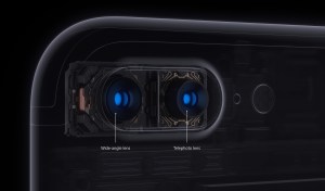 Cameras – the iPhone 7 gets Optical Image Stabalization, which assists with our shaky hands for pics. The PLUS model already had it and still does. The PLUS model gets a second back camera for a physical zoom feature and “portrait” mode, which blurs the background and focuses on the person in the foreground, which is pretty cool. Standard updates are there too, for things like “aperture” which no one really understands unless they are hobbyists, IMO.
 Home Button – the button doesn’t click anymore! It’s now “haptic” which means it has a little buzz feel that tricks your brain into thinking it clicks. The button also has a version of “3D touch” which was introduced on the screen with the 6S models. Basically a soft touch does one thing and a hard press does another. Takes some getting used to but it works. And it’s prepping us all for the removal of the button entirely in the next version.
Headphone Jack: It’s gone. You’ve heard. The phone comes with a dongle that works fine with my wired headphones. I await the sale of another dongle to give me two ports so I can listen and charge at the same time. The phone is mostly water-proof now as a result, which is a good thing in my books.
New Colors – Two new “blacks” were introduced. Goodbye to “Space Grey” and Hello to “Jet Black” and “Matte Black”. I elected for Matte Black, having heard that Jet Black, while very pretty, will scratch like the dickens. Who told us this you ask?? Apple!! Not a good sign.
Should you upgrade?
If you have a 6S you should not! There is absolutely no reason to upgrade if you have last year’s model. The improved camera and home button are not worth the upgrade. And by staying put you are perfectly positioned for the big update next year. If you have an iPhone 6 you’ll want to think long and hard about this one. If you are doing 2 year cycles, upgrading this year will put you on the outs next Fall. The tried and true approach of 2 year upgrades to new form factors with iPhone has certainly gone off the rails this year. So if you like getting the newest looking phone (versus the “S” year updates), then keep that 6 another year. If you have the battery issues with the iPhone 6 that have been reported, you might find sticking it out 365 more days a challenge.
The Whole Cup Summed Up:
Design: Cup Half Full (unlike many, I think the 6 series is great)
New Features: Half Empty (this is a “S” year masquerading as a major update year)
Upgrade Now?: Half Empty (if you can, stick with what you’ve got one more year)
Overall: Half Empty (I only have this device because I need it for my job. For my personal device, I’d wait for the big change Fall of 2017)

Long-form reviews to consider, when you have more time:
Charitech – One Today (App of Note)

I love technology and I strive to be charitable, as much as I am able. As a tech geek I use technology to make philanthropy easier. These are my tips and tricks. I call it Charitech.

Last Summer, when I started focusing a lot of energy on philanthropy, I was quickly overwhelmed by the daunting task of charity. It’s so easy to see the great needs and want to run in the opposite direction. Sadly, that seems like a natural reaction. So my first goal was finding ways to make charity more accessible and less scary. One of the first apps I found is called “One Today“.
 “One Today” is a Google product. For some that’s a great thing, for others that might be a reason to run for the hills! But I would recommend checking it out, regardless of your attitude towards the great search engine giant. “One Today” is a great way to do charity in small ways. And it’s as simple as the touch of a button.
When you first download the app, you are asked to select areas of interest that you would like to contribute funds towards. I chose: Food, Health, Housing, Civil Rights & Liberties, and Poverty. From there the application provides a variety of charities to choose from for donations. And all you’re being asked to contribute is one dollar. Yep, just a buck. That is something I could manage.
The very first charity I gave to really opened my eyes to poverty. The  charity is called “Rescuing Leftover Cuisine“. This charity “brings excess food from restaurants, catering companies, and institutions to local agencies, such as homeless shelters”, in 12 different cities in the United States. The app provides additional information about the charity and the need. For this charity they point out that while “40 % of food produced is wasted, while 1 in 7 Americans face food insecurity”. I was shocked that such a charity was needed in the United States. In a nation of such great wealth, I couldn’t believe it. But those are the numbers, and it makes sense, when you think on it a bit.
So what does your ONE DOLLAR get? Again, according to the app, $1 means 42 meals for the hungry. 42 MEALS!!! That was another shocker, and it was a simple choice to push the blue button in the lower right corner and contribute one dollar. Maybe I even dug deep and gave $2 that time and BOOM!! 84 meals for the hungry. It’s so small, and so big at the same time.
 I love how this app makes small acts of charity accessible. My daughter and I created an idea back in the Autumn of 2015. It’s called “Penny for the fountain, Dollar for the Poor“. Whenever she comes upon a fountain that she wants to toss a penny into, we open “One Today” and find a charity to give one dollar to. We talk about the charity options, and press that magic button. Then she tosses her coin in the fountain. That’s everything I hoped to accomplish with my other blog “Developing Charity” in a nutshell. Adding a little charity to an action that was going to happen anyway. My daughter is a big believer in the power of wishing wells! 🙂
So consider downloading this app, and giving it a go. It won’t take much time, it won’t take much money, but a little can add up to a lot.
Download the app here: iOS and Android
And check out more information on charities at www.developingcharity.net
#practicecharity
First Impressions – iPad Pro
For years there has been buzz about a giant iPad. An iPad that could take on the Surface tablet (which loves to point out how it beats the Macbook Air in side-by-side commercials). An iPad that would finally be as much about content creation as it is about content consumption. An iPad to rule them all. In September those rumors proved true, when Apple announced the iPad Pro. A gigantic iPad with a screen size of nearly 13 inches. With increased processing power, and all the bells and whistles you’d expect from a $1000 laptop (with similar price tag). For months the only people who could tell us anything were people in the tech review industry (i.e. tech geeks) and Apple itself (um…conflict of interest). But last week I finally got my hands on one. I’ve had it for about 5 days, and these are my first impressions.
It’s an iPad
 Let’s get this out of the way first thing. Yes, it’s a huge iPad. It looks like some mad scientist zapped the old iPad with some type of engorgement ray. Partnered with the classic “smart cover” the device looks pretty ridiculous at first glance. It’s just a big iPad. What good is that? I asked myself that question immediately after getting it into my hands. Sure, it’s a very nice iPad. It’s modeled after the current line of iPad Air 2. That means it’s super thin, very light, and has nice features like touch ID and improved cameras. While some apps have already been optimized for the larger screen, the vast majority of applications are just larger versions of their iPad Air counterparts. I’m reminded of the time when the first iPad came out and all of its apps were just iPhone apps blown up. Things are much better here, going from “little iPad” to “big iPad” but the comparison is worth noting. And just like what happened back then, the apps for iPad Pro will soon take on a life of their own, as developers start taking advantage of that massive 12.7 inch screen; not to mention taking advantage of the multitasking feature (also available on iPad Air 2) and the new Apple Pencil (a stylus). Right now this is a big iPad, but it won’t be that for long.
It’s a Laptop
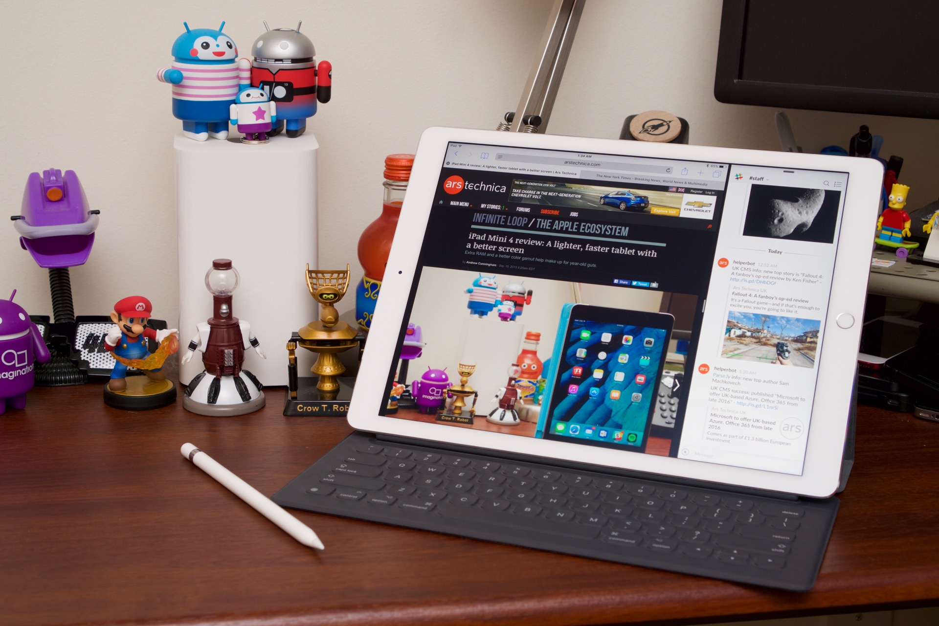 It took a couple of days to convince me of that statement. At first I didn’t see it. I’ve paired my iPad Air 2 with a bluetooth keyboard before. Heck, I’ve paired my iPad Mini with the slick Bluetooth keyboard from NewTrent, and got to pretend like I had the world’s tiniest macbook. But the iPad Pro is a different matter altogether. Unlike these previous hybrids, the iPad Pro is not pretending to be anything more than what it actually is. It’s a laptop (with a couple caveats of course). So what makes a big iPad a laptop? Let’s break it down.
Screen Size/Resolution – The first feature that easily distinguishes a laptop from a tablet PC is screen size. For  comparison let’s talk smartphones. When you cross 5.5 inches in screen size, the industry stops calling it a phone, and starts calling it a “phablet”, which is a hybrid of the terms “phone” and “tablet”. Once you hit 7 inches in screen real estate the term “tablet” seems to be universal. Usually the “phone” element disappears at this screen size too. That term sticks around all the way through the current “full size tablets” like iPad Air 2, Nexus 9, and Microsoft Surface Pro 4. But tablets are getting even bigger. They are becoming laptops. Please God, don’t let their ever be a “laptab” or a “tabtop”. Most entry level laptops start at 11inches (examples). So at almost 13 inches corner to corner, the iPad has the right screen size. It should be noted that the screen resolution of the iPad Pro is on par with the Macbook Air, so check that box off as well.
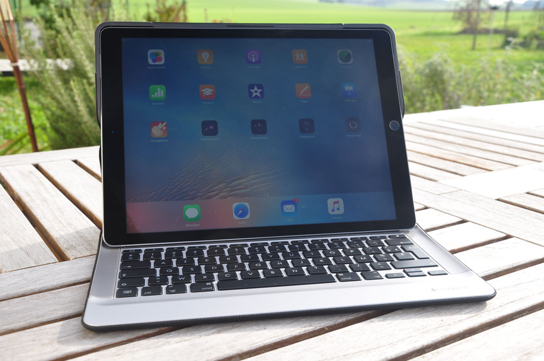
Keyboard – This one is huge. Laptops have always had keyboards. Sure, many hybrid laptops these days have  detachable screens, but the key function of the computer is found in its keyboard. It’s how you do everything. It’s how I’m typing this post right now (on the iPad Pro!). Email, web browsing, writing school papers, and the like. All require a good keyboard. And bluetooth keyboards are more often than not, pretty crappy. I’ve had a couple of decent ones, but even those I always know I’m going to deal with disconnection issues and battery life. For a tablet to become a laptop you need a keyboard that is literally part of the overall machine (no bluetooth, no battery charging). And Apple has done it with the iPad Pro. They introduced the new “Smart Keyboard” ($169) which connects to the iPad Pro using a new “Smart Connector” which are circles on the side of the iPad Pro that connect to 3 beads of metal on the keyboard case. I’m currently using the Logitech Create Keyboard ($150), which protects the iPad all around (the Smart Keyboard only covers the front). It’s adds twice the weight and three times the thickness, but it also makes the iPad Pro feel like a laptop (and is still the lightest laptop I’ve ever had). Finally, the keyboard must have keys that CLICK. Some might argue with me here, and perhaps the next generation will be more comfortable typing on flat surfaces, but I still need the response of the click. The feel of the button vastly improves my typing rate and minimizes my spelling errors.
Processor – Quick note, cause I know this one is super geeky. For a tablet to be a laptop, it needs to be able to work just as hard in terms of processing power. The processor is crucial to everything from how fast your applications run, how effective multitasking will be, even simply how responsive all those cool games will be. The iPad Pro has a processor on par with the Macbook Air, so again, no silver medal for the tablet this round.
It’s still missing some stuff
So I’ve made my arguments for why i consider the iPad Pro a laptop. I’d be a fool to refuse to face the gaps that are clearly there. So here is what the iPad Pro is still missing. First off, it is missing a MOUSE or TRACKPAD. Those are bold for a reason. It’s essential to have another way to interact with your screen besides your finger. But what about the Apple Pencil? The stylus could replace the mouse, right? I do think that the stylus is a great tool. I wish the iPhone 6 Plus had one. The Samsung Galaxy Note 5 has an awesome stylus. But that’s an accessory, and we are talking about the iPad Pro as a laptop. The stylus is useful but not integral to the laptop model. What is integral is either a trackpad, or option to attach a mouse. And the iPad Pro offers neither option, and that is an issue. This is particularly painful when I’m trying to edit something in a Word doc (like, say, this blog post). A trackpad/mouse would make that process much easier, and would feel like a laptop. So the iPad Pro needs something, even if it’s an over-priced bluetooth enabled trackpad to pair to it. It would be better to put
 it right into the case, like the Microsoft Surface has always done! The next gap is USB support. For the iPad Pro to be a laptop it must allow for peripherals. This is where the whole mouse thing could be dealt with. But this is also where you could add some extra memory options for the woefully inadequate 32GB storage in the cheapest model. Apple seems to believe that Bluetooth/WIFI connected devices are the future, and everyone wants to store their content in the Cloud. Maybe they’ll be proven right, but for now those missing USB ports (found easily on any other competitor of this size) are going to hold some people back from believing this device could ever replace the laptop. The last thing missing are optimized apps, but those will come. I wish that the device ran a hybrid of the Macbook OS (currently El Capitan) but for now we’re stuck with iOS. But 3rd party developers seem to like making money, so I’m sure they’ll save the day sooner rather than later.
The Whole Cup Summed Up

I wanted to hate the iPad Pro. I wanted to say it’s just a big iPad. That it isn’t going to replace the laptop. But I was wrong on most of those counts. I set my Macbook aside for the past 5 days and have used this iPad Pro as my laptop exclusively, and it’s proven itself to me. I am certain that this device is just the first step towards a whole new kind of laptop. Microsoft has had the “tablet/laptop hybrid” market more or less to themselves with the Surface line of tablets. They have had a blast mocking how versatile the Surface Pro is compared to the Macbook Air. And if not for the issues that plagued those devices around Windows 8, we might be saying Microsoft redefined the field. But that playing field is starting to level out. It’s not there yet. The iPad Pro has a couple gaping holes that the competition is sure to point out right away. No trackpad!!!? No USB ports!?!?! That’s just a huge iPad and not a content creation machine!! That’s what they will say. But they would be wrong. The iPad Pro is a laptop. It’s a first gen for Apple, and it’s an indicator of something new to come. There will always be tech geeks who hate how Apple claims to do “new things” when what they are doing is hardly new. (it actually annoys me too) That will be the case for the iPad Pro as well. But Apple markets their products with greater success than any other company, and they create markets where before there were only struggling sales. They did it with the MP3 Player (iPod), then the Smartphone (iPhone); they did it with the Tablet PC (iPad), and most recently with the Smartwatch (Apple Watch). All of those markets existed before Apple introduced their products. But few can argue that those markets weren’t radically changed after Apple introduced their tech. And those revolutionized markets brought opportunities for all sorts of new products, across many companies. Apple drives me crazy a lot of the time. The company just strikes me as too arrogant and full of themselves. But they make good stuff. And the iPad Pro will go down as one of their successes. That’s my bet. Though it might also be the device that killed the Macbook Air. But, in the world of mobile tech, it’s all about change. And this change appears to be a good one.
Here are a few other reviews of the iPad Pro to check out:
5 Things I noticed in my first hours with the iPad Pro – Macworld
Where it Stands – Apple TV (2nd Gen) and 1st Impressions of the new Apple TV!
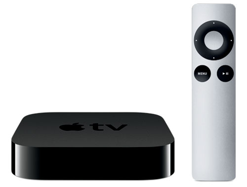
I’ve never actually reviewed the Apple TV on this blog. But I’ve had my current model for 5 years, so I think I can handle a “where it stands” review. Just know that when I first got my Apple TV it was the star of my entertainment center. It was my first streamer (followed by Roku, Chromecast, and Fire TV). It integrated well with my Macbook and my iPod Touch (these were pre-iPhone years). It had Netflix, which was all I cared about at the time, and I couldn’t say enough good things about it. Over the years Apple has added new “channels” including other streaming staples like Hulu, Crackle, and HBO Now. But after 5 years it is only one of several streamers that I have on my TV stand. And while I don’t use it exclusively any longer, it is still streaming throughout the week. So this old dog (5 years is ancient for tech like this) is still proving itself, but there is a new sheriff in town, and that’s the brand new 4th Generation Apple TV. So before we talk a bit about the difference, let’s first take a look at the 2nd Gen Apple TV, and see where it stands.
Apple TV – 2nd Generation (STREAMING MEDIA BOX)
Original Purchase Date: 10/01/2010
Time owned between Original Purchase and Where it Stands: 5 years, 45 days
Initial Impressions
In 2010 media streamers were not a large market. Even now, 5 years later, they aren’t a huge market, though many companies (amazon, roku, google, apple, etc) are working to change that situation. But back in 2010 “instant streaming” was as much a novelty as anything, as people still clung to their DVD players. The mass movement to digital media had only just begun. I’ve already spoken of my first impressions of the Apple TV, but understand this streamer was excellent in those early years. It had a simple interface (with only a few channels initially). And it saw cool updates every year, like Airplay where I could “cast” the content of my iPod/iPad/iPhone to the TV through the Apple TV. This was years before Google would introduce the same function with the Chromecast (another streamer I now own). So it was great. At the time it would have been my first recommendation, but five years is a long time.
The Tech in Action
Apple is a closed system. Always has been, always will be (to some degree at least). My first major beef with the Apple TV was that there was no way to play external media, like movies stored on an external hard drive. I was already into digital media when I got the Apple TV, and my tool of choice was the WDTV. This device allowed me to plug-in an external hard drive and watch my movies and shows via a simple interface on the screen. To be fair the only current media streamer that kind of does this is the Roku, and even that device is now a smooth experience. So the Apple TV has you locked into the channels they offered. I use Netflix and Hulu for the most part, and both work well on the Apple TV. I’ve found some cool education channels like the Smithsonian Channel and Discovery Channel that offer lots of free media. But, as it always seems to be with Apple, the free stuff will only get you so far. Most of the channels require some form of payment (one time or subscription). So don’t get too excited by the Disney Channel, HBO Now, or ESPN. You are going to pay for those channels to get much more than ads. Over the years the Apple TV has added channels and functionality without sacrificing speed and experience. That’s pretty unique, especially for Apple, which always is pushing you to their new devices by ditching support for older devices, at least in my opinion. So where exactly does this five year old streamer really stand?
Where it Stands
 The 2nd generation Apple TV was discontinued in 2013, so why are we having this conversation you might be asking. While the latest and greatest Apple TV is out now, you can still get the 3rd generation Apple TV and it will only run you $69. That’s better than the $100 I paid for my device in 2010. And it’s better than the entry-level price of $150 for the 32GB model of the 4th gen Apple TV. So I think these thoughts on the 2nd generation are relevant. So would I recommend it? As an entry-level media streamer the 3rd gen Apple TV is a bargain, since most similar devices will run you $100. But there are better “entry-level streamers” in the form of “streaming sticks”. Roku and Amazon both offer these for around $50. The Chomecast will only set you back $35. So from a price standpoint, I wouldn’t recommend the Apple TV. While it works just fine, it is expensive for something so old. It also works best for a household that already has other Apple devices. Where other streamers get along with everything better. If you have Amazon Prime, I’d point you to the Fire TV Streaming Stick. If you are brand new, with no affiliation, I’d point you to the Roku Streaming Stick. The Apple TV is good but no longer good enough.
So for now, the Apple TV (2nd and 3rd Generation) scores a CUP HALF EMPTY
First Impressions of Apple TV (4th Generation)
 Here is the short list of what the new Apple TV does that is different and exciting. First it’s a whole new interface, called TVOS. The iPad has truly come to the TV screen. And app developers will reap the benefits in the same way they’ve been cashing checks with their iOS apps for years. By allowing 3rd party apps on the Apple TV all sorts of options open. The long-awaited PLEX app is already available. This app allows you to stream media from your computer, or server (if you are a geek like me). This is similar to what the Apple TV has done for years with Airplay, but now any device running PLEX can take advantage of it. And thus begins the rise of digital libraries!!
The new Apple TV features an updated remote control with a trackpad vs the direction pad of the old device. It’s still small, so you’ll be checking the couch cushions from time to time, I’d imagine. The remote also takes a card out of the Fire TV deck with voice control. Of course Siri is front and center, pulling up shows and films based on search criteria. The really cool thing that differentiates the Apple TV from all other streamers in this regards is what I’d call “layered search”. You can search for comedies. Then filter to a specific star, and the search will modify accordingly. I haven’t tried this feature in person, but I can imagine the possibilities, having done voice search with my Fire TV for over a year.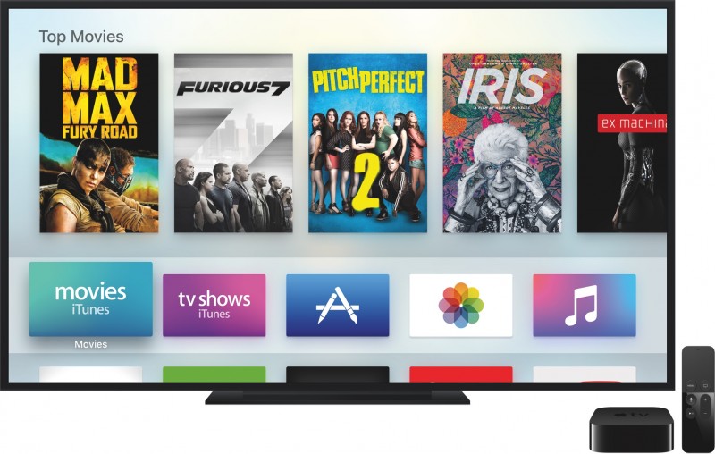
Finally, gaming. The Apple TV has long been an untapped resource for gaming revenue. The idea that you could throw iOS games to the screen was introduced with Airplay, but it was always clunky. Now Apple is taking on the Fire TV specifically, which also has a gaming element (and associated controller). Only time (and 3rd party developers) will tell if gaming will find new life on the Apple TV, but it seems like an easy bet to make.
Apple likes to “redefine” genres. They did it with the smartphone (iPhone), they did it with the tablet PC (iPad), they are trying to do it with the smartwatch (Apple Watch). And now they are truly going after media streamers. Roku, FireTV, Chomecast, and a few others have never faced competition like what it coming. Will the Apple TV prove to be the best? Only time will tell. But things look promising. Stay tuned.
Charitech – Where Charity Meets Technology
Last August I had a moment. One of those moments that forever changes your trajectory. That moment came from my experience with a story about a displaced Palestinian man, who fled Syria to Lebenon with his two kids. He made a living selling pens on the street. The amazing element is that a picture of the man spawned a kickstarter style campaign, raising over $250K for him and his family! The story of such giving floored me. And looking at myself in the mirror, I knew I that I wasn’t doing enough. Why? Because I wasn’t DOING ANYTHING! I talk a good talk, but that was it. So at that moment I decided to change. I launched a new blog (www.developingcharity.net). And I started an effort I called “Project 520” where I would donate $10 to a different charity every week of the next year ($10 X 52 weeks = $520). And I’m just wrapping up my 10th week. And it’s been great so far. But I wanted to find a way to connect my love of technology with my newfound charitable efforts. And that’s what “Charitech” is all about.
Charitech – How technology tools can enhance the process of personal philanthropy (in big and little ways)
I’ve long held that technology needs to enhance our lives. That’s the essential element. I have found tech tools that enhance my experiences with charity, and I plan to highlight a couple of them in “Apps of Note” in the coming weeks and months. But let me introduce you to one tool that is well worth your time. It is called “Charity Navigator” and it is availalbe as an app (iOS and Android) and a website. If you are a skeptic when it comes to charities. If you wonder, “where does my donation actually go?” or “how much of my donation goes to administration and fundraising?” This app will help you. This app can give you a wealth of information in an easy to digest package. So let’s break it down with a simple “App of Note” review.
Charity Navigator

In the simplest terms, Charity Navigator is a repository of sorts, gathering up data on a vast array of charities from around the country and around the globe. With a simple “search” function, you can lock in on a specific charity and look at the basic metrics of their philanthropic efforts. A quick search for one of my favorite charities, “water.org”, shows a 4 star rating, and a score of 95.38 out of 100. These numbers are arrived at through an analysis of both the financial responsiblity of the charity, as well as accountability and transparency. The main page of the search shows the address and phone number of the charity, and lists the board leadership, CEO, and mission statement. All important information to have public, ensuring that your chosen charity is on the up and up.
A slide to the right reveals the next feature of the app, “metrics”. Two pie charts are shown, the first a breakdown of where contributions come from (contributions, gifts, grants = good), and the second charts shows how the expenses break down (the larger percentage going to “program” the better). For my chosen charity, 99.2% of their funds come from “contributions, gifts, and grants” and 73.4% of their expenses go to program. That’s not too shabby. Though I have seen charities with over 90% going to program. It’s just important to remember that the
larger the charity is, the more money is probably being donated, and there will be corresponding overhead, in terms of the people needed to manage those funds efficiently. Which is what leads to the final section.
![IMG_0548[3]](https://twolumpsoftech.com/wp-content/uploads/2015/11/img_05483.png)
![IMG_0549[1]](https://twolumpsoftech.com/wp-content/uploads/2015/11/img_05491.png)
 Sliding the screen down from the two pie charts you are greeted with a vast array of data. Revenue vs Expenses in bar chart. Full breakdown of expenses. A checklist of accountability and transparency including things like “audited by independant accountant”, “independant voting board members”, and “CEO listed with salary”. The more check marks, the stronger the charity. Finally you’ll come to the money. Actual totals of revenue and expenses. Here’s where you find out if a large adminstration cost is justified. Water.org has annual contributions of over 15 million dollars. So I can understand why they would need people to manage those funds, and ensure proper distribution to the people who need the services the charity provides (in this case, clean water to third world countries mostly).
The Whole Cup Summed Up
Charity Navigator is a tool in the arsenal of anyone interested in becoming engaged in philanthropy. I agree when the skeptics say you need to know where your money is actually going. Where I break with the skeptics is the next step. Many people use the bad charities as an excuse to do nothing. If there are charities mis-using donations then all charities are bad. I guess that’s the logic. But with tools like Charity Navigator, we don’t have that excuse. This tool helps anyone become educated in intelligent giving. You can know with a reasonable amount of certainty that you are indeed giving to a good cause by using these tools. And I highly recommend checking the app out.
Charitech – Where Charity meets Technology
 This is just the first tool I’m sharing on Two Lumps of Tech. I have others. I have a whole folder on my iPad and iPhone filled with such tools. Giving isn’t hard, once you do it. It’s that first step. That first buck or $10 in my case. And once you have your tools straight, once you have your plan of attack, then it’s easy. And it feels good to do it. Because now your technology is not only helping you, it is helping others. And that brings our gadgets to a whole new level.
Remember – Something is Better than Nothing.
#practicecharity
App of Note – Funny or Die News Flash

UPDATE: August 2016. This app is no longer being offered. But read on and remember a cool concept, and hope for something similar to return to the news landscape. We can all use a little humor in our daily news!
I’ll admit it. I’m a bit of a news junkie. I do my best to stick to tech news and the major headlines, and I try to stay away from the comment sections. I think it’s good to be informed, but in a world where endless news articles are just a click away, some balance is required to not find yourself immersed by the torrent. Enter, smart news applications.
Smart News apps are designed to give you a quick burst of news. Not too much, but not too little. I’ve already reviewed one of my favorites, Yahoo News Digest, in a previous “App of Note”. Today I want to introduce you to another. And I’ll get this out of the way first, it is currently iOS only. So if you don’t have an iPhone or iPad, you are out of luck for the moment. But do read on, for this sweet little news app will certainly come to Android in the future, and if you’ve got a good sense of humor, and a tolerance for minor vulgarity, this news app will keep you informed while it’s making you laugh, and it’s called “Funny or Die News Flash”.
What Makes a Good Smart news App?
 In my opinion, every Smartnews app should meet the following criteria:
1. Scheduled Delivery– Smartnews should come at specific times during the day, versus constantly being updated. That way you can read all the content, and you know you’re done until the next delivery. Just like the good ole newspaper!
2. Short Informative Articles – Smartnews should be a quick read. I’m talking about the walk from the car to the office, or an elevator ride. You should barely need to scroll down through the article, because your goal is to know the top stories and that’s it. There are plenty of apps offering a more lengthy take on the news of the day (see #3)
3. Links, Links, and more Links – While a smartnews app is designed to be a short read it should offer links to get to longer articles, or even related articles from within the app.
4. Social Element – Smartnews should at the very least offer buttons for Facebook, Twitter, Text, and Email. That way if you read an article you want to share with others, it’s just a click to send it on it’s way.
5. Intelligent Swiping – This one might just be me, but every smartnews app I’ve used makes use of up/down and left/right  swiping in intuitive ways. That’s the key to a quick read. Read what is on the screen, swipe left, read the next story, swipe left, and so on. You want to send to Facebook, swipe up, click the icon, and off it goes. If a smartnews app is clunky, it is no longer serving it’s purpose.
So let’s see how the “Funny or Die News Flash” application stacks up to my criteria.
It Offers a Good News Spectrum
The app takes brevity to a whole new level. Each “story” is designed with two sections. The first part is the informative news piece. The second part is the joke related to the first part. It can literally be two sentances. That certainly puts the “flash” in news flash. But while the articles are incredibly short, they are also very diverse. US, International, Business, Entertainment, Sports, Tech. They don’t all show up each day, but I’ve seen them all appear from time to time. I checked the articles showing in the app against some of my other favorite smartnews apps, and I found they all had similar stories, because they all cover the most popular things in the media at the time. So for “short informative articles” Funny or Die News Flash nails it.
It Offers Social Element and Links
 Each article includes a “share” button, which allows you to send the story to a wide variety of sources. These include Facebook, Twitter, Evernote, Flipboard, and Pocket. Along with standard email and text links. Across from the “share” button is a link to the “Full Story”, which includes the name of the source (i.e. Baltimore Sun, Telegraph). Clicking this link takes you into Safari and you are able to read the entire story, which is great. So “Funny or Die News Flash” is solid with “link, links, and more links” and the “social element”.
It Offers a Slick Interface
One reason I love the Yahoo News Digest is how the swiping works. There you just swipe left/right to go through the articles, and up/down to read the articles. The “Funny or Die News Flash” just takes out the up/down element. Each articles is a single page, and you swipe left/right through them. You might be think, “what’s so slick about that?”. Well the really cool part is the video element. This is the first app I’ve seen that basically has a GIF running for every story, relevant to the article it covers. That means you actually have a short video (muted), playing while you read the story. It looks great. It loads fast! So “intelligent swiping” is a solid yes.
Where it Hits, and Where it Misses
The other thing “Funny or Die News Flash” has that no other smartnews app I’ve seen has is the humor. I’ve found myself laughing out loud at some of the jokes they tie to current headlines. It’s like having a comedian reading the news, which is really the only way the news should be read in my opinion. I get to be informed and entertained at the same time. So that is a big HIT for this application.
The only element I find frustrating is related to “scheduled delivery”. The app seems to only refresh at certain times during the day, but there’s no control over that (like there is in other smartnews apps, like Yahoo News Digest). And I have found that they tend to add new articles to the front of the “news feed” while leaving some articles on the back end that I’ve already read. Those jokes were certainly funny the first time I read them, but they lose their kick the next go around. And I really want to swipe to the very end, because that’s when the Funny or Die News Flash delivers, what I think is it’s best joke (to the right).
The Whole Cup Summed Up
 Smartnews apps are a great way to get fast news on mobile devices. They keep you informed while not taking up too much of your time. It’s the perfect tool for someone constantly on the go. Who has time to watch CNN, MSNBC, or the rest of the 24 hour news cycle anyway? With “Funny or Die News Flash” your in, you laugh, your out, and more clued in to what is going on in the news for the day.
If you have an iPhone and a good sense of humor, pick up the Funny or Die News Flash right now! It’s free and it’s hilarious. Well worth the few minutes it takes to get through the content. And if the news stories of the day aren’t so rosey, don’t they say that laughter is the best medicine?
Now we’re staring at our wrists!! – The Apple Watch is Coming – PART 1

This was originally posted on Sept 10, 2014, just after the Apple Watch was first announced. Now that we have a release date (April 24th), I plan to write a follow up in the coming week, discussing the pros and cons of Apple’s entrance into wrist-tech, including highlighting its features. But for now, check out my original first impressions of what a “computer on your wrist” could mean. And stay tuned for “part 2” in the coming days.
We have a rule in our house, “no tech at the table”. It’s a rule we follow most of the time, and it’s there for a very specific reason. Over the years that we’ve had smartphones and tablets in our house, we’ve noticed a distinct drop in how much we interact with each other. Instead of conversations about our days, we end up staring at our smartphone screens all evening long. So at least for a brief moment, there is “no tech at the table”. But what about when the “tech” is strapped on to your wrist?
Like all tech geeks, I spent two hours yesterday (Sept 9th) listening to the keynote 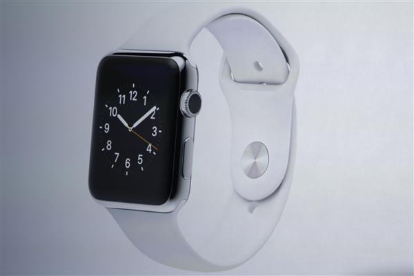 address from Apple, where they unveiled new iPhones and the Apple Watch. And while the iPhone 6 and iPhone 6 Plus are decent evolutions of the smartphone model for iPhone (bigger, brighter, faster), the Apple Watch is trying to be the definition of the newest category in tech: smartwatches. And based on my experiences with technology in my own house, I have to wonder what the impact of this new category will be.
Technology is saturating our society. From smart appliances, smart door locks, smart light bulbs, and smart thermostats and smoke detectors; technology is increasingly something you cannot get away from. The older generations that resisted the personal computer could do so because there were alternatives. In the coming years, you probably won’t be able to buy a microwave oven without a smartphone app to run it, and so sitting out on the next wave of tech advancements won’t be an option for anyone. But as our lives are infiltrated by technological advancements, the balance must not be lost with how we interact on a personal level.
I believe that the best technology is the kind that doesn’t take your attention away from what you are doing. That could be as simple as a media streamer that you are fighting with to watch a new episode on Hulu. Suddenly the joy of streaming internet television is lost, to a battle with failed technology. Smartphones have been the culprit of many failed personal connections ever since they came to dominate our society. I know many people who have “no tech” days during the week, and that’s a great idea. I’m far from alone in the realization that our personal technology is causing us to become impersonal, causing us to lose our connections to friends and family. And I worry that the amazing features of the new Apple Watch will not help in the struggle to keep those connections.
I thought a bit about how in films the future is full of technology that permeates all aspects of society. And then I thought about how in many visions of the future everyone is dressed the same way, usually in jumpsuits. And it dawned on me, the clothes they wear don’t matter any more. Because they no longer actually see each other. I see a future where we are all walking around staring at our phones, or now staring at our wrists. A world where we forget the voices of our friends, and only know them by emoticon and instant message. We can call that a more modern way to be connected, but is it better?
So when Apple releases their new Watch April 24, 2015, consider how much of your life that device might consume. Is the technology enhancing your life? Are your personal connections to friends and family made better because of this device? I would argue devices can do such things (the Pebble Time is a good example of a minimalist wristband, at a fraction of the cost of the Apple Watch), but we must be wary. And if you do buy the Apple Watch, make sure you don’t spend too much money on the most expensive model and band itself. Because if you’re looking for your new smartwatch to be a status symbol you might be disappointed, since chances are no one will be looking at you anyway.

First Impressions – Samsung Galaxy S6 and Galaxy Edge
 If you aren’t a tech geek like me you probably had no idea that an annual conference is held ever year in Barcelona, Spain. And at this conference many tech companies roll out their new gadgets. Well that event is called the Mobile World Congress (MWC), and it started March 1st. Two major smartphone companies announced devices on the first day: Sasmung and HTC. Today we’ll look at the new Samsung phones, the Galaxy S6 and Galaxy Edge. We’ll focus on the S6 model, as the Edge is pretty much the same phone with the addition of having a screen that wraps around, you guessed it, the edge!
The Design
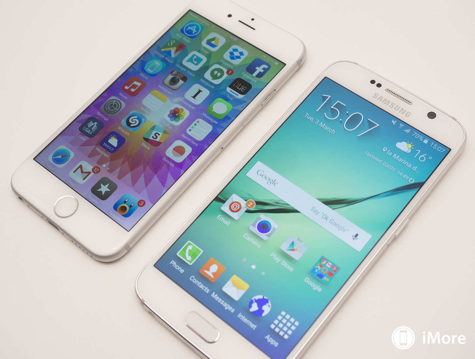
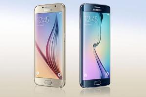 Samsung has long been known for putting out high-end phones in cheap looking cases. The tendancy to focus on plastic has been the chief argument by their competitors that they are not good phones. The Galaxy S5 last year found itself in those cross-hairs like never before because while the software was pumped up with new features (fingerprint ID, heart rate monitor, improved camera), the hardware itself still felt cheap; pic below – S6 (left) S5 (right). The tech industry knew that Samsung had to change that approach with the Galaxy S6 and they did exactly that.
 One review I read called the S6 the “love child of the iPhone 4 and the iPhone 6” and that’s pretty accurate. The phone is now entirely metal and glass. The metal edges look almost identical to the iPhone 6, and the glass back harkens back to the iPhone 4 and 4S. Though Samsung is using much stronger glass, so the scratching issues that plagued those iPhones should be avoided. This phone looks great! It looks like the high-end phone that this line has always been. Does it s
 till look a lot like the previous models? Yep. The dimensions are even the same as the S5. The camera is the same (with improved optics). The three buttons at the bottom (including those two that disappear when not in use) are still there. But it’s an improvement, no doubt. It’s evolutionary, not revolutionary, but after 4 models that looked virtually the same (little bigger each time), I think evolutionary is good enough for this year. Let’s briefly breakdown what the new features are and what features are gone for good.
What’s New
 Fingerprint Access
Last year to use this feature you had to swipe your finger/thumb across the home button (making it useless, based on my experience with it). Now it works just like the iPhone button. Rest your finger on the button and you are unlocked. The fingerprint will also pair for payments using Samsung Pay.
Improved Screen and Speaker
The screen is brighter and the speaker is louder. Since the phone size didn’t change, those updates should be pretty noticable.
I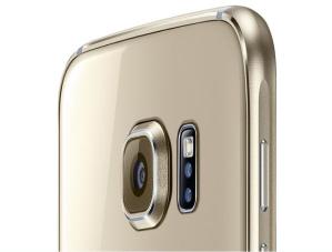 mproved Cameras
While the 16MP back camera is the same, they’ve added “optical image stabilization” which means your pics will look better, as it helps handle shaky shots (the iPhone 6 Plus uses this tech as well). The forward facing camera is now 5MP, which means those selfies will be crystal clear! You also can access the camera much quicker, with a double tap of the home button (they say less than a second).

Battery Charging – This one is a mixed bag for hardcore Samsung users. The battery is no longer replaceable (like most high-end phones these days), but they’ve added tech to the device that makes charging lightening fast (10 minutes of charge gets you 4 hours of battery!). They’ve also made it possible for wireless charging with any of the many charging mats on the market.
What’s Gone
Replaceable Battery
While this means extra batteries are a thing of the past, you do get a slimmer phone in the process. And rapid charge is a huge move forward, making all those extra batteries rather redundant.
 SD Card Slot
No more expandable memory for the Galaxy S Line. Samsung has adjusted the memory tiers from 16/32/64 to 32/64/128 (those would be Gigabytes). Most people would have to try and use 32 GB unless they are loading lots of videos or never cleaning out their camera roll. This is just another example of the movement towards cloud storage.
Waterproofing
The S5 was one of the  few high-end smartphones that was waterproof (meaning you could drop it in the toilet). That no longer is the case. So either get a LifeProof case for the phone, or be more careful when you’re at the beach this summer (not to mention those pesky toilets!)
The Edge – it’s trying really hard to be super cool
T he other phone Samsung introduced this week is the Galaxy Edge. Last year the Note Edge was released, which featured a third screen along the edge of the right side of the phablet. Now the edge is on both sides, but it doesn’t act like a third screen. It just stretches the screen over the side. There is still a “clock mode” so you can see the time on the phone’s edge when it’s laid flat. The Edge definitely looks cool. Its guts are no different from the Galaxy S6 though, so we’ll have to see how pricing works out, and if the “cool factor” is worth the cost.
The Whole Cup Summed Up 
I like the Samsung Galaxy S6 and Galaxy Edge. Samsung has always made decent phones that came in cheap packages. It’s great that the argument about the hardware can be put to rest (of course the lawsuits from Apple might start a whole new argument). Now you have some clear choices regarding SOFTWARE. Do you like Android or Apple? Do you like the interface that Samsung puts on top of the Android system (it’s called TouchWiz)? Do you like the grid design of Apple’s iOS 8? It’s really all about preference. All of these phones are premium hardware. Metal and Glass. They have similar cameras (though Apple remains the king for the moment at least there). They do the same things. They play the same games. Support the same apps. So head to the store when these phones come out and get them in your hands, and see what you think. I tend to jump between Apple and Android every six months (thank you T-Mobile Jump program). I love the iPhone 6. I think it’s the perfect phone, in terms of size, and functionality. But the S6 has me tempted. If it’s not too expensive the Galaxy Edge has me tempted too. But I have till May to sort it out. If you want either Samsung smartphone, your first chance will be April 10th.
Who knew that Samsung and Apple were cousins all along!?!