Blog Archives
Tech of Disney – Two Awesome Apps!!

Our Walt Disney World vacation was a success and everyone involved agreed that technology played a central role. We’ve already talked about how MagicBands made negotiating the parks, resorts, and souvenir shops easier. Today we’ll look at the applications we used during (and prior) to the trip to make sense of the madness and make sure everyone had a great time.
Disclaimer: Our vacation was in January, which is a slow month. So bear that in mind when making your plans. Even with these great apps, heading to WDW in July will always be pretty busy, but I’m sure these apps will help.
I was the “tech guy” for our trip and I employed several apps to keep everything sorted out. I used Google Maps to negotiate the way from Orlando to Clearwater, Florida and back (we spent a day at the Clearwater Marine Aquarium). I used Yahoo Weather to keep an eye on the sky and help everyone know whether to wear a jacket or shorts, depending on the day. I used the stock “Notes” app on my iPhone to keep tabs on souvenir money, and the breakdown of our meal plans (which we accessed with those sweet MagicBands). But there were two primary apps that I used to make this vacation successful, and I’m very excited to tell you about them. So here we go:
My Disney Experience App

This app is the “official app” from Disney for your vacation. The app provides a ton of tools to use in the parks including Ride Information, Character Meet-Up locations, Dining Options, Guest Services, and even Shopping.
The My Disney Experience App is something you definitely need while you’re in the park, or even before you’re in the park for planning purposes. Let me share how I used the app for our trip.
Using the App in the Parks
 I used the My Disney Experience App for two major things while in the park. First, the app allows you to modify your Fast Pass options directly on the device. We had an early Fast Pass for the Rock Coaster in Hollywood Studios. The bus took a long time showing up (one of the few times that happened to us), and the drive to the park was taking longer than I expected it to. Bottom line, we were going to miss our Fast Pass for the ride, and I knew, from reviewing the app, that we had a 45 minute wait if we had to go through the
 “stand by” line. So I pulled up the Fast Pass options on the My Disney Experience App, located another Fast Pass window, and switched everyone in our group to that window instead. We did indeed arrive at Hollywood Studios after our first Fast Pass had expired, but because of the functionality of the My Disney Experience app, we were able to saunter our way to the ride (taking a family pic in front of the Tower of Terror along the way) and take advantage of our revised Fast Pass window. This is just on example of the many times I adjusted our Fast Pass times with this app. We actually switched which park we were going to one of the days, and I was able to completely reassign our Fast Passes to the other park, all from within the app on my iPhone.

 The second way I used this app in the parks was for Dining. We were doing Quick Service Meals during most of our trip, which is the Disney equivalent of Fast Food. The app shows all of the Quick Service restaurants in the parks with menus provided. On our day in the Magic Kingdom we needed to find a location for dinner. While others in our group rode Dumbo the Flying Elephant, I pulled up the Dining options and took stock of what restaurants were around us (some restaurants have limited hours, and the app indicates that). By the time everyone was done flying I had narrowed it down to two places. With the whole group gathered around, I told them what foods each place offered, and the general consensus was to skip to gourmet mac and cheese of the Friar’s Nook (my choice), and head over for burgers and chicken in Tomorrowland at “Cosmic Rays Starlight Cafe”. You can’t win them all. Having all of the menus at your fingertips is a great feature, and something unique to the My Disney Experience app. If you are doing Table Service Dining, you can even make your reservations right from the app. But make sure you do that way ahead of time, because those slots fill up fast, and you’ll have few, if any, options if you do it the day of your visit.
While My Disney Experience provided some great options, including visual maps to guide our way through the parks, another app was my primary tool to make sure we spent more time on rides, and less time in lines. It’s an app called “Touring Plans”.
Touring Plans App

I’m not sure how I stumbled upon the website for “touring plans“. It was probably during my google searches for “planning a trip to Disney”. However it was that I found it, I can say without hesitation that this app was the jewel that made our vacation a smooth ride from start to finish. Unlike the “My Disney Experience” app, this one has a cost related to it, but I assure you that the price of $12.95 for an annual membership is well worth it. Your $13 gets you access to the Touring Plans website, offering tons of tools, including pre-designed schedules, from which the site got their name. You also can full access to the mobile application (available on iOS and Android). The mobile app is available for free, but you can’t access many of the features without a membership.
The “Touring Plans” app offers all sorts of information about the parks. Park hours (including the “extra magic hours” for resort guests), Crowd Calendar, Wait Times, Fast Pass Availability, and Ride information (height, intensity, description, and ratings). Bottom line, the only things missing from this app are dining information, and the ability to change Fast Passes on the go (but you have My Disney Experience for those anyway). While those features might sound similar to the “My Disney Experience” app, I found that Touring Plans was easier to use, and had more reliable wait times for rides especially.
As I looked over the app, I had a feeling of nostalgia that is usually associated with viewing photos from a trip. But that makes sense, since I spent most of my time there staring at these screens. But I wouldn’t have it any other way. Let me share how I used this app prior to our visit and during our time in the parks.
Using the App to Plan the Trip
Two months before our trip the family gathered to do some trip planning. Using the “touring plans” application I accessed the “Crowd Calendar” which does its best to predict the tourist traffic each day. We could see the days we would be there, with estimated crowd level. We used that information, along with the days that each park had “extra magic hours” (resort guests get early entrance or staying after the park close to the public) to determine which park we would visit each day. Our planning proved overwhelmingly successful. We had minimal lines, and tons of space as we made our way around the parks. Touring Plans Crowd Calendar proved accurate for us!
 The second thing we had to determine was which rides everyone wanted to go on. Bear in mind we had ages ranging from an 8-year-old up to the Grandparents, so everyone wasn’t always going to agree. I used a spreadsheet to create what I called “The Super Awesome Ride Selection Machine”, and filled it with data gathered from the ride descriptions in the “Touring Plans” app. Then I sat with everyone and had them rate their interest in every single ride (0 – not interested to 5 – we MUST go on that!!!!). In the end I had a good idea about which rides everyone wanted to go on, and when we’d need to split up. I used that information in real-time once we hit the park. We managed to get to roughly 90% of the rides we wanted to get to, and that is thanks to the wait time calculator. But I’m getting ahead of myself.
Using the App in the Parks
The “touring plans” app provides estimated wait times for all of  the rides and shows in all of the parks. When you pull up the ride list, you see the Disney posted time (reflected on the My Disney Experience App) and the “expected time” as calculated by Touring Plans. These numbers are derived from historical data and users entering their wait times while they are in line (which is added to the algorithms driving the historical data). I used the app, to time several of the lines we stood in. I verified just about every line’s wait time against the apps expected time and found the app was accurate almost all of the time. If anything, it sometimes stated a longer time than we experienced; it never went the other way! In addition to providing expected wait times, each ride indicates when there is a Fast Pass available, and when the line is expected to get shorter. We planned to ride Big Thunder Mountain again on the day we were in Magic Kingdom. I saw that there was a 40 minute wait as the expected time in Touring Plans. But the app told me that if we waited another hour the line would drop to 10 minutes. We waited (hit another ride in the meantime), and then we rode the ride an hour later with that 10 minute wait! Spectacular.
Anyone planning a trip to Walt Disney World (or Universal Studios – they have this service too), should get Touring Plans. It’s the easiest $13 you’ll spend, and it will definitely make your trip more enjoyable. If you don’t have a tech geek like me in our group, the site offers designed “touring plans” that will literally guide you through the park, hitting all the rides you want to go to at the optimal time. We didn’t use that service, but I can definitely see how it could benefit a group that doesn’t have a person who is fine staring at their smartphone the entire trip.
The Whole Cup Summed Up
As technology increases its presence in our lives, it is becoming more important to be comfortable with the tools. This is certainly the case for a vacation to Walt Disney World. The use of two relatively simple apps will have great benefits for your trip. You will stand in shorter lines, you will use your Fast Passes effectively (we changed some when we realized we had Passes for a ride with a 5 minute wait!), and you will feel more in control of your experience. Need to find a place to eat dinner? The My Disney Experience app has everything you need to know from menus, to prices, to exact locations in the parks. Need to know if it’s worth walking all the way across the park to hit Space Mountain one more time? Touring Plans can tell you how long you will wait before you take one step towards Tomorrowland. These are great tools. They are easy to use. And the first one is free and the second one is a bargain. So make sure to grab these apps before you head to Florida and I’m sure you will have an amazing time!
And when you want to know where to find her, you won’t need a Fairy Godmother…

First Impressions – Basis Peak Fitness and Sleep Tracker
Just when it seemed that the smartphone had eliminated the need for the old wristwatch, along comes the tech industry to reinvent an age old tool. Smartwatches once again dominated the Consumer Electronics Show (CES) in 2015, showing that wrist-based tech is certainly on the rise! From the simple fitness bands like the Fitbit Flex and Misfit Flash, to the souped-up smartwatches like Moto 360, Samsung Gear S, and the forthcoming Apple Watch, the tech industry is very interested in slapping something on your wrist.
But how do you know what is best for you? ![]() Do you even need one? Well, all of that depends on what you value. Do you want fitness metrics like steps, miles, elevation, heart-rate, and calories burned? Do you want a wristband that interacts with your phone to show calls, texts, emails, and calendar notices? The Wrist Tech industry is very diverse, and actually pretty overwhelming when you really start to see how many options are out there. I recently got my hands on one of the lesser known devices. Based on my initial experience, I’d categorize it as a “fitness watch”. It’s called the Basis Peak, and these are my first impressions.
Do you even need one? Well, all of that depends on what you value. Do you want fitness metrics like steps, miles, elevation, heart-rate, and calories burned? Do you want a wristband that interacts with your phone to show calls, texts, emails, and calendar notices? The Wrist Tech industry is very diverse, and actually pretty overwhelming when you really start to see how many options are out there. I recently got my hands on one of the lesser known devices. Based on my initial experience, I’d categorize it as a “fitness watch”. It’s called the Basis Peak, and these are my first impressions.
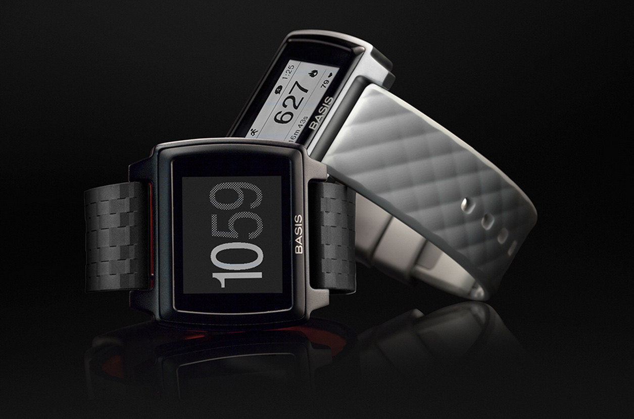
BASIS PEAK – Hardware
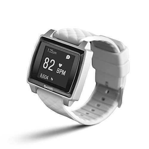 First off, the form factor. The Peak is not too big, and not too small. Weight is also minimal. It has a two tone LCD touchscreen which works very well. It comes with a rubber wristband that I find comfortable. This is important because to get accuracy from the heart-rate monitor it’s essential that the watch be strapped tightly to your wrist.
Battery life has been very good. I’m getting about 3 days of life (from the promised 5 days), but I have been using it a lot. Remember that the high end of battery life is usually found through minimal use. But 3 days isn’t bad, especially for a device that does 24/7 tracking.
The Peak is waterproof. So you can shower and swim with it on and there are no worries. Finally, the device will work with both Android and Apple phones, which makes it a rare breed indeed.
Overall I like the look and feel of the Basis Peak. So let’s talk about what this Fitness Watch does.
It’s a Fitness Tracker
First and foremost, this device is for fitness. It is not trying to compete with the Smartwatch category, at least not directly. The Basis Peak offers a few fitness metrics: steps, calories burned, and heart-rate (we’ll get to that last one in a minute). Noticeably missing from the device are the ability to track mileage (a significant omission), and elevation (which would require an altimeter to work). Many other fitness trackers offer both of those features, and for a premium cost device (the Peak will set you back $200) they really should be included.
Though the metrics are limited, it’s what the Peak does with the data that is pretty cool. The device sells itself as fully automated. You don’t have to tell the device when you go for a walk, take a run, or head off on a bike ride. The device can tell what you are doing, and the device responds with an icon for the activity, and begins tracking the activity as a “work out ” session of sorts. This is a great feature for people who like to track their metrics during exercise, especially those serious runners and bikers. And the key to solid metrics is the heart-rate monitor.
T his is my first experience with a fitness band offering constant tracking of an actual health element. It’s one thing to see if you can get those 10,000 steps in every day and the resulting feeling of accomplishment. It’s quite another when your fitness watch can give you insight into your actual health in real time. I’m quickly discovering that I am pretty out of shape. I know that by watching my heart rate skyrocket, even during a long, slow walk. I am excited by the idea of mobile technology like a fitness watch helping people make better health choices in the moment. The Peak is already doing that for me, after just a few days.
It’s a Sleep Tracker
You didn’t know how important it was to track your sleep patterns, did you!? According to the fitness band/watch industry it’s very important because the feature is pretty much standard on anything strapped to your wrist. I’ve used the FitBit Flex sleep tracker for a while and I didn’t find it terribly useful. That particular tracker only tracked sleep and awake, using “micro-movements”. So it showed me when I moved around in my sleep, but the data didn’t get any more specific.
![]() The Basis Peak is different, and it’s all because of the heart rate monitor, and something the company calls Body IQ. The device offers several metrics for sleep tracking including: Light Sleep, Deep Sleep, REM Sleep, Toss/Turn, and Interruptions. The phone based app also gives information to help you understand how much of each type of sleep is typical, so you have an idea if you are getting enough of what you need. This is the first fitness watch that I’ve used where the sleep monitor actually tells me something useful and something I can take action on.
The Basis Peak is different, and it’s all because of the heart rate monitor, and something the company calls Body IQ. The device offers several metrics for sleep tracking including: Light Sleep, Deep Sleep, REM Sleep, Toss/Turn, and Interruptions. The phone based app also gives information to help you understand how much of each type of sleep is typical, so you have an idea if you are getting enough of what you need. This is the first fitness watch that I’ve used where the sleep monitor actually tells me something useful and something I can take action on.
It’s a Smartwatch (sorta)
 When the Basis Peak first shipped it was strictly a Fitness Watch. It could do everything I’ve already described and nothing else. Then came the “smartwatch update“. This update was promised to early adopters and the company delivered recently with an update that allows Smartphones to communicate with the Peak, showing incoming calls, emails, texts, and calendar appointments on your wrist. The features are still pretty glitchy, which isn’t surprising because it’s so new. I tested both an Android phone and an iPhone and both were inconsistent with delivery of calls, texts, emails, and calendar appointments. Also the “manual sync” button in the phone app of both devices often resulted in an error saying “sync failed”. These issues definitely make the “smartwatch” element of the Peak less reliable.
Bottom line, if you want a full smartwatch experience, the Peak is not the device for you. At least not until they’ve worked through many of the bugs that are currently plaguing it.
The Whole Cup Summed Up
 The Basis Peak is a Fitness Watch. That’s the most important thing to remember. It’s trying to take on some of the other Smartwatches out there, but it’s just not there yet. The fitness metrics offered by the Peak are pretty standard, and nothing to get too excited about. What I am finding most useful is the Heart Rate Monitor and enhanced Sleep Tracking. In the end, the purpose for wearing a fitness watch or fitness band is to help you make better choices about your health, and the heart rate monitor is proving an excellent tool for me in that regard.
The Basis Peak will certainly get better in time. The company promised a software update and they delivered. This is no small feat, especially for a smaller company. This builds customer trust and that is essential for the fledgling industry of Wrist Tech.
The device currently cost $199 and comes in a couple colors.  You can swap out your wristband to jazz it up too. My opinion, based my first impressions of the Peak, is that it is overpriced for the features it offers. A $200 fitness watch should at least offer mileage tracking. It also wouldn’t hurt to put in that altimeter so users could track elevation (I used to challenge myself to take the stairs!). At a premium price, it should offer every feature possible. The only justification for the high cost would be the inclusion of “smartwatch” features, which the company is starting to offer. But the phone connectivity is still unreliable, and so be prepared for some frustration if you plan to use those features.
Mobile Health is taking off, and fitness bands and watches are leading the charge, providing valuable health data on your wrist (and your phone). This is technology that truly has the potential to change lives. Unlike the majority of tech updates (tablets, phones, and gaming consoles), wrist tech is often focused on health. At the same time these devices can keep you connected to the things that you value, in a way that involves minimal interruptions from technology.
These two elements in partnership on a small device like a wristband will revolutionize how we communicate with our friends and family, and with our doctors too! Great tech should be easy and life enhancing, and that’s the direction we are heading!
Apps of Note – Scribblenauts Remix

Taking a brief break from my “Tech of Disney” series, I thought it would be fun to highlight a game I recently came across called “Scibblenauts Remix”. My daughter got a Nintendo 3DS XL just after Christmas. The high cost of the system itself sent me off to the pawn shop to find cheap games. While her focus was on Littlest Pet Shop and Pokemon, I was hoping to find some games that had some educational element to them, as well as fun gameplay. I struck gold when I found the original DS version of “Scribblenauts” for $2 in a bargain bin!
 Basically it is a puzzle-solving game. You are presented with a challenge within a small 2D environment. Could be a farm, could be outer space, or underwater. You then use your “magic notebook” to type the items that you need to solve the problem. Those items will then appear on the screen for you to use. I love this game because it teaches critical thinking skills with the problem solving and it challenges my 2nd grader to spell all the words for the items she wants to use. She is really enjoying it. Heck, I’m really enjoying it. But I got tired of asking her if I could play “her” 3DS (with her listing the conditions I must adhere to in order to use it), so I decided to see if the App Store had some version of the game. I found it right away, and it is pretty awesome. Let’s break down the mobile app, “Scribblenauts Remix”.
The Cup Half Full
 I’ve compared gameplay between the DS version and the mobile version, and I’ve found very little difference. Sure the 3DS offers a second screen, but that’s mainly used for stats, the game itself is entirely played on the touchscreen of the 3DS. So there’s no difference between it and the mobile app (aside from using a 3DS stylus, though you could use one with the mobile app too, if you wanted).
The mobile app offers up a ton of levels for $0.99! And if you drop an additional….wait for it…. $0.99, you get all the current levels (around 50 right now) plus access to all additional levels coming down the road. I did some research and the original 50 levels were a breakdown of 20 original Scribblenauts game levels, 20 Super Scribblenauts levels, and 10 levels created especially for the mobile app. That’s a pretty amazing package for $2, being that buying new versions of the two DS games would run you $40 pretty easily (if you aren’t a pawn shopper like me).
 Finally, the mobile app has some cool additions not found on the 3DS version. One is the use of the dictation speaker built into the keyboard to speak the names of the items you want to get in your “magic notebook”. This negates my plan for spelling practice, but my daughter knows that speaking is a last resort, and she seems to be sticking to the plan so far. Also, if you want to scrap all of your current creations in the current level, all you have to do is shake the phone and you will be prompted to agree to scrap all creations. That’s comes in handy when my elaborate plans don’t work out so well.
One final bonus, since the mobile game works on iPad as well, you can play on a much larger screen than with the 3DS version!
The Cup Half Empty ![]()
As with all mobile apps, this one offers “in app purchases”. These come in the form of “avatar” character packs to use in the game. It comes standard with the primary character Maxwell, as well as a Lifeguard, a girl Maxwell, and God (picture old guy in white robe). There are several avatar packs that will run you another $0.99 for each group. They include mythical characters, historical figures, and monsters. So if you really want to play as Shakespeare or Dracula, you’ve got options. But it’ll cost ya. There are also “playgrounds” which come in a three pack for, you guessed it, $0.99. So I call the “in app purchases” a half empty thing, but really, you could get everything they have to offer and not even reach the cost of a single 3DS game, so that’s pretty cool.
The other issue I’ve found with the game is related to “Game Center”. At first glance it appeared that a game I started on my iPhone would transfer over to my iPad Mini, but that doesn’t appear to the case at this point. Though that could be a setting issue as much as anything. I’m not a hard-core gamer, so this isn’t a big concern for me, but I know that could be a deal breaker for some, who count those points like they’re real cash.
 Parental Note: This game does allow you to call up guns and other weapons. If you “shoot” the weapon at another character they will lose hearts and vanish in a cloud of smoke. When shooting humans, this will generally result in losing the level and having to start over. The game does not have overt violence, but for those sensitive to this issue, it’s definitely something to keep in mind.
The Whole Cup Summed Up
“Scribblenauts Remix” is a great little mobile game for both smartphones and tablets. It’s been around for a few years now, so new gamers will find tons of content, with more coming. I would expect a game with similar gameplay to cost at least $1.99 in the app store. But they’ve made this one accessible for everyone’s wallet. The gameplay is on par with the much more expensive 3DS version, and even offers a few perks like shake to scrap and voice commands.
You’ll probably be tempted by those in app avatar purchases, and who could blame you!? So if you’ve got a few extra bucks, pick this up.
And a note to parents. I sought out a game for my daughter that would be so fun she would barely register that she was learning and developing her brain, and this was a total score. So definitely check it out if you’ve got an elementary school kiddo. But be prepared to spend some time playing it yourself, cause it is tons of fun!
Try and tell me you don’t want to know what’s going on here!?

Apps of Note – Yahoo News Digest
![]()
In recent years Yahoo has been in the midst of a brand shift. They changed everything from their leadership to their logo. The company that was the “Google” of its day, has been looking for a way to get our attention, especially on our smartphones and tablets. They released a Weather App, which I also highly recommend. That app took advantage of the finger swiping we’ve all grown accustomed to on our hand-held devices. I’ve been using Yahoo weather since the day it was released. When I heard that Yahoo was releasing a News App, I was pretty excited to see if they could give me a similar experience, but this time instead of the 10 day forecast or storm warnings, they would give me a dose of the daily news. In my opinion, they certainly delivered.
Do you like to be informed on the daily news without feeling the need to become a news-junkie? Do you prefer your news to come in a package that you can knock out in five minutes flat? Then I’ve got the app for you. It’s called the “Yahoo News Digest”.
The Cup Half Full
The real genius of the Yahoo News Digest is you get the amount of news you want, which can be a quick glance, or an in-depth read. It’s up to you how far you want to dig. When you open the app, you get a list of 7-12 news stories stacked for a quick scroll through vertically. Each story is categorized (World, US News, Politics, Arts, Science, Entertainment, etc.). If you just want to see the high level news, one swipe and you’re done. Just the headlines and sentence or two. To go another level in, just tap which ever story you want to read and a short news article appears. Swipe up and down and you can read the article. Swipe left and right and you’ll be jumping through each of
the articles you had in the main screen. It’s fast!
Each article includes links to larger news stories, or relevant articles to consider for further reading. Once you’ve read all the articles available, you get a “Did you Know” fact that is related to the day or one of the articles you’ve just finished. It doesn’t take long to quickly scan through all the content, which is saying something in the world of the never-ending news cycle.
The Digest is delivered twice a day, and you set the time you want to receive it. My morning digest comes at 7am, and my evening one at 6pm. Finally the app has all the standard social networking links, so if you want to tweet about an article, post it to your Facebook wall, or email it to a friend, the buttons are right there for your clicking pleasure.
The Cup Half Empty
 The Yahoo News Digest is intended to be a “twice a day news” resource. If you want up-to-the-minute breaking news stuff, the Digest will not suit your needs. I put that as a “half empty” element, though for me, I like that it doesn’t constantly update with new information. Once I’ve read my 10 articles, I’m done till the next Digest is delivered.
You also have basically no control over what news you receive. Most news apps have a lot of customization built into them. Not interested in Kim Kardashian and the Hollywood crowd? Just turn of the “entertainment news” and you’re good to go. That’s not an option with the Yahoo News Digest. Though I’ve never seen a Kardashian article yet, so that’s good. Everyone gets the same “paper” for every daily edition, and for many that could be seen as a bad thing, in an age where we like everything customized for us.
The Whole Cup Summed Up
 The Yahoo News Digest is trying to do something very specific. Provide two daily doses of relevant news for the masses. The interface is clean and easy to use. The tap and swipe approach makes this app great for people just getting into smart phone and tablets. The ability to read stories quickly, but also dig deeper into the “in-depth” elements is great for a news-junkie like me.
But at the same time, Yahoo’s “one size fits all” approach to the app will certainly frustrate some users who want to only see news about things they are interested in. If that’s you, I recommend checking out “SmartNews”, which take news customization to a crazy place, and is also one of my go-to news apps that I use every single day.
I really like the Yahoo News Digest and think that it truly is news for masses. It’s the daily and evening paper of yester-year in a cool new package. So stay informed without the distraction of news apps that consume time and attention. Because it’s much better to experience the world than read about it.
Available on Apple and Android Smartphones and Tablets for FREE!

Review – Pebble Smartwatch

For months I’ve been waiting for a device that I was certain would change the way I interacted with my smartphone, the Razer Nabu Smartband. But while waiting for it’s release I continued researching other smartwatches and smartbands. My fitbit flex died a couple months back and my first goal was finding a new fitness band that had (gasp) a clock! I had considered the Pebble at one point, but it had two things working against it. One, it had a price tag of $149 and two, it didn’t do continuous monitoring, which made it’s usefulness as a fitness band much less attractive. But then one day the news came to the tech blogs that changed everything. The price dropped to $99 for the original model, and the device now supported continuous monitoring, with only negligible impact on the 7 day battery life. My excuses gone, I plunked down the cash and picked up a Pebble Smartwatch. I’ve been using the device for over a month, so here are my thoughts.
The Cup Half Full
This device does everything I wanted it to do when I bought it. The pebble app has a ‘’store” offering a wide variety of watch faces, and using them I now have a few different faces telling me the time, date, and weather. I find it fun to switch between my standard watch faces to more fun ones like my Superman watch or my Dr. Who watch (12 doctors means each hour they show you a face but no hour – so you gotta know which Doctor it is!) So the “telling me the time” piece was handled.
 The app store also offers a fitness band app from the makers of Misfit (which has it’s own hardware if you’re interested in a fitness band). This app allows me to track my steps just like my old Fitbit Flex. It seems pretty accurate, so I’m happy with that piece.
The set up to receive notifications of text messages and emails was seamless, and very user-friendly. The watch will even alert me of incoming calls and I can reject them from my wrist if it’s not a convenient time to talk. I find these features to be very handy, as much as I expected it would be.
Beyond those three features that were requirements for purchase, I have found several other apps that I use regularly on the Pebble. One is a multi-timer, which I have set up to open with a hard press of one of the buttons on the right hand side of the watch. This give me access to a timers, stopwatches, and alarms all with one press. It works from everything from cooking to timing my child’s daily reading. Another app is the “music” app, which comes standard on the device (no store required). This app allows me to control the music playing on my phone from my wrist. This comes in handy when I’m using a bluetooth speaker at home and want to change tracks from across the room. It’s also handy when driving, as another way to leave my phone in the seat next to me, and decrease distracted driving opportunities.
Beyond these main apps, I haven’t found many other uses for the Pebble. I installed the Pebble version of Tetris (Pebtris) for a kick of nostalgia, but I found the controls very cumbersome (big surprise!).
 Two final things to point out, and they can’t be understated. First, unlike the majority of Smartwatches currently on the market (or coming soon), the Pebble is compatible with both Android and Apple products. This is very important. While Android has been pumping out some very cool devices lately, iPhone owners are out of luck. And no matter how much they want to use that new Apple Watch come January, Android users won’t have that option. The Pebble is truly one of the few smartwatch options that works on both. Android connected watches will have a few more options than their Apple counterparts (with their open system approach), but both systems will support all primary functionality, seamlessly.
And finally, the Pebble is waterproof. Meaning you can submerge this thing in water and you will have no issues. I have tested this (nervously), and it works great. If we are moving into an era of wrist computers, it is imperative that they be waterproof, because that’s a pretty big risk to be taking, just to wash your hands, with a computer strapped to your wrist!
The Cup Half Empty
For all the things a Pebble can do, it is still a limited device. It is an extension of your smartphone, and really nothing more. Aside from the clock (and a few select apps), the device requires a connection to your phone. I am hesitant to include this fact in my “half empty” section because I’m an advocate for our wristbands not being “wrist computers”. I am not a fan of having another device that pulls us into the internet and away from what is going on around us. So I should be happy that the Pebble’s functionality is limited (versus the higher functions found in Android Wear and the forthcoming Apple Watch). But as I’ve used this device for a while now, there is one thing I wish I could do that I cannot do, and that is respond to text messages.
I experimented with an app that allows you to create five preset text responses, to select individuals, but I’ve found that difficult to work with, to put it nicely. I think it’s great that I can see my texts on my wrist without pulling out my phone. But it would be an enhancement for me if I could make a quick response. Something as simple as “OK” or “On My Way”. But to do that I still have to pull out my phone, and I find that is often the case when I receive texts from people. Email notifications are great because they don’t call for immediate response, but texts are not always that way (rarely in my case). So to be able to speak a text response to the smartwatch would be great. You can do that on the Galaxy Gear, Moto 360, Apple Watch, and many others, but you can’t on the Pebble, and that is the one major piece that I only discovered was missing after I used the device for a while.
The Whole Cup Summed Up
T he Pebble isn’t trying to be what the other newer smartwatches are trying to be. It doesn’t have a mic or speaker. It’s doesn’t even have an LCD type screen (eInk is the approach with backlight). What this device does is keep you up to date on the things that are important throughout the day, and it keeps that smartphone in your pocket or purse. Want to know the time, date, and current temp outside? It’s got you covered. Text and email notifications on your wrist? Done. Add to that a few bells and whistles like music control, timers, pedometer, and games, and you’ve got yourself a pretty nifty little gadget for only $99. Try to find any Android competitor that is even close to that! But the Pebble is missing that mic and speaker and, like me, you might find that you miss that once you are using it. It’s not a deal breaker for me. I just pull out my phone and send my responses. No biggie. The positives far outweigh the negatives at this point. And the fact that the watch fits on any standard watchband meant I could transplant it to my favorite Fossil band!
While it’s not the fastest, or the most stylish, the Pebble is still relevant for the type of user who doesn’t want another phone strapped to their wrist. So give it consideration if you’re in the market. And if the standard Pebble seems a little to boring, with it’s plastic case, there is always the Pebble Steel, which is much more visibly appealing, while offering very similar functionality (and a higher price tag). This smartwatch has enhanced my life, and kept me focused on what’s important. Hopefully it could do the same for you.
September Big Consumer Tech Announcements
If you are considering a new smartphone or phablet (i.e. giant smartphone), or if you’re interested in being an early adopter of the smartwatch industry, this September has several new products you’ll want to consider. Motorola, Samsung, and Apple are all releasing new smartphones and smartwatches. There’s sure to be a lot of competition, so do your homework before jumping into any device. Each company has pluses and minuses to consider. And smartwatches are probably going to be clunky for a while, so don’t slap down cash for those unless you’re prepared for the headaches of an early adopter (I know from experience!)
It’s going to be an exciting first couple weeks of announcements, and I’m looking forward to reading all the “hands-on” reviews afterwards. Will the iPhone be a major update (bigger screen, different body style)? Will there be an iWatch? Will one of these smartwatches be priced at anything other than premium rates!? $200 seems to be the lowest price so far. All these questions and more will be answered in the next two weeks! Stay tuned for some “first impressions” here at “Have a Cup of T(ech)”!!
| 9/3/2014 | 9/3/2014 | 9/4/2014 | 9/9/2014 | In October |
| Wednesday | Wednesday | Thursday | Tuesday | ??? |
| Samsung | Asus | Motorola | Apple | Razer |
| Galaxy Note 4 (phablet) | ZenWatch | Moto X+1 (smartphone) | iPhone 6 (smartphone) | Nabu(Smartband) |
| Galaxy Gear S (smartwatch update) ANNOUNCED 8/28/14!!! | Moto 360 (smartwatch) | iWatch (smartwatch) | ||
| Moto G (smartphone) | iOS 8 release date | |||
| OSX Yosemite release date |
The Device I Can’t Wait To Use – Razer Nabu Smartband
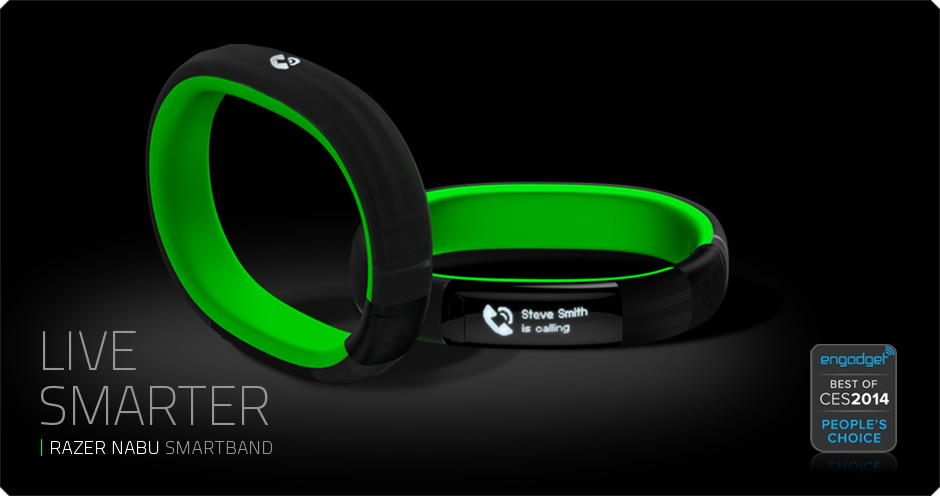
For the past month I’ve been introducing one device to everyone I know (and a few I don’t). And now I want to share it with you. Of all the upcoming devices this fall, this is by far the one I’m the most excited about. It’s called the Razer Nabu, and to say it’s a smartwatch would only give you part of the picture of why this device could be a bombshell in the current tech wars for our wrists. The Nabu has three areas of focus: notifications, fitness tracking, and a social element. While each of these areas has clear competitors, it’s when you put it all together that the smartband becomes something truly revolutionary. And the rumor that the device will sell for less than $100 is nothing but astounding.
It’s a Smartwatch
First and foremost the purpose of a smartwatch, in the current market, is to be an accessory for your smartphone. It’s a way to review incoming calls, read text messages, and perhaps even email. The Nabu does all of that. And their website hints at integration with even more tools like facebook, twitter, google maps, and skype. What make the Nabu different is how it notifies and how it is interacted with. Notifications come through via a small vibration. The screen is positioned on the inside of the wrist (they call it a privacy screen). You flip your wrist over to see the screen and that activates it (battery savings here!). Once you read the notification, you can press the button to dismiss, or simply shake your wrist and the screen goes blank. That’s pretty cool! You could almost say it’s a no-handed approach to notifications.
It’s a Fitness Tracker
Simply put, everything a top of the line fitness tracker can do, the Nabu can too. It tracks steps, miles, floors, and calories burned. It’s a step above the Fitbit Flex wristband, being that it has an altimeter to measure flights of stairs. The expected price point for the Nabu puts in on the same level as the FitBit Flex, and cheaper than fitness trackers from Nike, Jawbone, and Garmin (among many many others). The fact that you are getting all the smartwatch features on top of your fully functional fitness tracker is like icing on the cake.
It’s a Social Connection Tool
Here is where the Razer Nabu gets completely ridiculous, and where my skepticism is introduced. I have no doubt that they can release a wristband with a unique notification system and a fully featured fitness tracker. What they plan to do with the social element of the Nabu is where they could truly be moving into uncharted territory. Since the device isn’t out, I can’t verify anything, but here, essentially, is what they plan to do.
Say you’re out at the bar and you meet someone and you want to exchange information to get in touch in the future. Old school days, you’d be writing a phone number on a napkin or your hand. Recent years, you’d be calling each other’s cell phones to add it to your phone book. In the world of the Nabu, if you both are wearing the wristband, all you have to do is shake hands or high five and the information is exchanged. If it works in the bar, imagine how it could work in the business world. Say goodbye to business cards, it’s all in your wrist! That could be revolutionary, if it works. And it could lead to storing more information in your wristband, like your credit card for purchasing with a swipe of the wrist. Who knows where this could go!
Razer Nabu Smartband – Coming Soon!
So that’s what I’m super excited about these days. The device was supp osed to roll out months ago, but it was held back to deal with questions about hypo-allergenic issues, which recently caused the recall of FitBit’s top wristband. So this company is taking it’s time to give us something awesome. Razer is well respected for it’s gaming peripherals (read keyboards and headsets) so they aren’t some Kickstarter with a dream (though sometime those work too).
The device is supposed to launch in October 2014 and will be compatible with Apple and Android from the very beginning! So check out their official website, and watch the cool video showing this thing in action. And if you’re still on the fence, you can wait for my review once I finally have this amazing little device on my wrist!
Below you’ll find some reviews from people who’ve actually used the Nabu Smartband.
Review – Everything Me (Smart Launcher for Android)

What is a Launcher? I hear this all the time. What do you mean you can change it? Why would I want to do that anyway? These are good questions. In a market dominated by the iPhone, most people don’t even realize they are using a Launcher. You are. It’s that grid of apps and folders on your iPhone screen. That’s your launcher. It’s how you interact with the device. And on an iPhone it can’t be changed. And that’s okay. It’s a good interface, and it’s certainly easy to use. So no worries all you iPhone users. I’m even an iPhone user from time to time, and I don’t mind the Launcher. It’s the same Launcher on my iPad Mini. So don’t get hot under the collar when I tell you that Android is different. With Android phones your Launcher can change, and it’s pretty cool when it does.
These are launcher screens. In order, they are HTC One (M8), iPhone 5S, and the Samsung Galaxy S5. All similar but different in their approach.


Every single Smartphone has a stock launcher. HTC has Sense. Motorola has BLUR. Samsung has TouchWIZ. When you first turn on your Android phone, you will be staring at one of those Launchers, masquerading as your phone’s “operating system”.
I currently use an HTC ONE (M8), and for the first couple months I used the stock Launcher, “Sense 6”. It’s a slick interface, but it looks a lot like every other launcher, including iPhone’s design. Both Apple and Android launchers have the ability to move apps around, and add folders. What makes Android different is you manipulate the screen in different ways. You can place apps in specific locations (not tied to the grid pattern), you can add widgets (that’s how Android phones have that big clock on the screen), you can even leave the screen blank (for the minimalist crowd). Android offers so many choices. Just open your Widget menu and feel your eyes glaze over at all the options. For the casual tech user there are simply too many, I would argue. So I set out to find a better Launcher.
My goal was simple. I was going to find Launchers that did everything for me. I don’t want to build my own folders. If it’s a game, put it in a folder called “games”. But I wanted to go even further. I wanted the device to figure out which apps I wanted and make them available. I wanted the phone to look different based on where I was and what I was doing. I didn’t want to have to do any work. What a quest! Impossible you’d think. But after testing out over ten launchers I settled on two. They are Everything Me and Aviate. While I’ve used both launchers consistently, for the sake of your time, I’m going to focus on my favorite, Everything Me. Perhaps Aviate will get its own moment in the spotlight down the road, as it’s a very close runner up. So let’s talk about “Everything Me”.
Everything Me
I’ve been using Everything Me for a couple of weeks now. This Launcher is what you’d call “smart”. That means it uses a variety of source data to customize your experience with your smartphone.  Replacing the stock launcher with this smart launcher is a simple process, and after you’ve entered a few pieces of information (location data for the most part) you are up and running. You’ll notice right away that the interface looks very similar but also very different. The grid of folders is still there, but it’s automatically grouped. There’s also a spot called “FIND”. And it’s there that Everything Me first shows why it’s such an amazing Launcher.
Amazing Search Function
The find button is truly what makes Everything Me unique. It gives you the option to either type or speak to search. When you search, the phone will bring back results both from your phone (installed apps, contacts, calendar, etc) AND from the Internet. That’s right, it basically does a google search for everything you are looking for.
The best demonstration I’ve found for this is a new album from my friend’s band “Put Down the Muffin“. I have the CD saved on my phone. When I search for “Put Down the Muffin” my phone brings back internal results, including a button to direct me right to the album within the Google Music app that I use to listen to my music on my device. But it also gives me Internet Links (by way of app icons) which send me to, say, the bands Facebook page! It’s remarkable, and combines several searches into one.
The Smartest of Smart Folders
When I say the folders offered by Everything Me are smart, I mean really smart. The folders are generated automatically when you set up the Launcher. Games go in “games”, music apps go in “music”. Other smart folders on my device include, “news”, “shopping”, “health and fitness” and even “I’m Bored”. You can add and remove smart folders, you can move them around the screens, and you can customize them if you choose, though you probably won’t need to. But the creation of the folders is only the tip of the iceberg.
When you click on a smart folder everything changes. The wallpaper picture changes to something related to the category. The “social” folder shows a bunch of people’s faces in a huddle, the finance folder has a calculator, the photos folder has a camera lens, all serving as the background picture. The apps you have installed appear at the top (as the buttons you are used to), but just like the search function, the smart folder contains web search information for that category as well, appearing as additional apps. So when I click on “shopping” I see the apps I have installed “Google Play, Amazon, Target” but I also get links to web pages for other stores as well that I might consider. It’s a fast way to see more than you’re initially looking for, but perhaps exactly what you want to see!

The Whole Cup Summed Up
Everything Me is the best example I’ve found of a Smart Launcher. While so much is done for you, there is still the option to add your apps as icons, to add widgets, and personal wallpapers. The interface is still a grid of icons and folders, so the look isn’t too foreign to someone used to a stock launcher. But with Everything Me, I rarely go past the “Find” button, because if I want to do anything from make a phone call, listen to a song, search the web, or play a game, all I need to do is tell the phone what I want to do, and it takes care of the rest.
It is truly a SMART option, for us lazy people who don’t want to type stuff, or have a logical organization system for our many applications. So give it a try, because the best part is that this application is free and ready for you to experience.
HaikuReview – Mailbox Application
“Mailbox” is a great email application available for both Android and iPhone for free. What follows is as much a set of instructions showing its unique functionality, as it is a review of a product I’ve used since the BETA over a year ago. Definitely worth giving a try. My inbox has never been better organized, and less frustrating!
Email Made Simple
Use Swiping to Keep It Straight
You Are In Control
Slight Swipe Right – All Mail
Easily Search History
No More Scroll and Search
Hard Swipe Right – Delete
It Will Be Gone Forever
Clean Up the Mailbox
Slight Swipe Left – Remind
Select When You Want To Read
It Will Reappear
Hard Swipe Left – Folders
Create Space to Keep it Straight
Your Categories
If you make mistake
Just give the device a shake**
And you can undo
Email Set Apart
From All The Competition
Download It Today!
**’Shake to Undo’ iOS Only
